

Web Components With React A Practical Guide
If you’ve ever tried to maintain a consistent UI across multiple products, you know the struggle. One team uses React, another is on Angular, and a legacy app is still chugging along with vanilla JS. This is where combining web components with React becomes less of a niche trick and more of a strategic necessity for future-proofing your entire front-end. It’s how you build a single design system that just works, everywhere.
Why Bridge Web Components With React in 2026

I get it—the first reaction is often, "Why bother? React's component model is fantastic on its own." And it is. But this isn't about replacing React components. It’s about thinking bigger than a single project and focusing on long-term interoperability and maintenance across your entire tech ecosystem.
Picture a growing SaaS company. You've got your main product in React, a new marketing site built with Astro, and an older admin panel in Vue. Building and maintaining buttons, modals, and data grids that look and feel the same across all three is a nightmare. This is exactly the problem Web Components solve. By building these core UI elements as standard Web Components, you create one source of truth.
This "build once, use everywhere" approach pays off in a few huge ways:
- Massively Reduced Overhead: Teams stop rebuilding the same components for every framework. A single team can own the core library, saving countless development hours.
- Ironclad UI Consistency: Every app gets the exact same look, feel, and functionality. It’s a huge win for brand identity and user trust.
- A Future-Proof Stack: When the next big framework comes along, you won't face a massive rewrite. Your Web Components will be ready to go.
The core idea is simple: let React manage the application state and logic, while Web Components handle the rendering and encapsulation of individual UI pieces. This separation of concerns creates a more resilient and maintainable architecture.
Understanding the Core Philosophies
To really nail this integration, you have to appreciate that React components and Web Components are designed with different goals in mind. A React component lives and breathes inside the React ecosystem, tied to the virtual DOM and its state management. Web Components, on the other hand, are browser-native standards built for total encapsulation and portability.
To better see how they differ, and complement each other, let’s break down their core philosophies.
React vs Web Components Core Philosophies
This table contrasts the fundamental goals and characteristics of React components and standard Web Components to clarify when and why you would use them together.
| Aspect | React Components | Web Components |
|---|---|---|
| Encapsulation | Scoped CSS (e.g., CSS Modules) but not truly isolated. | Strong encapsulation via the Shadow DOM, preventing style leaks. |
| Interoperability | Only work within a React application. | Framework-agnostic; work in any HTML environment. |
| Dependencies | Require the React and ReactDOM libraries. | Zero dependencies; native to modern browsers. |
| Data Flow | Managed by React state and props. | Handled via HTML attributes, JavaScript properties, and events. |
This distinction is what makes them such a powerful pair. And given React's market dominance, this integration is more relevant than ever. In 2025, React held a commanding 42% market share among web frameworks, making it a go-to for scalable SaaS apps. Its architecture can slash development time by up to 30% on large teams, and that reusability is a perfect fit for plugging in universal building blocks like Web Components. For more on this, you can explore more data on why React leads the development world.
Practical Benefits for B2B and SaaS Applications
For any B2B or SaaS platform, consistency isn't a "nice-to-have"—it's a requirement. Using Web Components ensures that a critical piece of your UI, like a payment form or a complex dashboard widget, is identical everywhere. This simplifies testing, speeds up releases, and dramatically cuts down on maintenance.
This strategy is especially powerful in micro-frontend architectures. When different teams own different features and might even use different stacks, a shared library of Web Components acts as the universal translator, tying the entire user experience together. For any developer in this space, getting comfortable with this integration is a serious advantage for building more robust and scalable systems.
Building Your First Vanilla Web Component
Alright, first things first. We can't talk about using a Web Component in React until we actually have one to work with. Let's build a simple, no-fuss component from scratch using just the browser's native APIs. No build tools, no frameworks—just pure JavaScript to see what makes this tech tick.
We're going to create a <user-profile-card>. It's a classic example, but one you'll genuinely find all over B2B and SaaS products—think of any dashboard, admin panel, or CRM. Building it with zero dependencies means it will be fast, portable, and won't add any bloat to our React app later on.
Defining the Component Class
Every Web Component begins with a JavaScript class that extends the base HTMLElement. This class is the brain of your component; it’s where you’ll define its structure, manage its data, and handle any user interactions.
Here’s the basic skeleton for our UserProfileCard.
class UserProfileCard extends HTMLElement {
constructor() {
super(); // This has to be the very first line, always.
// We'll set up our component's internals here.
}
}
That super() call is non-negotiable. It runs the setup logic for a standard HTML element, giving our class all the properties and methods it needs to function correctly in the DOM.
Inside this class, the browser gives us a few special methods called lifecycle callbacks. The most useful one right out of the gate is connectedCallback(). The browser calls this function automatically the moment your component is inserted into the page. It's the perfect spot to render your HTML, attach event listeners, or fetch initial data.
Encapsulating with the Shadow DOM
Here's where Web Components really shine. The Shadow DOM lets you create a hidden, encapsulated DOM tree just for your component. This means your component's HTML is self-contained, and more importantly, its CSS is completely isolated. No more worrying about your app's global styles accidentally breaking your component's layout, or vice-versa.
We'll attach this shadow root right inside the constructor.
class UserProfileCard extends HTMLElement {
constructor() {
super();
this.attachShadow({ mode: 'open' }); // Let's create our private DOM.
}
}
We're setting the mode to 'open'. This is the most practical choice for most applications because it allows JavaScript from the outside (like our React code) to access the shadow DOM via element.shadowRoot. It's great for debugging or advanced integrations. The alternative, 'closed', makes it a true black box, which is rarely what you want.
With the shadow root in place, we can now populate it with our HTML and scoped styles inside connectedCallback.
connectedCallback() {
this.shadowRoot.innerHTML = <style> .card { font-family: sans-serif; border: 1px solid #ccc; border-radius: 8px; padding: 16px; max-width: 300px; display: flex; align-items: center; gap: 16px; } .avatar { width: 60px; height: 60px; border-radius: 50%; } .info h3 { margin: 0 0 4px; } .info p { margin: 0; color: #555; } </style> <div class="card"> <img class="avatar" src="" alt="User Avatar"> <div class="info"> <h3></h3> <p></p> </div> </div> ;
}
The real magic: Any CSS you put inside that
<style>tag is 100% scoped to this component. It's like having a CSS-in-JS solution without any of the tooling. This is true style encapsulation, baked right into the browser.
Making It Official with CustomElements
We've designed our component, but the browser doesn't yet know that <user-profile-card> should be handled by our UserProfileCard class. We need to make that connection explicit by registering it.
This is done with a single line, usually right after your class definition.
customElements.define('user-profile-card', UserProfileCard);
The browser's customElements.define() method tells it how to interpret our new tag. Just remember these two simple rules for the tag name:
- It must include a hyphen (e.g.,
my-element), which is how browsers distinguish custom elements from standard ones. - You can only register a specific tag name once. If you try to define the same tag again, you'll get an error, which prevents accidental overrides in a large application.
And that's it! We now have a fully functional, self-contained Web Component. Understanding these three core ideas—the class, the Shadow DOM, and the registration—gives you everything you need to start building truly reusable components that can work anywhere, including inside our React app.
Alright, you've built your self-contained <user-profile-card>. Now for the fun part: getting it to play nicely inside a React app. This is where the real magic happens, as we move beyond just rendering the component and into creating dynamic, two-way interactions that are essential for building solid UIs.
The good news is that the initial step couldn't be simpler. Since we registered the Web Component globally with the browser, React doesn't need any special setup to know what it is. You can just drop <user-profile-card></user-profile-card> right into your JSX, and it will render.
This straightforward process—define, encapsulate, and register—is the core workflow for any Web Component you create.
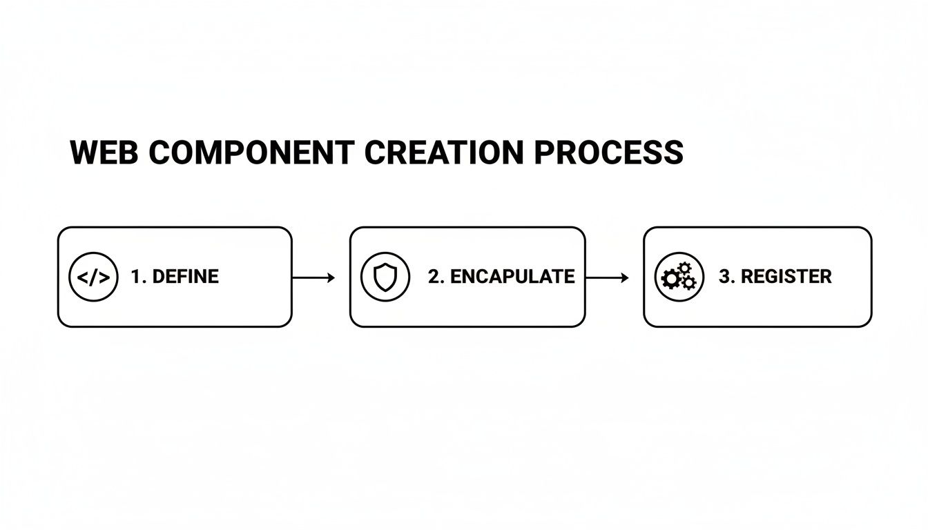
This flow really just boils down to defining your component's logic in a class, isolating its styles with the Shadow DOM, and then telling the browser it exists.
Passing Data with Attributes
The most direct way to get data from React into your Web Component is through standard HTML attributes. It works exactly like you'd expect, just like setting an attribute on a <div> or an <img>. This approach is perfect for simple, string-based data like a user's name, their job title, or an avatar URL.
Let's see this in action by modifying our React component to pass down some user data.
function UserDashboard() {
const user = {
name: 'Alex Doe',
title: 'Lead Developer',
avatar: 'https://i.pravatar.cc/150?u=alex'
};
return (
Welcome to the Dashboard
);
}
Pay attention to the naming convention here. React props like userName automatically translate to the kebab-case user-name in the HTML. This is the standard for custom element attributes and keeps things clean. Of course, your Web Component will need to be set up to listen for these attribute changes and update itself.
But there's a big catch with attributes: they are only strings. If you need to pass complex data like objects, arrays, or functions, you'll find yourself serializing with JSON.stringify, which is clumsy and inefficient. For richer data, we need a better way.
Using Refs for Complex Data and Methods
When you need to pass non-string data or call methods directly on your component, React’s useRef hook is your best friend. A ref gives you a direct handle to the underlying DOM element, letting you access its JavaScript properties and methods just as you would with any other element.
This method is way more performant for complex data because you're completely bypassing the attribute layer and its string-only limitation.
Think of a ref as a direct communication channel between your React component and the Web Component's instance. It's the go-to technique for passing down objects or arrays, or for imperatively triggering an action like
card.refreshData().
Setting this up is a three-part dance:
- Create a ref in your React component:
const cardRef = useRef(null); - Attach it to your custom element:
<user-profile-card ref={cardRef}></user-profile-card> - Use
useEffectto interact with the element, ensuring it's actually mounted in the DOM before you try to access its properties.
Let's look at a practical example where we pass a full user object and then call a custom highlight method that we've defined on our Web Component.
import React, { useRef, useEffect } from 'react';
function UserProfileContainer() {
const cardRef = useRef(null);
const userData = {
id: 123,
name: 'Jane Roe',
isActive: true,
permissions: ['admin', 'editor']
};
useEffect(() => {
// Check if the element has been rendered
if (cardRef.current) {
// Set a property directly with our complex object
cardRef.current.user = userData;
  // Now, call a custom method on the Web Component instance
  cardRef.current.highlight('blue');
}
}, [userData]); // Re-run this effect if userData ever changes
return
}
This pattern is absolutely essential for advanced web components with React integrations, especially in the SaaS dashboards we often build, where components are constantly juggling rich data structures.
Getting Data Back out with Custom Events
So far, we've only pushed data down. How do we communicate back up to React? The standard Web Component pattern for this is to dispatch custom events. Your React component can then listen for these events and update its state, closing the data-flow loop.
Let's say our user-profile-card has an "Edit" button. When a user clicks it, we want to notify the parent React app.
- In the Web Component: You'd dispatch a
CustomEvent, stuffing any data you need into thedetailproperty.this.dispatchEvent(new CustomEvent('onEdit', { detail: { userId: this.user.id } })); - In the React Component: You'll use
useEffectand your ref to add an event listener to the custom element.
Here’s what the React side of that looks like:
useEffect(() => {
const node = cardRef.current;
const handleEdit = (event) => {
console.log('Edit clicked for user:', event.detail.userId);
// Here you would trigger a state update, open a modal, etc.
};
if (node) {
node.addEventListener('onEdit', handleEdit);
// This is critical: clean up the listener when the component unmounts!
return () => node.removeEventListener('onEdit', handleEdit);
}
}, []); // An empty dependency array ensures this runs only once
This creates a clean and predictable data flow: props and properties flow down, and events bubble up.
Projecting Content with Slots
What if you want to provide a structured component but let the user decide what goes inside certain parts of it? That's exactly what the <slot> element is for. It acts as a placeholder inside your Web Component's Shadow DOM, allowing you to project external HTML directly into it.
This is a fantastic way to build flexible layouts. For instance, our user card could have a dedicated slot for action buttons.
Inside the Web Component's template innerHTML:
Then, from your React component, you can simply pass in children with a slot attribute that matches the name you defined.
This technique is incredibly useful for building reusable wrappers like modals, panel layouts, or page shells where the frame is consistent but the content needs to be dynamic. In the B2B and SaaS applications we build, this is a common pattern. Our React.js consulting teams often use this for creating complex, data-driven UIs.
For example, a modern stack might have React Server Components (RSC) render critical AI ops components on the server, which then integrate with services like Firebase or Supabase to automate tasks without client-side hydration conflicts. This hybrid approach is definitely gaining ground, with an estimated 13.4 million sites by 2026 expected to be using this kind of architecture.
Styling and Server-Side Rendering: The Real-World Hurdles
When you start using web components with React, just passing props and listening for events is the easy part. The two biggest real-world headaches you'll actually run into are styling across the Shadow DOM boundary and getting everything to play nice with Server-Side Rendering (SSR). If you get these wrong, you're in for a world of broken styles and frustrating hydration errors.
The secret sauce of Web Components—the Shadow DOM—is also their biggest styling challenge. Any styles you write inside your component are completely locked away from the rest of your app. Your global CSS files can't touch them. While that's fantastic for preventing style conflicts, it becomes a problem the moment you need to theme a component to match your application's look and feel.
You simply can't target an element inside a Web Component with a standard CSS selector from your main stylesheet. It won't work. This encapsulation is intentional, but it means we have to be deliberate about creating themeable components from the start.
Creating a Themeable Component
The best way to handle styling across the Shadow DOM today is with CSS Custom Properties, often just called CSS Variables. This approach lets you create a public styling API for your component. You're essentially giving developers control over specific design tokens—like colors, fonts, or spacing—without forcing them to know anything about your component's internal structure.
Inside your Web Component's <style> tag, you consume these variables and provide a sensible fallback.
.card {
background-color: var(–card-bg-color, #ffffff);
border: 1px solid var(–card-border-color, #e0e0e0);
}
Now, from your React app's global CSS, anyone can easily set those values.
user-profile-card {
–card-bg-color: #f8f9fa;
–card-border-color: #ced4da;
}
This creates a clean contract. The component advertises what's customizable, and the app provides the specific theme values.
If you need even more direct control, you can reach for the ::part() pseudo-element. It allows you to style a specific element inside the Shadow DOM that you've explicitly exposed with a part attribute.
- Inside your Web Component's HTML:
<h3 part="title">...</h3> - In your React app's CSS:
user-profile-card::part(title) { font-size: 1.5rem; }
This is a powerful tool, but use it with caution. Exposing too many internal parts can make your component’s markup brittle and a nightmare to refactor later.
Key Takeaway: Stick with CSS Custom Properties for general theming. Reserve
::part()for the rare cases where you absolutely must give developers direct styling access to a specific internal element. This gives you flexibility without sacrificing encapsulation.
Dodging Server-Side Rendering Traps
Server-Side Rendering introduces its own set of complications. Frameworks like Next.js pre-render your React components on the server to generate HTML, which is great for performance and SEO. The problem is that the server (usually a Node.js environment) has no idea what browser-specific APIs like customElements are.
This mismatch leads to the dreaded hydration error. The server sends down a <user-profile-card> tag, but because it doesn't recognize it as a custom element, it's just a meaningless, empty tag. When the client-side JavaScript loads, React tries to "hydrate" the HTML from the server. It sees the server's generic tag but finds a fully upgraded custom element on the client, causing it to throw an error.
The fix is to make sure your Web Component is only ever defined and used on the client, where the necessary browser APIs exist. I've found two strategies work best here.
Client-Side Only Registration with useEffect
One reliable method is to wrap your custom element definition in a useEffect hook with an empty dependency array. This guarantees the customElements.define() code only runs once, and only after the component has mounted in a browser environment.
import { useEffect } from 'react';
import { UserProfileCard } from './path/to/UserProfileCard.js';
function App() {
useEffect(() => {
// A quick check prevents errors during hot-reloading in development.
if (!window.customElements.get('user-profile-card')) {
window.customElements.define('user-profile-card', UserProfileCard);
}
}, []);
return
}
This approach works quite well, though you need to be mindful of where this registration code lives to ensure it runs before the component is rendered. It's also a good time to think about how your styling choices affect perceived load time, a core tenet of our web accessibility consulting.
Dynamic Imports in Next.js
For those using Next.js, there's an even cleaner solution: next/dynamic. This lets you import a React component that wraps your Web Component, but with SSR completely disabled for that specific component.
import dynamic from 'next/dynamic';
const DynamicUserProfile = dynamic(
() => import('../components/UserProfileWrapper'),
{ ssr: false }
);
function HomePage() {
return (
My Page
);
}
In this setup, the UserProfileWrapper component is where you'd import and register the Web Component. This ensures none of that logic ever touches the server. This is my go-to recommendation for any Next.js project using web components with React because it cleanly isolates server and client concerns.
Packaging and Publishing Your Component Library

So you've built a solid Web Component. That's a huge first step, but it's not the finish line. A component sitting in a single repo doesn't do anyone much good. The real win, especially in a growing organization, is turning that component into a shareable, version-controlled asset that any team can pull into their project.
This is how you build a genuine single source of truth for your UI. When everyone from the main product team to the marketing microsite team is using the same button, you create consistency and save a massive amount of time. It all starts with packaging it up for distribution.
Picking the Right Tool for the Job
While you could wrangle vanilla JavaScript to get your component bundled, you'll save yourself a lot of headaches by using a dedicated tool. Modern build tools are designed to handle the tricky parts of packaging web components with React in mind, like transpilation for older browsers and generating framework-specific wrappers.
Two of the most popular choices in this space are Lit and Stencil.js.
- Lit: This is Google's baby. It’s incredibly lightweight and stays very close to the metal of web standards. If you value minimal overhead and want components that are fast and lean, Lit is a fantastic option. It gives you reactive properties and clean templates without a lot of extra baggage.
- Stencil.js: Think of Stencil as more of a compiler. Its killer feature is the ability to automatically generate framework bindings. For organizations with teams that are heavily invested in React, this can make adopting your new component library practically frictionless.
Honestly, for many projects, a tool like Vite is the perfect sweet spot. It has a "library mode" that's practically built for this exact use case. It’s blazing fast and the configuration is refreshingly simple, meaning you can get a professional build process going in minutes, not hours.
The ultimate goal of many component libraries is to be adopted by a wide array of projects and teams, underscoring the role of professional website developers who can architect and maintain these systems. A well-packaged library is a developer's best friend.
Configuring Your Build Process
Let's run with Vite since it's so approachable. Your main goal is to tell Vite that you're building a library, not a standalone web app. This all happens in your vite.config.js file.
The key is the build.lib section. You'll point it to your library's entry file and define the output formats. I always recommend generating both an ES Module (ESM) and a Universal Module Definition (UMD) build. This gives you the best of both worlds: modern bundlers will grab the efficient ESM version, while the UMD build ensures your component can still be dropped into older setups or even a simple <script> tag.
// vite.config.js
import { resolve } from 'path';
import { defineConfig } from 'vite';
export default defineConfig({
build: {
lib: {
entry: resolve(__dirname, 'src/index.js'), // Your library's entry point
name: 'MyComponentLibrary',
fileName: (format) => my-component-library.${format}.js
},
rollupOptions: {
// Optional: If you have external dependencies you don't want to bundle
}
}
});
With that in place, running vite build will create a dist folder containing your neatly bundled files, ready for the world.
Prepping Your package.json for Publication
Your package.json file is the passport for your component library. It gives package managers like npm all the metadata needed to distribute it correctly. Getting a few specific fields right is crucial.
name: Your package's unique identifier on npm. A good practice is to use a scoped name, like@my-org/ui-components.version: Stick to Semantic Versioning (SemVer) to communicate changes clearly.main: This should point to your UMD build. It’s the fallback for older CommonJS environments.module: This points to your shiny new ESM build. Modern tools will use this entry point by default.files: This is a big one. You need to explicitly tell npm what to include in the package. You almost always want to limit this to yourdistfolder and maybe a README. This prevents you from publishing source files, configs, and other clutter.
Taking the time to set this up correctly is a hallmark of a professional, maintainable system. It’s a foundational piece of a solid workflow. To see how this fits into the bigger picture, you can explore more on DevOps and continuous delivery. Once you publish to npm, these fields ensure every developer who installs your package gets exactly what they need, and nothing they don't.
Alright, you've seen the nuts and bolts of how to connect Web Components and React. But knowing how they fit together is only half the battle. The real questions that come up in practice are about the when, the why, and the "gotchas" you'll inevitably run into.
Let's walk through some of the most common questions I hear from developers trying this for the first time.
So, When Should I Actually Use a Web Component Over a React Component?
This is the big one, and the answer almost always comes down to a single word: interoperability.
Think about it this way: are you building a component that needs to live outside the walls of a single React app? If you're creating a design system for a company that has products built with React, Angular, and maybe even some plain HTML marketing pages, Web Components are your answer. They give you a single, universal component you can drop anywhere without rewriting it for each framework.
On the other hand, if your entire world is React—and you're confident it will stay that way—just stick with native React components. The ecosystem is mature, and you avoid adding another layer of abstraction. Staying native simplifies everything from state management to onboarding new developers.
A simple rule I follow: If it needs to be universal and framework-agnostic, build a Web Component. If it's a feature or UI piece for a specific React app, build a React component.
What Are the Real Performance Trade-Offs?
Putting these two technologies together does have a few performance quirks you need to be aware of. First, there's a tiny bit of overhead on the initial load. The browser has to find your custom element tags, define them, and then "upgrade" them into fully functional components. This is negligible for a few elements, but it's something to keep in mind if you're rendering hundreds of them.
The more significant headache is often Server-Side Rendering (SSR). As we covered earlier, you have to be deliberate about how your Web Components are registered on the client side to avoid those dreaded hydration errors.
And for passing data, my experience has been clear: using a ref to set JavaScript properties directly on an element is much more efficient than serializing complex objects into string attributes. Trying to JSON.stringify an object into an attribute and parse it back inside the component is a recipe for messy code and performance bottlenecks.
How Do I Handle State Between Them?
The cleanest pattern is to let React be the single source of truth. You should absolutely avoid building stateful logic inside your Web Components when they're being used in a React app. This keeps your data flow predictable and easy to debug.
Here's the pattern that works best in the real world:
- Passing Data Down: For simple string values, attributes work just fine. For anything complex, like objects or arrays, pass the data from your React state down to the Web Component using a
refto set its properties directly. - Sending Data Up: When the Web Component needs to communicate back to React (like after a button click or a form input), it should emit a custom event. Your React component can listen for that event and update its own state accordingly.
Following this "props down, events up" model keeps your state management centralized where it belongs—in React.
At MakeAutomation, we specialize in helping businesses build robust, scalable systems like these. If you need to implement AI-powered workflows or streamline your development processes, find out how we can help.