
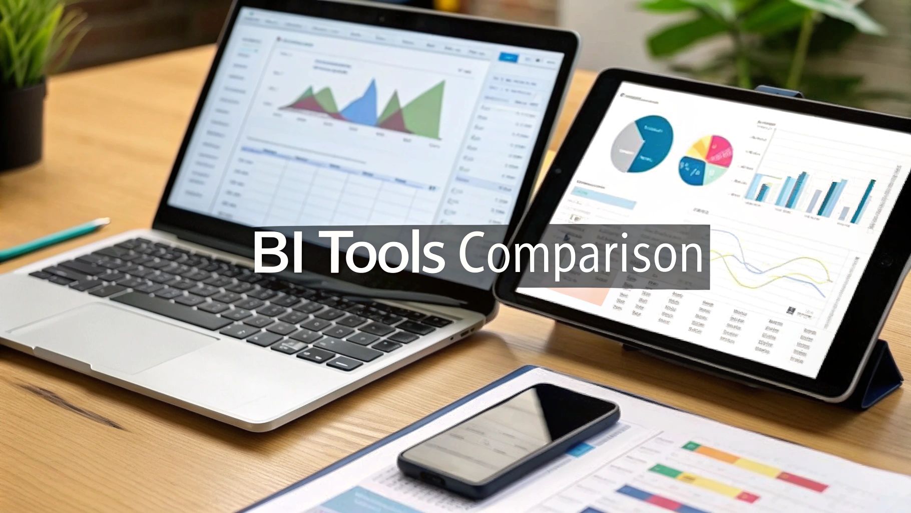
Business Intelligence Tools Comparison Guide
Comparing business intelligence tools often boils down to a fundamental choice. On one hand, you have platforms like Microsoft Power BI and Tableau that are masters of visual storytelling and building user-friendly dashboards. On the other, you find tools laser-focused on real-time data processing or deep, developer-centric integrations.
There’s no single "best" tool for everyone. The right choice is the one that fits neatly with your specific data sources, your team's existing skills, and what you’re ultimately trying to achieve as a business. It all depends on whether you need simple, self-service analytics for the masses or a powerful engine that your technical team can build upon.
Understanding Business Intelligence Tools
At its heart, business intelligence (BI) software is designed to collect and make sense of huge volumes of unstructured data pouring in from all over your business—and outside of it. Think of these tools as the bridge connecting raw information, like sales figures, customer support tickets, and website clicks, to clear, actionable insights.
Instead of getting bogged down in manual spreadsheet work, BI platforms automate the heavy lifting. They transform messy, complex datasets into clean, intuitive reports and visuals that tell a story.
The main job of any BI tool is to give decision-makers at every level the confidence to act. They do this through a few key functions that work in concert to build a data-first culture.
- Data Consolidation: Pulling together information from disparate sources—databases, CRMs, cloud apps, you name it—into a single, unified view.
- Interactive Visualization: Building dynamic charts, graphs, and maps that let users drill down, filter, and explore the data from different perspectives.
- Automated Reporting: Setting up reports that automatically track key performance indicators (KPIs) over time, so you’re not starting from scratch every Monday morning.
To get the most out of these tools, you have to understand their core output. A great starting point is defining What is a Business Intelligence Dashboard.
The Growing Importance of BI
Adopting BI is no longer a "nice-to-have"—it’s a competitive must. The global market for business intelligence software hit USD 41.74 billion in 2024 and is on track to reach an incredible USD 151.26 billion by 2034.
This massive growth isn't happening in a vacuum. It’s being fueled by the integration of AI and machine learning, which are turning data analysis from a backward-looking exercise into a predictive one.
This chart from Precedence Research paints a clear picture of just how fast the market is expanding over the next decade.

This powerful upward trend shows just how much companies are banking on BI to sharpen their operations, get inside their customers' heads, and find new ways to grow. With that foundation in place, we can dive into our detailed business intelligence tools comparison.
What to Look for When Comparing BI Platforms
Choosing the right business intelligence tool can feel overwhelming. It’s easy to get lost in a sea of features, but a structured approach makes all the difference. To really compare these platforms, you need to look past the marketing hype and evaluate them based on what actually matters for your business.
Let's start with what I consider the most important factor: ease of use. If a BI tool is clunky or requires a data science degree to operate, your team simply won't use it. It doesn't matter how powerful it is if it just sits on the shelf. The best platforms strike a balance, offering intuitive drag-and-drop interfaces for everyday business users while still providing the advanced functionality data analysts need.
This infographic breaks down how I weigh the core criteria for most organizations I work with.
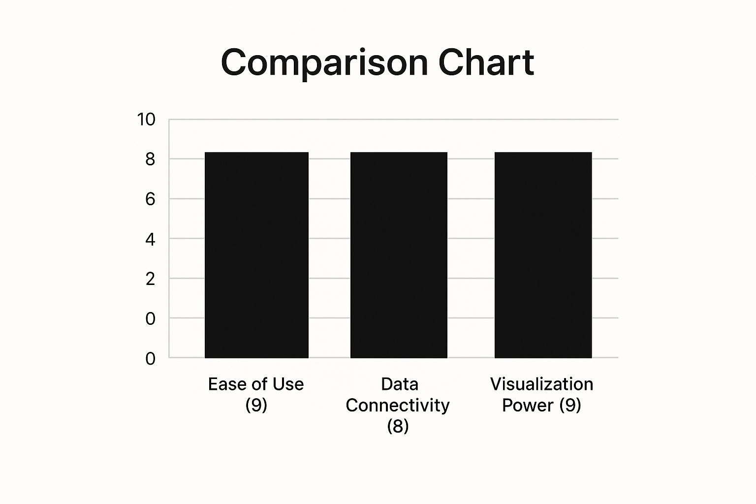
As you can see, usability and visualization often deliver the quickest wins. They directly influence how quickly your team can start pulling real value from your data.
Data Connectivity and Integration
A BI platform is worthless if it can't get to your data. Data source connectivity is all about how well a tool can pull information from the places where your business actually runs—databases, cloud apps like Salesforce, simple spreadsheets, and various APIs. The more pre-built connectors a tool offers, the less time your technical team will spend building and maintaining fragile custom connections.
Good connectivity is the bedrock of creating a single source of truth. When you follow solid data integration best practices from the get-go, you avoid the frustrating data silos that lead to conflicting reports. A large company with on-premise databases will have very different needs than a cloud-native startup that runs entirely on SaaS tools, so this isn't a one-size-fits-all consideration.
A BI tool’s true power is unlocked not by its flashy charts, but by its ability to reliably connect to the messy, fragmented data sources that run the business. Without solid connectivity, you’re just visualizing incomplete stories.
Visualization and Scalability
Finally, let's talk about turning that data into something meaningful. Visualization isn't just about making pretty graphs; it’s about telling a clear story with your data. Top-tier tools give you a flexible canvas to create compelling, easy-to-digest visuals that communicate complex insights instantly.
At the same time, you need to think about the future. Scalability is about how the platform will perform as your company grows. A solution that’s perfect for a team of five can crumble under the pressure of five hundred users and massive data volumes. Choosing a tool that can handle more data, more users, and more complex questions without slowing down will save you from a painful and expensive migration later on.
A Head-to-Head BI Tool Comparison
When you're doing a real business intelligence tools comparison, you have to look past the marketing slicks and feature checklists. The best tool isn't about having the most features; it's about how it works in the real world for your team. Let's break down three of the biggest names in the game—Microsoft Power BI, Tableau, and Qlik Sense—and see where each one truly shines.
Each of these platforms was built with a different philosophy in mind. Getting a feel for those underlying differences is the only way to pick a tool that fits your company’s culture, your team's existing skills, and your long-term data goals.
Microsoft Power BI: The Ecosystem Integrator
Microsoft Power BI's biggest win is how deeply it's woven into the Microsoft universe. If your company already runs on Office 365, Azure, and Dynamics, adopting Power BI feels less like a new tool and more like unlocking a new level in a game you already know how to play. The user experience is familiar, and the connections are seamless.
It has absolutely dominated the market for a reason. By 2021, Power BI had captured over 30% of the analytics platform market, with more than 100,000 organizations using it. This explosive growth is a direct result of its aggressive pricing and its native integration with the enterprise software most businesses already use. You can see how competitors like Tableau stack up in the broader market landscape.
Where Power BI really excels is in creating structured, well-governed reports that can be distributed reliably across a large organization. Its data modeling engine, powered by the DAX formula language, is incredibly powerful for complex financial and operational calculations. It provides a solid framework for IT to manage the data, while still giving business users the freedom to explore within safe boundaries.
Best For: Companies already committed to the Microsoft stack. It’s a perfect fit for finance, operations, and sales departments that need a scalable, cost-effective, and governed solution for standardized reporting and self-service analytics.
Tableau: The Visual Storyteller
For years, Tableau has been the undisputed king of data visualization. Think of it as the artist's canvas of the BI world. It gives you an incredible amount of control over every visual detail, empowering anyone to build stunning, interactive dashboards that tell a powerful story.
Tableau's whole approach is built around fluid exploration. Unlike Power BI, which often requires you to build a data model first, Tableau lets you connect to a data source and start dragging, dropping, and visualizing immediately. This makes it a go-to tool for data analysts and consultants who need to parachute into a new dataset and find insights fast.
- Unmatched Ease of Use: Its drag-and-drop interface is still considered the gold standard for non-technical users who just want to create beautiful charts.
- Vibrant Community: Tableau has a massive, passionate user community. If you have a problem, chances are someone has already solved it and shared the solution online.
- Deployment Flexibility: You can run it just about anywhere—on your own servers, in the public cloud, or using their fully-managed Tableau Cloud.
This level of polish and flexibility does come with a higher price tag, especially for the "Creator" licenses needed to build new data sources and dashboards. Its data prep tool is capable, but it's a separate product and can feel less integrated than Power BI's built-in Power Query Editor.
Best For: Teams that live and breathe data storytelling. It’s ideal for marketing, research, and any client-facing role where the goal is to communicate complex insights through beautiful, engaging, and interactive visuals.
Qlik Sense: The Associative Explorer
Qlik Sense brings something completely different to the table with its patented Associative Engine. Most BI tools are query-based; you ask a specific question, and they give you a specific answer. Qlik is different. It lets you explore all the relationships in your data, all at once.
When you click on a data point, it instantly highlights all associated values in white and, more importantly, all unrelated values in gray. This simple green-white-gray system is revolutionary because it shows you what you're missing and can spark questions you didn't even know you had.
- The Associative Engine: This is Qlik's secret sauce. It’s designed for unguided data discovery, revealing hidden connections that other tools would miss.
- Speedy In-Memory Processing: The engine loads all data into RAM, which makes interacting with dashboards and filtering massive datasets feel instantaneous.
- Augmented Analytics: Qlik has gone all-in on AI and machine learning, baking in features that automatically surface insights and even let you ask questions in plain language.
The trade-off is a steeper learning curve, particularly for developers who need to get under the hood and build the data models. And while its visualizations are powerful, they don't always have the out-of-the-box aesthetic polish that Tableau is famous for.
Best For: Organizations that want to foster a culture of true data curiosity. It’s built for users who want to go beyond the obvious and uncover unexpected insights by exploring the full context of their data.
At-a-Glance Comparison of Top BI Platforms
To help you quickly see how these three powerhouses stack up, here’s a high-level summary. This table cuts through the noise to focus on the key differentiators that will likely drive your decision.
| Criterion | Microsoft Power BI | Tableau | Qlik Sense |
|---|---|---|---|
| Primary Strength | Deep Microsoft ecosystem integration and governance | Best-in-class interactive data visualization | Associative engine for unguided data exploration |
| Ease of Use | High for users familiar with Excel; moderate learning curve for DAX | Very high for visual analysis; intuitive drag-and-drop | Moderate; the associative model requires a new way of thinking |
| Pricing Model | Very affordable entry-point; cost-effective at scale | Premium pricing, especially for creator licenses | Higher-end pricing, often sold as an enterprise solution |
| Ideal User | Business analysts, IT, and finance teams in a Microsoft environment | Data storytellers, marketers, and business users needing ad-hoc visual analysis | Data explorers and analysts looking for hidden insights |
| Data Modeling | Very strong and structured (DAX language) | Flexible but often relies on well-prepared data sources | Powerful and unique associative modeling; can be complex |
Ultimately, the "best" tool depends entirely on your specific needs. Power BI is a pragmatic choice for Microsoft-centric organizations, Tableau is the leader for visual communication, and Qlik offers a unique path to uncovering insights you didn't even know to look for.
Don't Get Blindsided by the Real Cost of BI Software
When you're comparing business intelligence tools, the sticker price is just the start of the story. The real financial picture is captured by the Total Cost of Ownership (TCO), which factors in all the other expenses needed to get the software running and delivering value.
Just comparing the monthly user fees for tools like Power BI and Tableau is a classic mistake that can lead to some nasty budget surprises later on. To get it right, you have to dig deeper.
Peeling Back the Layers of Hidden Costs
The biggest "gotchas" in BI software pricing are almost always related to implementation and user adoption. Getting a platform installed is one thing; getting your team to actually use it effectively is another beast entirely.
Here are the costs you absolutely must factor into your TCO calculation:
- Implementation & Setup: Most vendors or their partners charge a hefty one-time fee to get you set up. This covers integrating your data sources and building those first critical dashboards. Expect this to run anywhere from a few thousand to tens of thousands of dollars.
- Training & Onboarding: Your team won't magically become data experts. You have to invest in proper training to drive adoption and get the most out of the tool.
- Data Infrastructure: Are you going with the vendor's cloud service or hosting it yourself? On-premise hosting might look cheaper initially, but don't forget the costs of server hardware, maintenance, security, and the IT staff to manage it all.
- Support & Maintenance: Basic support is usually included, but if your reports are mission-critical, you'll likely need a premium support package for faster response times or 24/7 access. That's an extra, recurring cost.
The value of a BI tool isn’t unlocked when you buy it—it’s unlocked when your team adopts it. Skimping on training and support is the surest way to turn a powerful analytics platform into expensive shelfware.
Pricing Models and Finding the Real ROI
Every major BI platform plays the pricing game a little differently. Microsoft Power BI lures you in with a very affordable entry point, which is fantastic for smaller teams. But the costs can escalate quickly once you need Premium features for larger-scale data processing or company-wide report distribution.
Tableau starts at a higher per-user price point, especially for the "Creator" licenses needed to build dashboards. Qlik is often positioned for larger enterprises, with custom pricing that reflects its unique data engine and robust governance capabilities.
For a structured approach to this financial analysis, our guide on how to calculate return on investment offers a great framework.
In the end, it’s not just about the cost, but the value you get back. A pricier tool might deliver a far greater ROI if its specific features help your team make better decisions that directly impact revenue. The cheapest option is rarely the best value in the long run.
BI Tools in Action Across Industries

A simple business intelligence tools comparison on paper doesn't tell the whole story. The real value of any platform emerges when it's put to work solving tangible business problems. A tool’s worth isn’t just its list of features; it's the specific results it delivers in the real world.
To get a clearer picture, let's look at how these leading BI platforms perform in different industries. You’ll see that each tool has unique strengths that make it a better fit for certain challenges, which really drives home the need to match the software to your specific operational needs.
Retail and E-commerce Analytics
The retail world is brutally competitive, and success often comes down to one thing: deeply understanding customer behavior. For a national retail chain, this might mean using Tableau to visualize in-store foot traffic. By layering sales data onto store layout heatmaps, managers can spot underperforming displays and rearrange aisles to boost the average basket size.
An e-commerce brand faces a different puzzle. They might turn to Qlik Sense to map out the entire customer journey, from the first ad click to the final checkout. Qlik’s Associative Engine is built for this kind of exploration, helping marketers see how various touchpoints influence conversions and revealing surprising connections a standard report would never catch.
The right BI tool doesn't just show you data; it answers critical, industry-specific questions. For retail, that's about optimizing the physical or digital shelf. For finance, it's about managing risk second by second.
Finance and Manufacturing Applications
In financial services, there's no room for error or delay. A wealth management firm could use Microsoft Power BI to build live dashboards tracking market swings and portfolio performance. Its native integration with Azure ensures secure, high-speed data processing, giving advisors the instant insights they need to react to market changes. Seeing these complex data streams clearly is key, and you can find inspiration for effective designs in these business intelligence dashboard examples.
Manufacturing brings a whole other set of data challenges centered around operational efficiency. Here’s how a BI tool could make a difference on the factory floor:
- Supply Chain Optimization: A company can use a platform like Power BI to pull inventory levels, supplier lead times, and shipping logistics into one dashboard, spotting bottlenecks before they disrupt the entire chain.
- Predictive Maintenance: By connecting to sensor data from machinery, Qlik Sense can help predict equipment failures, allowing for proactive maintenance that prevents expensive downtime.
- Quality Control: Tableau can visualize production line data to pinpoint exactly where defects are happening most often, helping engineers refine processes and cut down on waste.
Each scenario shows a tool solving a distinct problem. Tableau shines at telling visual stories for customer analytics, Power BI is the go-to for governed, real-time insights in finance, and Qlik is brilliant at finding hidden patterns in complex operational data. Understanding this context is what takes you beyond a simple feature checklist.
How to Choose the Right BI Tool for Your Team
So, after looking at all the options, how do you actually make a decision? It's not about finding some mythical "best" tool, but about picking the one that slots neatly into how your team already works. Your choice really boils down to three things: your current tech stack, how comfortable your team is with data analysis, and what you’re trying to accomplish.
Don't get overwhelmed by the sheer number of choices out there. Think of these recommendations as a simple starting point to help you zero in on the right fit for your business.
Situational Recommendations
-
For the Microsoft-Centric Enterprise: If your company runs on Microsoft, Power BI is almost a no-brainer. It’s built to work seamlessly with Azure, Office 365, and Dynamics, making it a familiar, secure, and budget-friendly way to scale up your analytics.
-
For Compelling Data Storytelling: Go with Tableau when your main goal is to empower analysts to build beautiful, interactive dashboards. For crafting data narratives that captivate and inform, whether for internal meetings or client presentations, its visual flexibility is second to none.
-
For Unguided Data Discovery: Qlik Sense is the answer when you want to encourage people to get curious and explore data on their own terms. Its Associative Engine is uniquely designed for digging into complex data and finding those "aha!" moments and hidden connections that other tools often overlook.
Picking a BI platform is a major commitment, and it goes far beyond the software license. You're investing in your people. With the average BI analyst salary hitting $75,703 in 2024, it's clear that expertise is highly valued. Understanding the growing BI market trends can give you the context needed to make a smart, future-proof decision.
Answering Your Final Questions About BI Tools
Alright, you've narrowed down the options, but a few practical questions are probably still bouncing around. Let's tackle them head-on, so you can make a choice that actually works for your team.
Is Power BI or Tableau Better for Less Tech-Savvy Users?
This is a classic question. The main difference really comes down to what "non-technical" means in your organization. If your team lives and breathes Excel, Power BI will feel like coming home. The interface is unmistakably Microsoft, which can make building standard reports feel much more intuitive right out of the gate.
Tableau, however, was designed from the ground up for visual discovery. Its drag-and-drop canvas is incredibly powerful for exploring data and telling a story without needing to write a single line of code. For users who want to creatively play with data and design beautiful dashboards, Tableau often feels more freeing, even if it doesn't have that initial Microsoft familiarity.
The bottom line: If your team needs structured reporting and knows Excel, Power BI is a smoother entry point. If the goal is to empower users to create stunning, interactive data stories with total creative control, Tableau is the winner.
What's a Realistic Timeline for Implementation?
This is the "how long will this take?" question everyone has. While every company is different, a safe bet for a standard implementation for a mid-sized team is anywhere from four to twelve weeks.
That timeline covers the whole process: getting the platform set up, hooking up your main data sources, building out that first batch of essential dashboards, and getting your team trained up so they can actually use the thing.
Can These Tools Connect to Our Company's Custom Databases?
Absolutely. This is a must-have feature, and all the major players—Power BI, Tableau, and Qlik included—have you covered. They come equipped with robust options like ODBC/JDBC drivers and API connectors.
This means you can easily plug into your company's proprietary databases or other in-house applications. You won't have to worry about leaving any of your unique, critical data out of the picture.
At MakeAutomation, we live and breathe this stuff. Our expertise is in untangling complex data systems and automating the connections, so your BI implementation is fast and effective from day one. See how our team can help you connect your tools and start getting real insights by visiting https://makeautomation.co.