Business Process Mapping Techniques for 2025
Why Mastering Process Mapping Matters in 2025
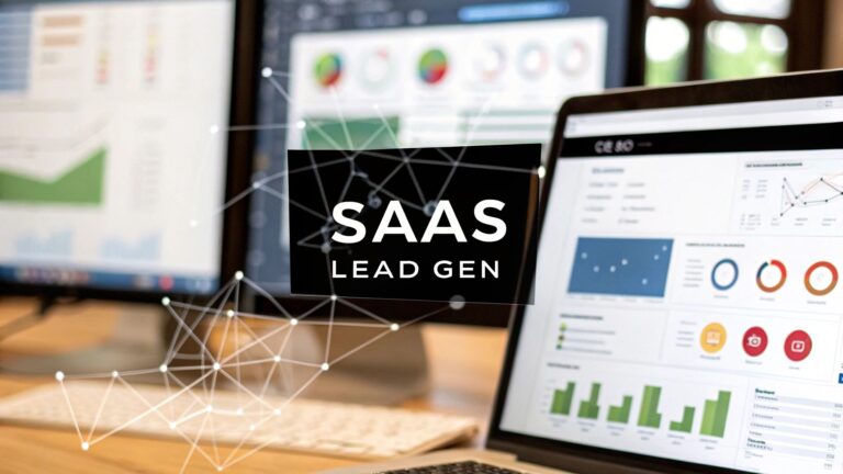
Process clarity drives scalable growth for B2B and SaaS founders, sales and marketing leaders, operations directors, startup entrepreneurs, and HR teams. As remote teams and automated lead-gen workflows proliferate, hidden handoff gaps and redundant steps can stall growth and inflate costs. Rigorous mapping often cuts error rates by up to 30% and highlights automation triggers. This roundup of eight business process mapping techniques – from simple flowcharts to advanced process mining – arms you with specific, actionable methods to visualize end-to-end workflows. You will see real examples from SaaS onboarding, talent acquisition, and cross-functional campaigns, plus insights on integrating templates and automation tools.
In this listicle you will learn:
- How to choose the right technique for your scenario
- Step-by-step mapping actions with SaaS and B2B use-cases
- Pros and cons for each method, plus time savings estimates
- Automation opportunities and recommended next steps
Each section pairs concise how-to steps, a practical scenario, and a blockquote highlighting a key insight. Apply these business process mapping techniques to cut waste, improve handoffs, and build repeatable, automated operations in 2025.
1. Flowcharts
Flowcharts are the most fundamental business process mapping techniques that use standardized symbols (rectangles, diamonds, ovals, arrows) to represent sequential steps, decisions, and flow directions. They offer a clear visual of how work moves from start to finish, helping teams spot inefficiencies and align on process details.
What are Flowcharts?
Flowcharts map each task or decision point in a step-by-step layout. Symbols convey action steps, decision forks, and input/output flows. This clarity reduces miscommunication across departments in SaaS, B2B, and growth-stage contexts.
Why Use Flowcharts?
- Visual clarity: Simplifies complex procedures
- Cross-functional alignment: Common language for teams
- Quick audits: Easily spot redundant or missing steps
When to Use Flowcharts?
Flowcharts shine when you need to document or optimize processes with defined start/end points. They work best for workflows with up to 30 steps, such as:
- Onboarding new software modules
- Customer support ticket escalation
How to Implement Flowcharts
- Use consistent symbol sizing and spacing
- Keep process steps concise and action-oriented
- Apply descriptive labels to define each step
- Test the flowchart with actual process participants
- Limit to 20–30 steps for readability
- Use color coding to distinguish process types
Real-World Examples
- Manufacturing production workflows
- Customer service request handling processes
- Software development approval workflows
- Healthcare patient admission procedures
Next Steps
Start by drafting a simple flowchart in Lucidchart or Visio, then review with your operations team. For templates, automation tips, and deeper guidance, Learn more about Flowcharts on domain.com.
2. Swimlane Diagrams (Cross-Functional Flowcharts)
Swimlane diagrams extend traditional flowcharts by organizing process steps into horizontal or vertical lanes, each representing a department, role, or system responsible for specific activities. This method highlights hand-offs, dependencies, and interdepartmental communication across complex operations. It’s a core business process mapping technique for SaaS, B2B, and growth-stage teams aiming to scale efficiently.

What are Swimlane Diagrams?
Swimlane diagrams map process steps into distinct lanes, each labelled with the owner department or role.
They reveal who does what, when, and how work flows between teams.
Popularized by ASQ, Six Sigma, and Rummler & Brache, this technique reduces silos and improves accountability.
Why Use Swimlane Diagrams?
- Clear hand-offs: Shows exact moments tasks transfer between teams
- Role accountability: Assigns ownership for every sub-process
- Dependency spotting: Exposes bottlenecks and delays
- Cross-functional alignment: Creates a shared visual language
When to Use Swimlane Diagrams?
Use this approach when processes span multiple functions or systems. Key scenarios include:
- Launching a loan approval workflow across credit, underwriting, and finance
- Managing insurance claims with claims, underwriting, and billing teams
- Coordinating product development from marketing through production
- Optimizing order-to-cash cycles in retail organizations
How to Implement Swimlane Diagrams
- Define high-level process stages and assign lane owners
- Arrange lanes by sequence, not by hierarchy
- Map out each task with clear start and end points
- Use consistent colors for each swimlane
- Minimize crossing lines by repositioning related activities
- Involve representatives from every department
- Validate the draft with actual process participants
- Update lanes with sub-process details and ownership
Real-World Examples
- A bank reducing loan cycle time by 25% through lane-based auditing
- An insurance provider cutting claim delays with clearer interdepartmental KPIs
- A SaaS vendor aligning sales, onboarding, and support flows
- A manufacturing firm streamlining procurement and production hand-offs
Next Steps
Download a free swimlane template in Lucidchart or Visio and host a cross-functional mapping workshop. For deeper guidance, automation tips, and advanced templates, learn more about Swimlane Diagrams on domain.com.
3. Value Stream Mapping (VSM)
Value Stream Mapping is a lean technique and one of the most powerful business process mapping techniques that visualizes every step in a workflow to pinpoint waste and inefficiencies. It captures both material and information flow, distinguishing value-adding activities from non-value steps to drive continuous improvement.
What is Value Stream Mapping (VSM)?
Value Stream Mapping charts the end-to-end process flow, using standardized icons for cycle times, queue times, and inventory levels. This holistic view helps teams in SaaS, B2B, and manufacturing contexts surface hidden delays and non-value activities.
Why Use Value Stream Mapping (VSM)?
- Visualizes complete process flow to highlight waste
- Quantifies cycle and queue times for data-driven decisions
- Aligns cross-functional teams on lean objectives
- Fuels continuous improvement and cost reduction
When to Use Value Stream Mapping (VSM)?
Use VSM to optimize multi-step workflows that span teams or departments, such as:
- Automotive assembly line throughput
- Pharmaceutical production scheduling
- Healthcare patient care delivery
- Software deployment pipelines in SaaS
How to Implement Value Stream Mapping (VSM)
- Walk the actual process to collect real-time data
- Map the current state with cycle, queue, and inventory metrics
- Tag each step against the 7 wastes (transport, inventory, motion, waiting, overprocessing, overproduction, defects)
- Design a future state eliminating non-value steps
- Engage frontline workers in mapping workshops
- Review and update the map in regular kaizen events
Real-World Examples
- Automotive plants cutting lead time by 20% through waste elimination
- Hospitals reducing patient waiting times by 30% with streamlined care paths
- Software teams halving deployment cycles by mapping code-to-release steps
Next Steps
Begin with a simple VSM of a critical process using Visio or Miro templates. Learn more about Value Stream Mapping (VSM) on domain.com:
Learn more about Value Stream Mapping (VSM) on domain.com.
4. Business Process Model and Notation (BPMN)
Business Process Model and Notation (BPMN) is a standardized graphical notation for depicting end-to-end workflows. Adopted by the Object Management Group (OMG) and recognized under ISO 19510, BPMN bridges business analysts and technical teams with executable, visual process models. As one of the leading business process mapping techniques, BPMN offers both clarity and precision for complex environments.
What is BPMN?
BPMN uses a comprehensive set of symbols—activities, gateways, events, and sequence flows—to capture every element of a process. Pools and lanes represent organizational roles, while gateways illustrate decision logic (AND, XOR, OR). BPMN diagrams can be directly executed in workflow engines, making them powerful for both documentation and automation.
Why Use BPMN?
- Standardization: Universal notation reduces misinterpretation
- Scalability: Models grow with added exception paths and subprocesses
- Alignment: Shared language for stakeholders and developers
- Automation-ready: Diagrams translate into executable code in BPM tools
- Traceability: End-to-end visibility of happy and alternative flows
When to Use BPMN?
BPMN excels when you need to map multi-departmental or cross-organizational processes. It is ideal for scenarios requiring both high-level overviews and detailed exception handling—such as policy approvals, order-to-cash lifecycles, and clinical workflows.
How to Implement BPMN
- Start with a high-level diagram covering major pools and lanes
- Define the happy path first, then layer in exception and compensation flows
- Use clear gateway logic labels (AND, XOR, OR) to avoid ambiguity
- Incrementally add subprocesses to manage diagram complexity
- Validate each model with business stakeholders and IT teams
- Select a BPMN-compliant tool (Camunda, Signavio, Bizagi) for execution
Real-World Examples
- Banking transaction processing systems
- Enterprise workflow automation platforms
- Insurance policy lifecycle management
- E-commerce order fulfillment chains
- Healthcare clinical workflow orchestration
Next Steps
Begin by drafting a simple BPMN model for a critical process in Lucidchart or your BPM tool. Review it with cross-functional teams, then iterate to include exception flows. Learn more about BPMN on the OMG website (https://www.omg.org/spec/BPMN/2.0/).
5. Data Flow Diagrams (DFD)
Data Flow Diagrams are structured analysis tools that map how information moves through a system or business process. They use simple symbols—circles for processes, squares for external entities, parallel lines for data stores, and arrows for data flows. DFDs bring clarity to software requirements and are a core business process mapping technique.
What are Data Flow Diagrams?
DFDs illustrate the flow of data between users, processes, and storage in a hierarchical way. A context diagram shows an overview of the entire system, while level 1 (and beyond) diagrams break processes into finer details. This layering helps SaaS and B2B teams manage complexity without losing sight of the big picture.
Why Use Data Flow Diagrams?
- Data visibility: Uncovers hidden data paths and transformation points
- Requirement clarity: Aligns developers, operations, and stakeholders
- Scalable detail: Leveling avoids overwhelming diagrams
- Cross-functional language: Standard notation fosters team alignment
When to Use Data Flow Diagrams?
DFDs excel when you need to design or audit information systems such as:
- E-commerce transaction processing
- Customer information management systems
- Banking account management workflows
- Hospital patient record systems
How to Implement Data Flow Diagrams
- Begin with a context diagram showing all external entities and the system boundary.
- Number each process for easy reference in documentation.
- Use clear, meaningful names for processes and data stores.
- Maintain data flow balancing between higher and lower levels.
- Document every data source, sink, and transformation.
- Keep diagrams simple—use additional levels to manage complexity.
Real-World Examples
- Warehouse inventory update cycles in supply chain systems
- User authentication and session management in SaaS platforms
- Insurance claims data exchange between carriers and adjusters
- Financial transaction flows in banking account systems
Next Steps
Draft a context-level DFD in tools like Lucidchart or Draw.io, then decompose key processes into level 1 and level 2 diagrams. For templates and advanced guidance, visit [domain.com/data-flow-diagrams].
6. RACI Matrix (Responsibility Assignment Matrix)
As one of the most actionable business process mapping techniques, the RACI Matrix clarifies roles and responsibilities across a process or project. Rather than mapping sequential steps, it assigns who is Responsible, Accountable, Consulted, and Informed for each activity or decision. This clarity reduces confusion on expectations, especially in complex cross-functional workflows.
What is RACI Matrix?
The RACI Matrix focuses on role assignment rather than process sequence. You list key activities in rows and stakeholder roles in columns. Each cell contains one letter—R, A, C, or I—highlighting ownership and communication paths throughout the process.
Why Use RACI Matrix?
- Role clarity: Prevents overlaps and gaps in responsibility
- Accountability tracking: Ensures one person is always Accountable per task
- Streamlined communication: Identifies who must be Consulted or Informed
- Governance support: Ideal for audit trails in regulated environments
When to Use RACI Matrix?
Use this technique when process steps are clear but accountability is not. Typical scenarios include:
- Project governance and decision-making structures
- Budget approval processes across departments
- Product launch coordination
- Crisis management response plans
- IT change management and release processes
How to Implement RACI Matrix
- Define all process activities (limit to 15–20 items)
- Identify stakeholder roles and assign R, A, C, or I
- Ensure only one “A” per activity for clear ownership
- Involve Responsible parties during creation for buy-in
- Validate assignments with all stakeholders
- Communicate the final matrix to the entire team
- Update the RACI Matrix whenever roles or processes change
Real-World Examples
- Finance month-end close procedures
- Marketing campaign approval workflows
- Customer support escalation governance
- Product launch task coordination
Next Steps
Start by building a simple RACI table in Google Sheets or Excel. Review it with your operations and project teams, then integrate it into your stakeholder communication plan. For templates and deeper guidance on business process mapping techniques, visit https://makeautomation.co/business-process-mapping-techniques.
7. Gantt Charts and Timeline Mapping
Gantt Charts are process mapping techniques that visualize activities along a timeline, showing start dates, durations, and dependencies. They map processes temporally to reveal scheduling clarity, resource allocation patterns, and critical path insights.
What are Gantt Charts and Timeline Mapping?
Gantt Charts plot each task as a horizontal bar against a time axis. Bar length represents task duration, while start points and dependency lines illustrate sequencing. This temporal layout uncovers bottlenecks and parallelization opportunities in complex process flows.
Why Use Gantt Charts?
- Temporal clarity: Clearly see when tasks start, finish, and overlap
- Resource alignment: Assign people or tools based on activity windows
- Critical path focus: Highlight tasks that determine overall completion time
When to Use Gantt Charts?
Gantt Charts excel when your business process mapping techniques require strict time management and coordination. Typical scenarios include:
- Software development release schedules
- Marketing campaign launch timelines
- Construction project milestones
- Event planning and execution timelines
How to Implement Gantt Charts and Timeline Mapping
- Gather historical data to set realistic time estimates
- List all tasks, assign durations, and map dependencies
- Identify the critical path and mark it clearly
- Color-code activities by team, status, or priority
- Schedule regular (weekly) updates to capture progress
- Build in buffer time for tasks on the critical path
- Validate timeline assumptions with resource owners
Real-World Examples
- A SaaS product team coordinating development sprints, QA, and marketing prep
- A digital agency planning cross-channel campaign rollouts
- Supply chain managers lining up delivery trucks, warehousing, and shipments
- Conference organizers synchronizing venue setup, speakers, and attendee registration
Next Steps
Download a Gantt chart template in Microsoft Project, Monday.com, or Asana. Populate tasks and dependencies, then review with your operations leads. Automate status updates via your PM tool to keep stakeholders informed in real time.
8. Process Mining and Simulation
Process Mining and Simulation is a modern, data-driven technique that extracts event logs from ERP, CRM, and other enterprise systems to reveal the true as-is process. By combining discovery with virtual testing, you can experiment with improvements before rollout, reducing risk and cost.
What is Process Mining and Simulation?
Process mining analyzes historical event logs to automatically reconstruct workflows, bypassing manual interviews and whiteboarding. Simulation builds on this by modeling “what if” scenarios to forecast performance under different rules, resource levels, or demand spikes.
Why Use Process Mining and Simulation?
- Data accuracy: Captures real execution paths, not just ideal models
- Risk reduction: Validates changes in a virtual environment
- Continuous optimization: Monitors KPIs and flags deviations
When to Use Process Mining and Simulation?
Ideal for high-volume, well-logged processes such as:
- Banking transaction processing
- Insurance claims handling
- E-commerce order fulfillment
- Healthcare workflow compliance
- Telecommunications customer service
- Manufacturing production yield
How to Implement Process Mining and Simulation
- Ensure robust event logging in your source systems
- Cleanse and align timestamped data fields
- Load logs into a process mining tool (Celonis, Disco, or open source)
- Engage process experts to validate discovered models
- Build simulation scenarios to test throughput, resource allocation, and routing
Real-World Examples
- A bank cut transaction delays by 30% after mining interbank logs
- An insurer uncovered claims bottlenecks and reduced cycle time by 25%
- An e-commerce leader improved fulfillment speed by virtually testing warehouse layouts
Next Steps
Audit your event-logging coverage, then pilot a core process in a process mining platform. Learn more about Process Mining and Simulation on domain.com to dive deeper into implementation best practices and templates.
Business Process Mapping: 8-Technique Comparison
| Technique | Implementation complexity | Resource requirements | Expected outcomes | Ideal use cases | Key advantages |
|---|---|---|---|---|---|
| Flowcharts | Low | Low — basic drawing tools, single analyst | Clear sequential steps, simple bottleneck visibility | Simple processes, training, documentation | Universal, easy to create and modify |
| Swimlane Diagrams (Cross-Functional) | Medium | Moderate — cross-functional input, diagramming tool | Clear handoffs, ownership and dependency visibility | Cross-department workflows, hand-off processes | Highlights responsibilities and communication gaps |
| Value Stream Mapping (VSM) | Medium–High | High — time measurements, frontline involvement, data collection | Waste identification, cycle time and inventory metrics, improvement plan | Manufacturing, production lines, Lean improvement projects | Quantifies waste, prioritizes process improvements |
| BPMN (Business Process Model and Notation) | High | High — training, advanced tooling, skilled modelers | Precise, standardized models often executable for automation | Complex enterprise processes, automation and integration projects | Standardized, detailed, supports execution and automation |
| Data Flow Diagrams (DFD) | Medium | Moderate — system knowledge, analysts | Clear depiction of data movement, system boundaries, requirements | Information systems design, software requirement analysis | Focused on data flows, easy hierarchical decomposition |
| RACI Matrix | Low | Low — stakeholder input, simple spreadsheet or table | Clarified roles and accountability, reduced decision ambiguity | Project governance, multi-stakeholder coordination, approvals | Simple to create, clarifies ownership and reduces duplication |
| Gantt Charts & Timeline Mapping | Medium | Moderate — time estimates, scheduling tools, resource data | Time-based schedule, dependencies, critical path, progress tracking | Project planning, releases, event scheduling, resource planning | Visualizes timing and dependencies, aids resource allocation |
| Process Mining & Simulation | High | High — event logs, analytics tools, data engineering, experts | Empirical as‑is process models, variant detection, predictive insights, tested scenarios | High-volume digital processes, compliance monitoring, optimization at scale | Data-driven discovery, conformance checking, safe what-if testing |
Putting These Techniques Into Action
Now that you have explored eight powerful business process mapping techniques, it is time to weave them into your growth strategy. Each method offers a unique lens on workflow clarity and optimization. By selecting the right tool for your challenge, piloting a small process, then scaling with automation, you can unlock measurable efficiency gains and drive strategic impact across your organization.
Summarize Key Insights
- Flowcharts & Swimlanes simplify complex workflows with clear shapes and lanes, making cross-functional handoffs visible.
- Value Stream Mapping highlights non-value steps, enabling SaaS teams to cut waste and accelerate feature delivery.
- BPMN & Data Flow Diagrams provide formal notation for precise, enterprise-grade documentation.
- RACI Matrix aligns roles, reduces silos, and speeds decision making in B2B sales cycles.
- Gantt Charts & Timeline Mapping ensure launch milestones stay on track for digital product rollouts.
- Process Mining & Simulation uncover hidden bottlenecks and forecast process performance under different loads.
“Choosing the right map is like choosing the right lens—each reveals critical details that fuel continuous improvement.”
Actionable Next Steps
- Pick one high-impact process (for example, your lead qualification funnel) and map it using a flowchart or BPMN.
- Identify at least three improvement opportunities (waste, delays, unclear ownership).
- Pilot a lightweight automation in MakeAutomation or a similar platform to replace manual handoffs.
- Track key metrics (cycle time, error rate, stakeholder satisfaction) to measure uplift.
- Scale the proven approach to other teams using templates and version control.
Why Mastering These Techniques Is Valuable
- Faster Decision Making: Clear process visuals empower stakeholders to align on improvements instantly.
- Enhanced Collaboration: Shared maps break down silos and foster a culture of transparency.
- Scalable Growth: Automated, standardized workflows support rapid headcount or market expansions without chaos.
- Data-Driven Optimization: Continuous process mining fuels iterative refinement, keeping you competitive.
By integrating these business process mapping techniques into your daily operations, you’re not just drawing diagrams—you’re architecting a blueprint for scalable success. Each structured map becomes a source of truth, guiding teams toward more efficient, predictable outcomes. Embrace this disciplined approach, and watch productivity soar while costs and errors shrink.
Stay curious, stay structured, and keep mapping your way to a leaner, more agile business future.
Ready to automate your next process map and capture even greater ROI? Explore how MakeAutomation streamlines end-to-end workflow optimization and turns your visual maps into live, executable processes. Visit MakeAutomation to get started.