

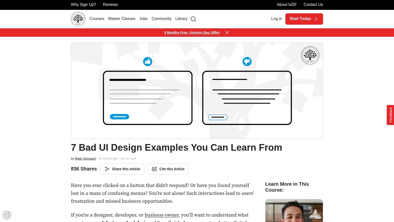
7 Poor User Interface Design Examples to Avoid in 2026
A new trial user signs up for your SaaS product with real intent. They want to import data, connect a tool, invite a teammate, or launch the first workflow. Within minutes, the interface starts making them work harder than the task should require. The import action sits behind an abstract icon. Settings behave one way in the left rail and another in the top menu. A save action gives no confirmation, so they click twice and create duplicate records.
Teams often dismiss these as minor UI flaws. Customers experience them as product risk.
Poor interface decisions do not stay inside Figma files or design critiques. They show up in support tickets, stalled onboarding, lower activation, abandoned trials, and harder renewals. In B2B products, that cost is even higher because one confusing workflow can block an admin, a buyer, and the rest of the team they planned to onboard.
I have seen teams treat this work as polish and defer it until after launch. That trade-off usually backfires. Cleaning up interface debt later means reworking product logic, retraining support, rewriting help docs, and explaining avoidable friction to customers who already expected the product to be easier to use.
This article looks at poor user interface design examples through an operational lens. The point is not to collect screenshots of bad choices. The point is to show how these patterns hurt conversion and retention, how to detect them early, and how to prevent them with repeatable checks, product metrics, and automation. That approach aligns closely with universal design principles that reduce avoidable friction across different user needs and contexts.
If you have already spotted similar issues on your own site or app, this related breakdown of 5 Common Website Design Mistakes And How To Avoid Them is worth reading too.
1. Example 1 Ambiguous Icons Without Text Labels
Abstract icons look efficient in design files. In a live product, they often fail the moment a new user lands in the interface.
This is common in admin panels, analytics products, and workflow builders. Teams replace clear labels like “Imports,” “Billing,” or “Team Access” with symbols that only make sense to the people who designed them. The result is hesitation. Users stop scanning and start decoding.
That’s especially risky on mobile and small laptop screens, where navigation space is already tight. Mobile UX mistakes make users five times more likely to quit tasks, according to the verified UX statistics compiled by Userpilot. If your navigation already asks users to interpret unlabeled icons, you’ve added another failure point before they even start the task.
Detection and mitigation playbook
The fastest way to catch this issue is to watch first-session recordings or moderated onboarding sessions. If users hover, click back, or open multiple menus before finding a primary action, the icon system isn’t helping.
Track:
- Navigation hesitation: Record where users pause before selecting a core destination.
- Misclick clusters: Check whether people repeatedly open the wrong menu from the same icon group.
- Time to first key action: Use activation events such as import completed, teammate invited, or integration connected.
Audit for:
- Primary actions without labels: If the icon controls revenue-critical workflows, pair it with text.
- Non-standard symbols: A custom metaphor might look clever and still fail basic recognition.
- Collapsed sidebars by default: Hiding all labels may reduce clutter, but it raises cognitive load.
One good standard is simple. Icons can support recognition. They shouldn't carry meaning alone. That principle aligns with broader universal design guidance and tends to age better as products add features.
Practical rule: If a new customer can’t correctly name what an icon does before clicking it, it needs a label.
Automation helps here. Run screenshot-based UI audits on production builds and flag navigation states where primary destinations appear as icon-only. Pair that with product analytics alerts when a core action’s discoverability drops after a redesign.
2. Example 2 Inconsistent Design Patterns
A product can be visually attractive and still feel unreliable. Inconsistent patterns are usually why.
You see this when one primary button is solid blue, another is outlined, and a third is text-only even though all three trigger important next steps. It also shows up when search behaves differently from page to page, or when modal footers move between left-aligned and right-aligned actions depending on which team shipped the feature.
Users don't describe this as “pattern inconsistency.” They say the product feels confusing.
Healthcare.gov’s 2013 launch remains a strong reminder of how damaging interface confusion can become when architecture and interaction design break down. The Interaction Design Foundation’s write-up on bad UX examples describes how flawed interface choices contributed to catastrophic enrollment failures and a costly recovery effort. Most SaaS products won’t fail that publicly, but the mechanism is the same. Inconsistent structures make users second-guess where to click, what happens next, and whether the system can be trusted.
Detection and mitigation playbook
Pattern inconsistency is one of the easiest issues to spot in a design audit and one of the hardest to control without process.
Check three layers:
- Visual consistency: Are buttons, form fields, tabs, and alerts using the same tokens and states?
- Behavioral consistency: Does the same action pattern behave the same way across modules?
- Language consistency: Do similar actions use the same wording, or does one area say “Archive” while another says “Deactivate”?
A practical audit method is to compare five high-traffic workflows side by side. Don’t review them as screens. Review them as systems of decisions. If similar tasks use different visual logic, users have to relearn the interface every time.
Consistency is speed. Every exception forces the user to think about the interface instead of the task.
Automation is useful here too. Design token linting, component usage checks, and screenshot regression testing can catch drift before release. The goal isn’t rigid sameness. The goal is predictable behavior. When a pattern changes, it should be deliberate, documented, and tied to a user need instead of a team preference.
3. Example 3 Hidden or Obscure Critical Navigation
Some navigation mistakes don’t hurt every session. They hurt the exact sessions that matter most.
Billing, exports, API keys, integrations, user permissions, audit logs, and security settings often get buried in avatar menus, nested drawers, or desktop hamburger menus. Teams do this to keep the interface “clean.” Customers experience it as friction at moments tied directly to expansion, retention, and trust.
Jira is a familiar example of what happens when complexity outgrows clarity. The Eleken article on bad UX examples describes Jira’s excessive feature density and cluttered navigation, including a dashboard with over 15 nested menus, 8 toolbar icons, and 20+ contextual panels. Whether or not your product is as complex, the lesson holds. If users need critical account functions, they shouldn’t have to hunt through layers of chrome to find them.
Detection and mitigation playbook
Look at support tickets and internal sales handoff notes. If customers ask where to find export, SSO, billing, or integration setup, the issue isn’t training. It’s navigation design.
Audit for:
- Critical pages hidden behind profile menus: Account-level settings often need stronger visibility than “personal preferences.”
- Desktop hamburger menus: They save space but often suppress discoverability for no good reason.
- Feature hierarchy mismatch: The most important tasks should appear where users expect them, not where the sitemap had room.
Track:
- Search usage for known destinations: Heavy use of search to locate obvious settings is often a red flag.
- Repeat support topics: “Where do I find…” questions usually map to hidden IA problems.
- Drop-off in setup flows: Integration and billing abandonment often starts with navigation friction.
A useful fix is to separate “frequent task navigation” from “account administration” without hiding either. Put revenue-critical destinations in the main shell if customers need them to evaluate, activate, or expand usage.
For prevention, use event-based alerts. If a key destination suddenly loses visits after a release, your analytics should flag it before support does.
4. Example 4 Poor Form Design and Vague Error Validation
A prospect gets through your demo flow, starts the trial form, fills in 12 fields, hits submit, and gets “Something went wrong.” That is not a minor UI issue. It is a conversion leak sitting at the point where intent is highest.
Poor form design usually looks ordinary in design review. Long stacks of unrelated fields, two-column layouts that break reading order, hidden formatting rules, missing input masks, and validation that appears only after submit. In production, those choices create retries, abandoned onboarding, duplicate entries, and support tickets that get logged as “bug reports” even when the underlying problem is clarity.
Mobile raises the cost. Baymard Institute’s research on mobile form usability guidelines shows how input type mismatches, tightly spaced controls, and weak error recovery increase entry errors and slow completion. For B2B and SaaS teams, that friction hits qualified leads, admin setup, procurement flows, and any configuration step tied to activation.
Detection and mitigation playbook
Test forms the way buyers and admins use them. Start with an empty state. Complete the flow on desktop and on a phone. Use realistic data, make common mistakes, refresh mid-flow, paste values in the wrong format, and tab through every field. Good forms reduce correction time. Bad ones turn users into QA.
Audit for:
- Validation that arrives too late: Show feedback at the field level, with clear rules before users commit the whole form.
- Error copy that hides the fix: Replace generic failure states with specific instructions tied to the field and rule that failed.
- Labels that disappear during input: Persistent labels beat placeholder-only patterns because users keep context while editing.
- Layout choices that break scanning: A single clear vertical path usually outperforms side-by-side fields unless the relationship is obvious, like city and postal code.
- Required fields with weak signaling: Mark requirements consistently and explain why you need sensitive or high-friction inputs.
Track:
- Field-level drop-off: Identify the exact field where completion rate drops or retries spike.
- Error rate by field and device: Mobile-specific failure patterns often point to keyboard, masking, or tap target problems.
- Time to complete: Rising completion time without a corresponding increase in data quality usually means the form is harder than it should be.
- Resubmission attempts: Multiple failed submits from the same session often indicate vague validation or missing recovery guidance.
- Support volume tied to onboarding, billing, or setup forms: These tickets often expose interface problems before analytics dashboards do.
A useful review standard is simple. Every error message should answer three questions: what failed, where it failed, and how to fix it.
If the form supports revenue-critical actions, treat it like a product funnel, not a static UI component. Teams looking at ways to increase conversion rates often focus on headlines and CTA color first. In SaaS, form friction is often the bigger loss because it shows up after intent is already established.
Automation helps prevent regressions. Add scripted checks for required-field messaging, inline validation states, input masking, mobile keyboard type, tab order, focus return after errors, and preservation of entered data after a failed submit. Those checks belong in release QA and design system governance, especially if multiple teams ship forms across the product.
5. Example 5 Misleading Call to Action and Confirmshaming

A buyer clicks “Continue” to review pricing. The next screen charges the card. They may complete the purchase once. They are far less likely to trust the product again.
This is the cost of misleading CTAs and confirmshaming. These patterns can raise a local conversion metric while hurting retention, support load, refunds, and expansion revenue. In B2B and SaaS products, the damage often spreads beyond one user because admins warn teammates, procurement gets cautious, and renewal conversations start from a trust deficit.
The pattern shows up in predictable places. Upgrade prompts hide billing consequences behind vague labels. Cancellation flows use guilt-heavy copy to make the exit feel irresponsible. Permission requests frame the safe choice as a mistake. Baymard Institute’s research on checkout usability has repeatedly shown that users abandon flows when interfaces create uncertainty around next steps and commitments, which is exactly what misleading CTA language does in higher-stakes moments.
Detection and mitigation playbook
Start with the click consequence. If the action changes billing, permissions, data access, account status, or contract terms, the label should say so plainly.
Audit for:
- Labels that hide the outcome: “Continue,” “Confirm,” or “Proceed” are weak choices when the action starts a trial, renews a plan, deletes records, or submits a purchase order.
- Uneven visual weight: A large primary button paired with a faint text link can push users into the wrong choice even when the copy is technically accurate.
- Confirmshaming language: Opt-out text such as “No thanks, I prefer losing leads” or “I don’t care about growth” signals manipulation.
- Missing policy context: Renewal timing, billing frequency, cancellation terms, and permission scope should appear before the click, not after it.
- Interruptive modal patterns: If a user chooses to cancel or decline, the interface can offer alternatives, but it should not obscure the original path.
Track:
- Refund requests and dispute reasons: These often expose misleading upgrade and checkout flows before a product team sees a dashboard trend.
- Cancellation completion rate: If many users start cancellation and then stall, review whether the flow is persuasive or obstructive.
- Support tickets tied to billing confusion: Look for phrases like “I didn’t realize,” “I thought this was a trial,” or “I couldn’t find the cancel option.”
- Backtracking and hesitation in session recordings: Repeated hovers, modal closes, and page revisits around pricing or account changes usually point to unclear consequences.
The design trade-off is real. Clear labels can reduce impulsive clicks. They also improve downstream quality. Teams get fewer accidental upgrades, fewer angry tickets, and cleaner intent signals for experimentation. That makes optimization work more credible over time.
For products with analytics-heavy admin experiences, the same principle applies to reporting and export actions. Good business intelligence dashboard examples make actions explicit so users know whether they are filtering a view, saving a report, or changing shared data for the whole team.
For healthier conversion work, the better path is relevance and clarity. If your team is focused on sustainable conversion gains, these ways to increase conversion rates are more durable than dark patterns.
Automation idea: route any copy or UI change attached to billing, cancellation, deletion, export, permission requests, or auto-renewal through a release check that requires UX, legal, and product approval. Add linting rules in the design system for banned confirmshaming phrases, and flag generic CTA labels on high-risk actions before they ship.
6. Example 6 Information Overload in Dashboards

Many B2B dashboards fail for a simple reason. They try to show everything instead of helping users decide what to do next.
I see this most often in analytics tools, ad platforms, RevOps products, and admin consoles. A single screen carries charts, tables, alerts, filters, benchmarks, and export controls without any hierarchy. It becomes a wall of data. New users feel lost. Experienced users build workarounds.
Jira’s feature density is a useful warning sign here too, not because every dashboard looks like Jira, but because clutter compounds. The same Eleken analysis noted that users reported spending 40% more time searching for functions in Jira compared with simpler tools. That’s what overloaded dashboards do. They shift effort from decision-making to interface navigation.
Detection and mitigation playbook
Don’t ask if the dashboard is exhaustive. Ask whether a user can identify priority, status, and next action within a few seconds.
Review each dashboard for:
- Clear hierarchy: Is there an obvious primary metric or task?
- Context: Do numbers explain what changed and whether action is needed?
- Progressive disclosure: Are advanced filters and low-frequency controls tucked away appropriately?
- Role fit: A sales leader, operations manager, and analyst probably shouldn’t all get the same default view.
Track:
- Interaction depth before first useful action: Too many clicks and filter changes often signal overload.
- Widget usage: If large blocks never get interacted with, they may be decorative noise.
- Export dependency: Frequent CSV exports can indicate users can’t work effectively in the interface itself.
A solid corrective move is to design dashboards around decisions, not data inventory. Show what matters now, then let users drill into detail. If you need inspiration, these business intelligence dashboard examples are a better model than the all-metrics-on-one-screen approach.
“If everything is visible, nothing is prioritized.”
For prevention, automate screenshot reviews for density spikes, enforce component caps per dashboard region, and require a documented primary user question for every new widget.
7. Example 7 Lack of System Feedback or Status
A customer clicks Save on a contract update in your SaaS app. The button does nothing visible for three seconds. They click again. Now you have duplicate submissions, a support ticket, and a customer who no longer trusts the product.
That is what missing system feedback looks like in practice. It rarely gets reported as a design issue first. It shows up as “sync is broken,” “the app froze,” or “your system lost my work.” In B2B products, that trust gap turns into slower operations, more manual checking, and higher support volume.
Jakob Nielsen’s usability guidance on visibility of system status has held up for years because the underlying behavior has not changed. Users need a quick, clear signal that the system received the action, is processing it, and finished successfully or failed with a reason.
Detection and mitigation playbook
Review feedback states anywhere the system takes an action on the user’s behalf, especially saves, imports, exports, approvals, syncs, report generation, and AI workflows.
Audit with this checklist:
- Immediate acknowledgment: Does the interface react within a moment of the click, tap, or submission?
- In-progress state: Do long-running tasks show loading, queue position, percent complete, or expected wait time?
- Outcome clarity: Does the product show success, partial success, or failure in plain language?
- State accuracy: Does the screen reflect the new saved state instead of leaving stale data visible?
- Recovery path: If something fails, is the next action obvious?
Track:
- Repeat clicks on the same control within a short window: Often a sign that the first action did not feel registered.
- Refreshes immediately after save or submit: A common trust check when users doubt the current state.
- Abandonment during long-running tasks: Users leave when progress is invisible or unreliable.
- Support tickets tagged “stuck,” “still processing,” or “didn’t save”: Useful leading indicators of feedback gaps.
- Duplicate records after submission: Sometimes a backend problem, often a UI feedback problem first.
The trade-off is speed versus reassurance. Teams often strip feedback states to keep interfaces visually clean or to ship faster. That choice usually creates downstream cost. A spinner on its own is cheap to build but weak for anything that takes real time. A better pattern is action-specific feedback: disable the button, show progress, update the affected record, and confirm the result where the user is already looking.
Automation should catch this before release. Add test cases that fail if async actions do not expose pending, success, and error states. Instrument repeat-click and refresh-after-action events in product analytics. In mature SaaS teams, I also recommend a status-state inventory in the design system so every new async component starts with feedback patterns instead of treating them as optional polish.
Comparison of 7 Poor UI Design Examples
| Example | Implementation Complexity | Resource Requirements | Expected Outcomes (Post-fix) | Ideal Use Cases | Key Advantages |
|---|---|---|---|---|---|
| Example 1: Ambiguous Icons Without Text Labels | Low–Moderate, add labels/adjust layout | Small design + front-end dev effort, basic usability testing | Improved discoverability, higher CTR, fewer support tickets | Primary navigation and frequent actions in SaaS dashboards | Reduced cognitive load; faster onboarding; clearer affordances |
| Example 2: Inconsistent Design Patterns | Moderate–High, build/enforce design system | Cross-team coordination, component library, visual regression tooling | Consistent UI, faster development, fewer regression bugs | Multi-team products or rapidly evolving interfaces | Predictability, reuse, stronger brand perception |
| Example 3: Hidden or Obscure Critical Navigation | Low–Moderate, reorganize nav and labeling | Product decisions, minor dev changes, analytics monitoring | Higher access to billing/features, increased conversions, fewer tickets | Billing, subscription management, upgrade flows | Greater visibility of revenue paths; reduced churn |
| Example 4: Poor Form Design and Vague Error Validation | Moderate, redesign forms and add inline validation | UX research, front-end validation logic, session replay tools | Higher completion rates, fewer errors, improved data quality | Signups, payments, critical data-collection forms | Lower abandonment; clearer user guidance; better conversions |
| Example 5: Misleading CTA and Confirmshaming | Low, revise copy and CTA treatment | Content review, marketing alignment, legal/compliance checks | Restored trust, improved long-term retention, fewer complaints | Consent dialogs, subscription/opt-in flows, modals | Ethical UX; regulatory safety; sustainable conversions |
| Example 6: Information Overload in Dashboards | Moderate–High, redesign with role-based views | Product research, analytics, dev for customizable dashboards | Higher engagement, actionable insights, fewer exports | B2B analytics dashboards, role-specific reporting | Focused insights; reduced cognitive strain; better decisions |
| Example 7: Lack of System Feedback or Status | Low–Moderate, add indicators and notifications | Dev changes, performance monitoring, UX patterns | Fewer duplicate actions, reduced support load, increased trust | Save/submit actions, long-running processes, background jobs | Improved visibility of system status; higher user confidence |
From Audit to Action Building a User-Centric UI
A familiar pattern plays out in growing SaaS products. The team ships fast, revenue looks healthy, and nobody notices the interface getting harder to use until support volume rises, onboarding slows, and customers start asking for training to complete tasks that should have been obvious.
Poor UI usually enters the product through small, defensible decisions. A rushed release skips the design system. Sales asks for one more exception for a large account. Marketing tests CTA copy that gets clicks but weakens trust. Product adds another dashboard card because an internal stakeholder wants visibility. None of those choices look serious in isolation. Together, they create friction that shows up in activation, expansion, and retention.
That is why an audit is only the starting point. Teams need an operating model that catches interface drift early and gives them a repeatable way to fix it. In practice, that means turning each issue in this article into a detection and mitigation playbook for your product.
Three systems usually make the difference:
- A design system with rules, not just components: Define hierarchy, interaction states, navigation behavior, form patterns, empty states, and UI copy standards. The goal is fewer one-off decisions.
- Behavior-based feedback loops: Review session recordings, tag support tickets by UX issue, watch onboarding calls, and track product events tied to confusion or drop-off. Design quality should be visible in operating metrics, not discussed only in critiques.
- Automated safeguards in delivery: Add screenshot diffs, accessibility scans, design token checks, regression tests, and release checklists. Good teams do not rely on memory to keep the UI consistent.
Accessibility belongs in the same workflow. WebAIM's Million report found widespread accessibility failures across homepages, which should concern any B2B team shipping interfaces that buyers, admins, and end users depend on every day. Their findings are worth reviewing in the WebAIM Million accessibility report. Accessibility problems are not edge cases. They affect task completion, procurement reviews, and the amount of support your team must provide after rollout.
Mobile deserves the same treatment. Even desktop-heavy B2B products get used on phones for approvals, status checks, alerts, and quick account actions. If those workflows break on smaller screens, users notice fast. This guide to 10 Mobile App Design Best Practices is a useful companion if mobile UX is part of your roadmap.
The practical next step is simple. For each problem area, define the signals that indicate failure, assign an owner, and decide what gets checked manually versus automatically. Track metrics such as form completion rate, error recovery rate, dashboard feature usage, CTA misclicks, repeated navigation loops, and duplicate submissions after slow saves. Pair those metrics with audit checklists and release gates so the team catches regressions before customers do.
Strong UI teams build products that are easy to learn, hard to misuse, and cheaper to support. That is the business case for user-centered design.
If your team needs more than an audit, MakeAutomation can help you build the systems behind better UX. That includes documentation, SOPs, workflow automation, QA safeguards, and AI-assisted operational processes that keep your interface consistent as the product grows. For B2B and SaaS teams, that often means the difference between fixing the same UI problems every quarter and preventing them in the first place.