

Boxes and Arrows Diagrams That Scale B2B Workflows
You can usually spot the problem before anyone says it out loud. One team says the lead goes to sales after enrichment, another says support has to approve first, and the ops lead has a spreadsheet with three different handoff rules depending on who built the process. The workflow exists, but nobody can explain it the same way twice.
That's where boxes and arrows earn their keep. Not as a pretty diagram, but as the one artifact that forces a team to agree on what each step is, who owns it, and what has to happen before the next move. In B2B operations, that shared grammar matters more than the drawing itself, because the diagram becomes the reference point for SOPs, automation rules, and the exception handling people always forget until something breaks. The historical appeal of box-based diagrams is the same reason they still work now, they compress a lot of structure into a form people can read quickly, whether the context is statistical exploration, economics, or workflow design, as the long history of box plots and box-based economic diagrams shows. John W. Tukey's box plot history and the Edgeworth box tradition in economics both point to the same practical advantage, a box can hold meaning when everyone agrees on the grammar.
Why B2B Teams Keep Drawing the Same Diagram
A SaaS founder usually notices the pattern in a messy handoff. Sales qualifies a trial, marketing says it belongs in nurture, success wants a kickoff call first, and the CRM reflects whichever person updated it last. Everyone is being reasonable from their own angle, but the workflow keeps mutating because the team never locked the rules into one visual contract.
The first useful boxes and arrows diagram is often not a flowchart in the glossy sense. It's a forcing function. Once the team puts the process on one page, gaps show up fast, like a step with no owner, a decision with no criterion, or a tool that appears in two places with different responsibilities. That's why this kind of diagram shows up early in automation work, before anyone starts building scenarios in Make, Zapier, or n8n. The point is alignment, not decoration.
What usually goes wrong in the room
A whiteboard session tends to reveal the same friction. One person draws the customer journey, another draws the internal approval path, and a third adds the CRM fields that only they understand. The picture looks complete, but it's three different grammars taped together.
Practical rule: if two people leave the meeting with different interpretations of the same arrow, the diagram isn't ready.
That's why practitioners treat the diagram as a decision artifact. The founder doesn't need a prettier slide. The team needs a single view that exposes who owns what, what the trigger is, and where the work hands off. Once that is clear, the SOP writes itself more easily, and the automation logic stops fighting the process.
What Boxes and Arrows Actually Mean
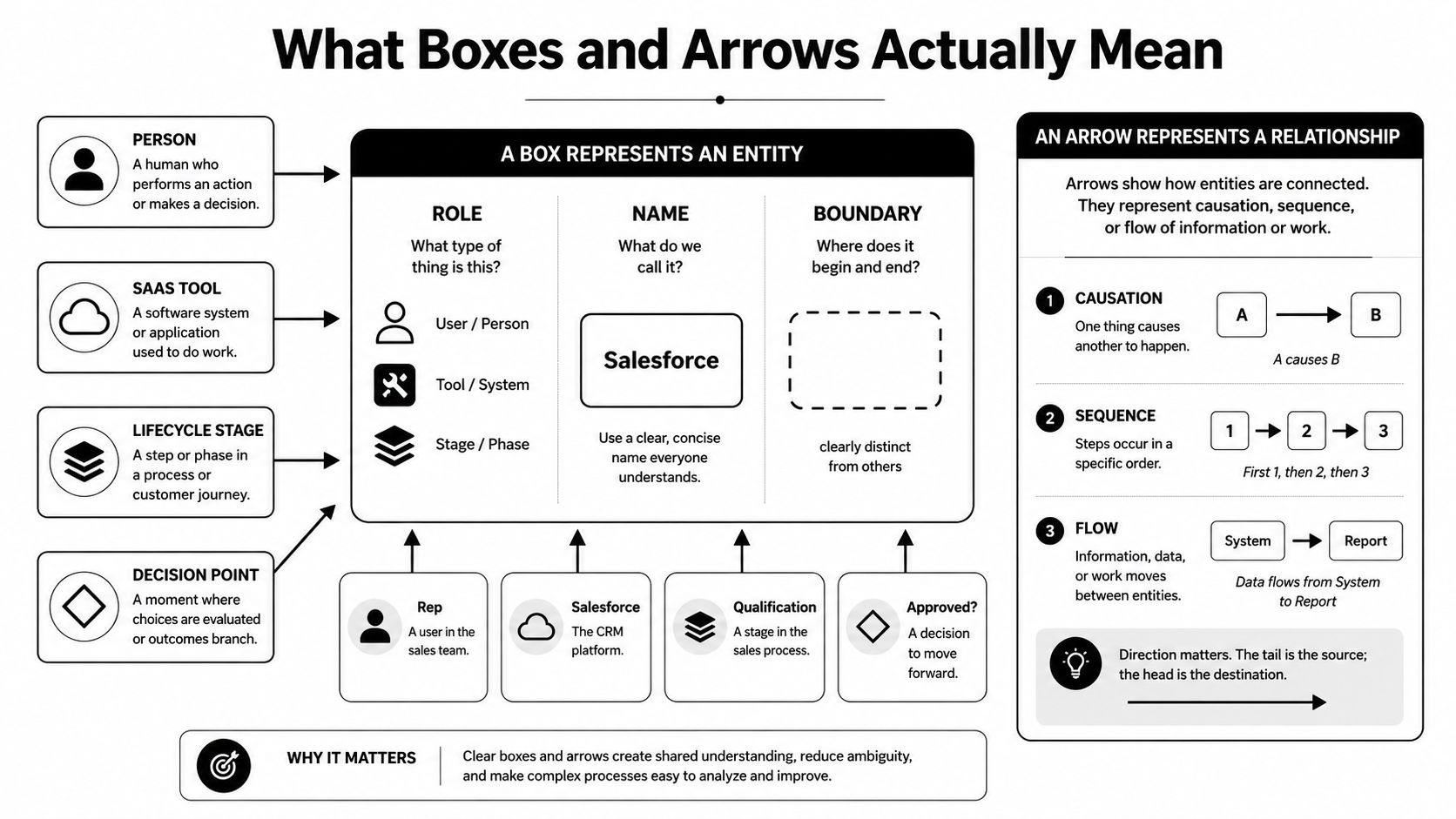
A box is not just a rectangle. It's a typed entity with a role, a name, and a boundary. In one workflow, a box might be a person, like an SDR. In another, it might be a SaaS tool, a lifecycle stage, or a decision point. The shape is only useful when the team agrees what kind of thing it represents.
An arrow is not just a line. It's a typed relationship. In business process work, that line might mean a handoff, a data flow, a dependency, a sequence, or an escalation. If nobody defines that meaning up front, the same diagram can look obvious to the builder and misleading to everyone else.
Use a sentence test before you draw
A fast way to check the grammar is to read the diagram like a sentence. Boxes are nouns, arrows are verbs. If the nouns are unclear, the sentence becomes word salad. If the verbs are vague, no one knows whether the line means “send data,” “wait for approval,” or “move to the next stage.”
In a simple B2B lead flow, that difference matters. “Salesforce” could be a box, but so could “lead qualification,” and those are not the same thing. A diagram that mixes them without labeling the role creates confusion later, because a tool, a stage, and a person all behave differently in automation.
The most reliable habit is to add a one-line legend every time. Define what a box means in this diagram, what an arrow means, and what type of exception is allowed. The goal is not artistic consistency, it's semantic consistency. If you want a practical starting point for building that discipline into your own mapping work, use the framework in MakeAutomation's business process mapping techniques guide as a companion reference.
A simple grammar for one workflow
Take inbound demo requests. If the box means “Lead record,” then the arrow to “qualification” must mean a specific transition, not a vague sense of progress. If the box means “HubSpot,” then the arrow should describe the dependency or integration path, not the business outcome itself.
That distinction keeps the team honest. It also keeps the automation builder from making assumptions the diagram never stated. A diagram that says exactly what each shape means can survive a handoff to ops, sales, and engineering without mutating into three different versions.
Where B2B and SaaS Teams Use Them
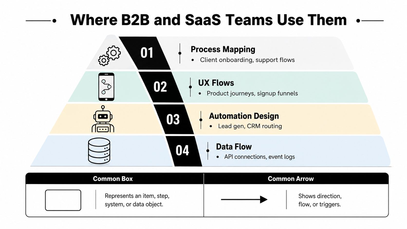
B2B and SaaS teams use boxes and arrows in four different jobs, and each job needs a different grammar. A client onboarding map tracks ownership and handoffs. A UX flow tracks screens and user decisions. An automation diagram tracks triggers, filters, and routing. A system architecture map tracks services, data, and dependencies. If you want a closer look at how to choose the right diagram for the job, our workflow visualization guide covers the practical differences.
Process mapping and support flows
This version matters first for ops teams that need clear handoffs. A client onboarding map can show contract signed, kickoff scheduled, account created, and implementation complete. The value is sequence, but the larger value is ownership. Each handoff should point to a named role or team so nobody argues later about who owned the next move.
Support flows use the same structure, but the work changes. A ticket enters, triage happens, severity gets assigned, and escalation triggers if the issue crosses a threshold. The arrows matter because they show how work leaves one queue and enters another. That makes the diagram useful for queue design, not just for documentation.
UX flows and signup journeys
Product teams use boxes and arrows to model a signup or activation path. The boxes can stand for screens, states, or decisions. The arrows show what happens when a user clicks, submits, or abandons the flow.
Trial-to-paid journeys often branch in ways the team needs to see before they ship. A user who completes setup follows a different path from a user who never activates. The diagram exposes friction points without dragging the CRM or support process into the same view.
Automation design and CRM routing
Automation work is where the diagram stops being explanatory and starts being operational. A lead arrives, enrichment runs, scoring evaluates fit, then routing sends the record to the right rep or nurture sequence. Each arrow can stand for a trigger, filter, or action in the tool.
Teams that run lead gen at scale need this clarity before they build. If the route from “new lead” to “AE assignment” is fuzzy on paper, the automation usually mirrors that confusion in production. The result is duplicate assignments, silent failures, or fallback rules nobody remembers creating. That is also why teams comparing intake logic with screening logic often separate sales routing from hiring workflows, as in Talent Pronto's resume screening insights.
System architecture and data flow
Architecture diagrams use the same primitives, but the boxes usually represent services, databases, or apps. The arrows show dependencies, API calls, event flows, or sync directions. That matters because a clean architecture map lets non-engineers see what changes if one system goes down or a field mapping changes.
The practical difference is scope. Process mapping describes how people work. Architecture mapping describes how systems behave. If the team merges them too early, the result looks detailed and reads badly, because one diagram is trying to explain two different kinds of motion.
From Diagram to SOP to Automation Rule
Once the diagram is stable, turn each box into one numbered SOP step. That keeps the written procedure tied to the same language the team already agreed on. A box named “Qualify lead” should become a step with the same name, not a vague paragraph buried in a document nobody opens.
Then turn each arrow into a rule. In a lead flow, the arrow from enrichment to qualification might become, “If firmographic data is incomplete, pause routing and flag the record.” The arrow from qualification to AE assignment might become a filter in Make, Zapier, or n8n, depending on the stack. A well-formed diagram makes those rules visible before you touch the tool.
The best automation teams also build a QA checklist from the same diagram. They test the handoffs that break most often, usually the spots where a field is missing, a person is out of office, or a status update arrives late. That's why diagramming is not separate from SOP writing, it's the blueprint for both.
The cleanest automations usually come from the ugliest first draft, because the draft exposes every ambiguous arrow before the platform does.
A useful example is lead intake. A record comes in, enrichment runs, qualification scores the lead, then the route branches. If the score crosses the agreed threshold, the record goes to the premium team. If it doesn't, the record enters nurture. The SOP documents each action in plain language, and the automation rule mirrors the same logic in the tool.
For teams reviewing talent workflows, Talent Pronto's resume screening insights are a good example of how a screening step can be expressed as a clear rule set before it gets automated. The same idea applies whether the object is a candidate, a lead, or a support ticket.
If you want the written part of the system to stay aligned with the visual part, anchor the procedure in MakeAutomation's SOP writing guide. The diagram should define the workflow, the SOP should name the steps, and the automation should enforce the rules.
Common Mistakes That Break the Diagram
The biggest mistake is using color as decoration. Teams add red, green, blue, and yellow until the diagram looks like a paint swatch, but the colors don't mean anything. That happens because people want the picture to feel clearer fast, and color feels like progress. The fix is simple, use color only when it carries a defined meaning, and write that meaning in the legend.
Skipping names is the second failure. A box labeled only with a shape or icon can look sleek, but nobody can tell whether it represents a tool, a role, or a stage. In meetings, that turns into ten minutes of “What does this one mean?” The fix is to name every box with a noun phrase that matches its role in the workflow.
Mixing abstraction levels is more damaging. A CEO, a database, a workflow stage, and a Slack alert should not sit in the same visual layer unless the diagram explicitly shows why. That mistake usually happens when someone tries to capture everything at once. The fix is to split the diagram by level, then use the right view for the question being answered.
Arrows also get overworked. One line should not mean sequence, dependency, data movement, and approval all at once. That kind of overload makes the diagram look complete while hiding the rule that matters. The fix is to assign one relationship type per arrow and label it if the meaning could be mistaken.
Three Starter Templates You Can Reuse
If you need a starting point, don't invent a new diagram type for every problem. Use one of three patterns and keep the grammar tight. Each one solves a different workflow problem, and each one is faster to interpret than a custom mashup.
| Template | Shape | Best For | Example Use |
|---|---|---|---|
| Linear SOP | One box per step, one arrow forward | Repeatable work with few exceptions | Client onboarding from signed deal to kickoff |
| Branching Decision | One entry, then yes/no or scored paths | Qualification and routing | Trial user goes to AE or nurture based on fit |
| Swim-Lane Handoff | Columns by role, arrows cross lanes | Accountability across teams | Marketing hands leads to SDR, SDR hands to AE |
Linear SOP
Use this when the process is stable and the sequence matters more than the decision points. Onboarding, invoice approval, and content publishing all fit here. The diagram should feel almost boring, because boring usually means the handoff logic is clear.
Branching decision
Use this when one input can split into different outcomes. Lead qualification is the obvious example, but so is support triage. The key is that the diagram needs a visible decision node, not a hidden rule buried in someone's head.
Swim-lane handoff
Use this when ownership matters more than the order of tasks. If a task moves between sales, operations, and finance, swim lanes make that movement explicit. They also reveal where work gets stuck because the lane boundary itself becomes the handoff point.
The quickest selection rule is this. If you're documenting sequence, use a linear SOP. If you're deciding outcomes, use a branching decision. If you're clarifying ownership, use a swim-lane map.
A Real Workflow From Sketch to Live Automation
A useful workflow usually starts on a whiteboard with six boxes. Trial signup comes in, the product activation event fires, enrichment checks the account, qualification scores fit, routing sends the lead to an AE or nurture track, and closed-won or recycle closes the loop. That sketch is not just a planning aid. It's the first version of the operating system.
The next artifact is a one-page SOP. Each box becomes one step, and each arrow becomes a condition or handoff. The language stays plain because the job of the SOP is to make the process executable by a person on the team, not just legible to management.
From there, the diagram turns into a Make scenario or a similar automation build. Each module gets a name that matches the box in the sketch, and each webhook or router mirrors the arrow logic. If the enrichment step fails, the workflow needs a fallback. If qualification passes, the CRM update and assignment happen immediately. If it doesn't, the nurture path takes over.
The final layer is the CRM rule set. Fields update in a consistent way, owners get assigned the same way every time, and the status values match the diagram instead of becoming a separate taxonomy. That consistency matters because it keeps reporting, routing, and handoffs tied to one canonical model.
Many teams finally see why the grammar-first approach pays off. The visual doesn't just explain the workflow, it constrains it. That makes the automation easier to maintain when the process changes, because the diagram already names the entities, the transitions, and the exceptions.
Making the Diagram the Source of Truth
A good diagram reduces dropped handoffs because every arrow has an owner. It speeds onboarding because new hires can read one map instead of chasing ten scattered docs. It also makes automation sturdier, because the rules were extracted from a workflow that already named the entities and relationships clearly. Before you approve the next diagram, check for five things, names on every box, labels on every arrow, one legend, one owner, and one SOP per diagram. The diagram is not the deliverable, the aligned team and the running automation are.
If you want this turned into a working workflow map, SOP set, and automation blueprint, MakeAutomation builds those systems for B2B and SaaS teams that need cleaner handoffs and less manual rework. Visit MakeAutomation to see how the same boxes-and-arrows logic can become a live operating process in your business.