

CSS Sticky Sidebar: A Modern Implementation Guide
You're probably here because the sidebar looked easy in a demo, then refused to stick once you dropped it into a real app shell.
That's normal. A CSS sticky sidebar is simple in isolation and surprisingly fragile in production. Grid alignment, parent overflow, fixed headers, viewport height, and responsive stacking all change the result. Most tutorials stop at position: sticky; top: 0; and skip the parts that break in a SaaS dashboard, admin panel, docs layout, or long-form settings page.
The good news is that sticky sidebars are still one of the cleanest ways to keep navigation, filters, help text, or action panels visible while the user works through long content. The trick is building them with the browser's rules instead of fighting them.
Why a Sticky Sidebar Still Matters in 2026
Long, dense interfaces haven't gone away. If anything, B2B and SaaS products keep adding more controls, more states, and more context. A persistent sidebar still solves a real problem. It keeps the user's local navigation, section index, filters, or summary actions visible without forcing repeated scroll jumps.
That matters most in places where people are trying to complete a task, not browse casually. Think onboarding checklists, pricing configurators, report builders, procurement forms, CMS editors, or knowledge base articles with deep nested sections. If the sidebar disappears, users lose orientation. If it stays visible, the interface feels more stable.
From JavaScript hacks to native CSS
Before position: sticky became standard, teams leaned on JavaScript plugins and position: fixed workarounds. Those approaches often pulled the sidebar out of normal layout flow, ignored parent boundaries, or needed scroll listeners that constantly manipulated the DOM. The result was heavier code and more edge cases.
Native sticky positioning changed that. According to Claire Parker-Jones's write-up on sticky sidebars, position: sticky was standardized in the CSS Positioning Module Level 3, reached near-universal browser support by 2018, and cut many implementations from dozens of lines of JavaScript to just three lines of CSS, including the Safari prefix.
Practical rule: If your sidebar behavior can be solved with native CSS, don't add scroll listeners just to recreate what the browser already does.
That shift wasn't only about cleaner syntax. It improved scroll performance because the browser can manage the sticking behavior without constant script-driven updates. For product teams, that means fewer moving parts in a layout component that appears all over the application.
Why teams still choose sticky over fixed
A fixed sidebar is always attached to the viewport. That sounds useful until it starts covering footers, modals, or content inside bounded layouts. Sticky behaves better because it respects the structure around it. It stays visible while the user scrolls through the relevant section, then stops when that section ends.
That's exactly what most SaaS interfaces need. The sidebar should assist the current workflow, not float above everything forever.
Use sticky when the content belongs to a section. Use fixed only when the UI is global.
The Pure CSS position sticky Method
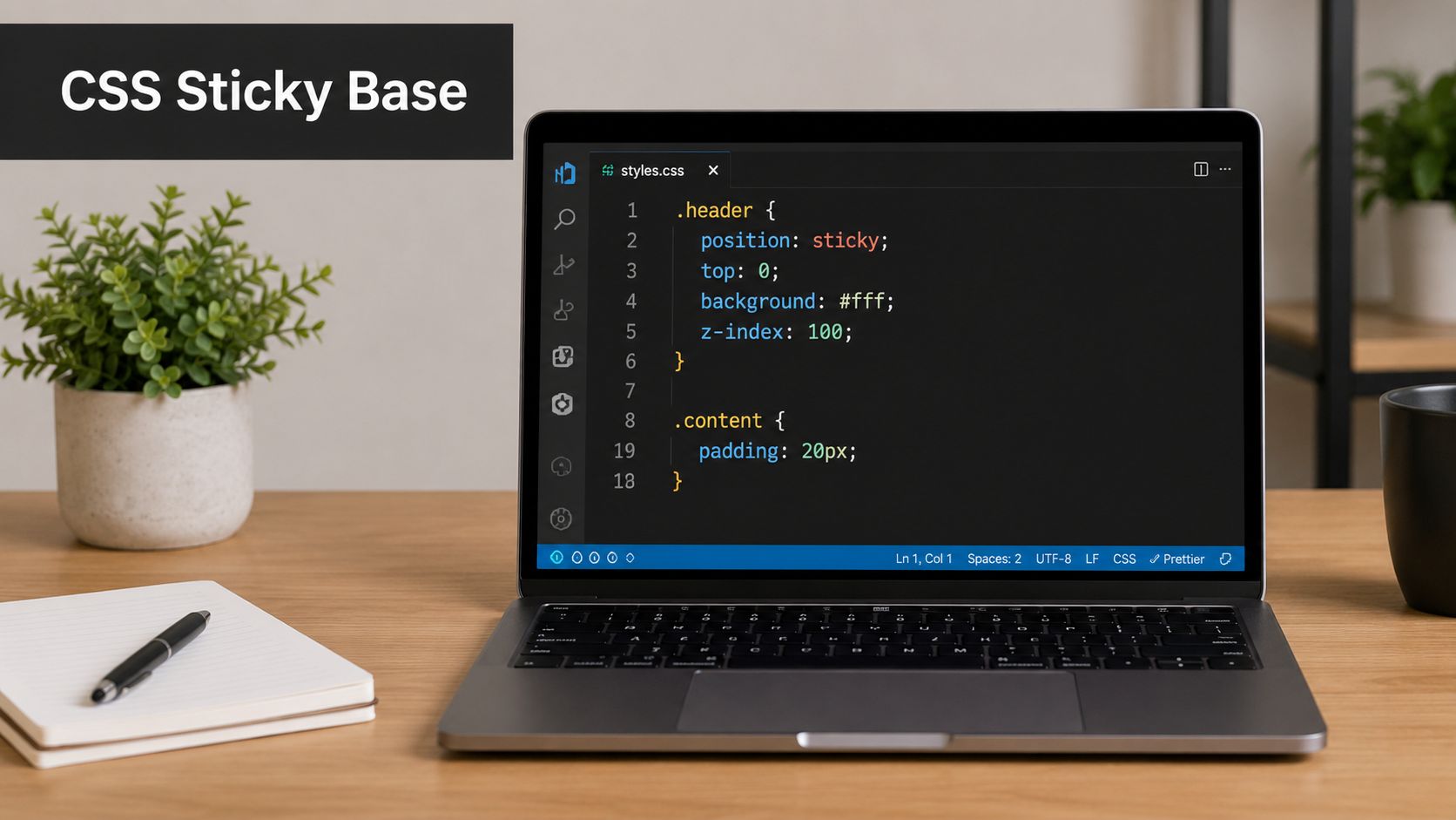
The smallest working version of a sticky sidebar is still the right place to start. Strip away frameworks, utility classes, and app-shell complexity. Make it work in plain HTML and CSS first.
<div class="layout">
  <aside class="sidebar">
    <nav class="sidebar-card">
      <a href="#overview">Overview</a>
      <a href="#billing">Billing</a>
      <a href="#users">Users</a>
      <a href="#security">Security</a>
    </nav>
  </aside>

  <main class="content">
    <section id="overview">...</section>
    <section id="billing">...</section>
    <section id="users">...</section>
    <section id="security">...</section>
  </main>
</div>
.layout {
  display: grid;
  grid-template-columns: 280px minmax(0, 1fr);
  gap: 2rem;
  align-items: start;
}

.sidebar-card {
  position: -webkit-sticky;
  position: sticky;
  top: 1.5rem;
}
That's the core. No JavaScript. No observers. No scroll math.
What actually makes it stick
Two properties matter first:
position: stickytells the browser the element should behave like a relatively positioned element until it reaches a scroll threshold.topactivates that threshold. Without a directional offset liketop: 0, sticky won't kick in.
The third part is the one that trips people up. The sticky element doesn't stick relative to the whole page in every situation. It sticks within the boundaries of its nearest scrollable ancestor. The Mimo glossary entry on position: sticky explains that sticky elements are constrained by the nearest scrollable ancestor and stop sticking when the user reaches the bottom of that parent container.
That's why your sidebar can feel “half-broken” when the CSS is technically valid. It's doing exactly what the browser was told to do.
Think of a sticky sidebar as moving inside a track. The parent container is the track. The sidebar can slide and stick inside it, but it can't leave it.
The parent container decides the rules
A few layout conditions matter immediately:
| Requirement | Why it matters |
|---|---|
A top value exists |
Sticky won't activate without an offset |
| The parent allows visible overflow | Clipping can stop sticky behavior |
| The layout aligns items at the start | Grid and Flexbox defaults can interfere with height and positioning |
In modern Grid and Flexbox layouts, align-items: start is often the missing property. Without it, the browser may stretch or align items in ways that keep the sidebar from behaving like a clean vertical column.
The mental model that prevents footer overlap
This is one of the best things about sticky. The sidebar doesn't keep floating over unrelated content forever. Once its parent container ends, the sticky behavior ends too. That built-in boundary prevents a table of contents, action rail, or help panel from overlapping the footer or the next layout region.
If you want a sidebar that remains visible only while the user is inside a specific content area, sticky gives you that behavior by default. Most developers spend time trying to force sticky to act fixed, when the bounded behavior is the feature, not the bug.
Integrating Sticky Sidebars in Modern Layouts
A sticky sidebar usually breaks after the layout gets real. The simple demo worked, then the app gained a route shell, a card wrapper, a tab panel, and a full-height dashboard container. Now the sidebar scrolls away, stretches to a strange height, or sticks inside the wrong box.
The fix is usually the layout model, not the sticky rule.
A grid pattern that holds up under real content
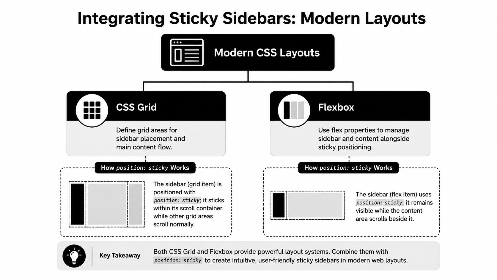
For SaaS dashboards, settings screens, and docs layouts, Grid is the safer default because it gives the sidebar its own track instead of asking flex items to negotiate space on the fly.
.app-layout {
  display: grid;
  grid-template-columns: 18rem minmax(0, 1fr);
  gap: 2rem;
  align-items: start;
}

.app-sidebar {
  position: sticky;
  top: 1.5rem;
}

.app-main {
  min-width: 0;
}
That minmax(0, 1fr) matters. Without it, long tables, code blocks, and wide charts can force the content column to overflow and make the whole layout feel broken. align-items: start matters too, because stretched grid items often produce the kind of sidebar height that fights sticky behavior instead of helping it.
I use this pattern when the sidebar width should stay predictable while the main column absorbs the messy parts of the UI.
Flexbox works if you control the sizing
Flexbox is still fine for a two-column layout. It just asks for tighter sizing rules, especially once content starts changing after load.
.app-layout {
  display: flex;
  gap: 2rem;
  align-items: flex-start;
}

.app-sidebar-wrap {
  flex: 0 0 18rem;
}

.app-sidebar {
  position: sticky;
  top: 1.5rem;
}

.app-main {
  flex: 1 1 auto;
  min-width: 0;
}
The common failure in Flexbox is a sidebar wrapper that is allowed to shrink, grow, or inherit a height you did not intend. That usually shows up after an accordion opens, a chart mounts, or an async panel changes the main column height. Grid makes those boundaries clearer. Flexbox can still work well, but it gives you more ways to create a layout bug by accident.
Full-height sidebars need a scroll strategy
Teams often want the sidebar to feel like a viewport panel, not a short box that happens to stick. In that case, set a max height or height based on the viewport and let the sidebar content scroll inside itself.
.app-sidebar {
  position: sticky;
  top: 1.5rem;
  height: calc(100vh - 3rem);
}
That pattern works well for long navigation trees, filters, and action rails. It also forces a design decision. If the sidebar can be taller than the viewport, decide whether the page should scroll, the sidebar should scroll, or both. Leaving that undefined is how you end up with hidden controls at smaller laptop heights.
Route shells and nested layouts affect sticky more than people expect
Sticky behavior gets more predictable when the same outer layout stays mounted across page changes. If your app rebuilds wrappers between views, the sticky container can reset, lose its scroll context, or pick up a new ancestor with clipping. That is one reason stable layout shells matter in React apps. A good React Router nested routes layout pattern helps keep the sidebar mounted in the same structural slot while child content changes.
Utility classes save time, but they do not fix layout mistakes
Framework helpers such as sticky-top are fine for basic offsets. They do not solve stretched grid items, clipped ancestors, or a sidebar placed inside the wrong wrapper. As noted earlier in the article's cited reference, Grid-based sticky sidebars tend to behave more consistently than loosely structured Flexbox layouts, and Bootstrap utility classes still depend on the surrounding container being set up correctly.
Use the helper class if you want. Still verify the track sizing, the alignment, and which element owns the sticky positioning context.
Debugging When Your Sidebar Refuses to Stick
You ship a two-column settings page. The sidebar looks fine in a static mockup, then refuses to stick once it sits inside the app shell. That usually comes down to a small set of layout mistakes, not a browser bug.
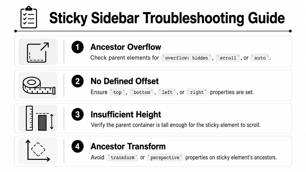
Start in DevTools, not in your CSS file. Select the sticky element, then walk up the ancestor chain until you find the element that owns scrolling, clipping, or sizing. In production layouts, sticky usually breaks for one of four reasons: the wrong scroll container, an ancestor with clipping, a missing offset, or a sidebar that has no room to behave like a sticky element.
Check overflow first
Ancestor overflow still causes the largest share of sticky failures. As noted earlier in the article's cited reference, sticky stops behaving as expected when an ancestor creates a new scroll or clipping context with overflow: hidden, auto, or scroll.
Symptom
The sidebar scrolls away like a normal block.
Cause
A wrapper such as .page, .content-shell, .tab-panel, or .card-body is clipping or scrolling.
Solution
Remove that overflow, or move the sticky element to a wrapper that is not clipped.
.bad-parent {
  overflow: hidden;
}

.good-parent {
  overflow: visible;
}
A fast test is to disable overflow on ancestors one by one in DevTools. The moment sticky starts working, you found the constraint.
Grid layouts make this easier to reason about because the sidebar and main content usually live in a clearer structural wrapper. If your team is standardizing these shell patterns across products, a design system layout approach for shared app shells helps keep sticky behavior consistent instead of fixing it page by page.
Verify the sticky contract
position: sticky needs a real offset and enough vertical space to move within its parent. If either part is missing, the browser is doing exactly what you asked, and the result still looks broken.
Check these four conditions:
- The sticky element has
top,bottom,left, orrightset. - The parent is tall enough for the sticky state to become visible.
- The sidebar is shorter than the space it needs to occupy.
- The element you expect to scroll is the one scrolling.
This last point trips up app layouts all the time. The page may look like the document is scrolling, but the actual scroll container is often an inner panel such as .app-main or .content.
The video below is a helpful visual walkthrough if you want to compare your setup against a working example.
Fixed headers create a second class of bugs
A sticky sidebar under a fixed header needs two things: the correct top offset and a deliberate stacking order. Repeating a guessed pixel value across breakpoints is how sidebars end up hiding under nav bars during real use.
Symptom
The sidebar sticks, but disappears under the header or looks cut off.
Causetop does not match the header height, or z-index is too low.
Solution
Store the header height in a custom property and update it when the header changes.
:root {
  --header-height: 72px;
}

.sidebar {
  position: sticky;
  top: var(--header-height);
  z-index: 20;
}
If the header gets taller on tablet or mobile, the offset has to change with it. This is also where short-height devices expose bad assumptions. Bruce & Eddy's guide to mobile optimization is useful background here because sticky failures often show up as a viewport and layout problem, not just a sidebar problem.
When the CSS is technically correct
Sometimes sticky is working and the layout still feels wrong. The parent may end too early. The sidebar may be taller than the viewport. A card inside the sidebar may contain enough controls that users cannot reach the bottom without a second scroll area.
When I debug these cases, I ask three direct questions:
- Which element is scrolling?
- Which ancestor is clipping?
- Where should the sticky boundary stop?
Answer those first. Then check sizing and offsets. That order saves time because it matches how sticky fails in modern Grid and Flexbox layouts.
Creating Responsive and Fallback Solutions
A sticky sidebar often looks fine in a desktop mockup, then turns into dead weight on a 13-inch laptop or a phone in a horizontal orientation. The fix is simple. Treat sticky as an enhancement you enable only when the layout has enough room.

Disable sticky on narrow layouts
For app shells and content-heavy SaaS screens, the safest mobile pattern is usually a single-column stack. Let the sidebar drop into the normal document flow and prioritize readable content over persistent side chrome.
.layout {
  display: grid;
  grid-template-columns: 20vw auto;
  gap: 2rem;
  align-items: start;
}

.sidebar {
  position: sticky;
  top: 1rem;
}

@media screen and (max-width: 768px) {
  .layout {
    grid-template-columns: 1fr;
  }

  .sidebar {
    position: static;
  }
}
That change removes a lot of edge-case behavior in one step. You avoid cramped columns, overlapping controls, and sidebars that consume half the viewport on small screens.
For mobile design beyond this one component, Bruce & Eddy's guide to mobile optimization is worth reviewing because it helps frame sticky behavior as part of a broader responsive strategy, not an isolated trick.
Account for short viewports, not just small widths
Width breakpoints catch only part of the problem. Sticky also breaks down on short viewports, especially when mobile browser chrome reduces the usable height or when the sidebar contains filters, form controls, or long secondary navigation.
A practical production rule is to enable sticky only when both width and height support it. That keeps the layout predictable on tablets, split-screen windows, and short laptop displays.
.layout {
  display: grid;
  grid-template-columns: 20vw auto;
  gap: 2rem;
  align-items: start;
}

@media screen and (min-height: 560px) and (min-width: 769px) {
  .sidebar {
    position: sticky;
    top: 1rem;
  }
}

@media screen and (max-width: 768px), screen and (max-height: 559px) {
  .layout {
    grid-template-columns: 1fr;
  }

  .sidebar {
    position: static;
    height: auto;
  }
}
I use this pattern a lot in dashboard layouts because it maps to how the UI fails. The issue usually is not CSS support. The issue is that the sticky area steals too much vertical space to stay usable.
If the sidebar content is still valuable on smaller screens, collapse it into an accordion, move actions into a top toolbar, or expose filters behind a button. Users still get the functionality without fighting a pinned column that was designed for desktop.
Fallbacks are mostly about behavior, not browser support
JavaScript polyfills are rarely worth the maintenance now. Native position: sticky support is broad enough that the better fallback is a clean non-sticky layout, not extra script.
Document that behavior at the component level. If your team ships reusable layout primitives, define when sticky is allowed, when it must turn off, and how the sidebar content reflows when it becomes static. That belongs in the same ruleset as spacing tokens, viewport thresholds, and grid templates. If you are standardizing these patterns across a product, building a design system is a good reference for turning one-off layout decisions into something your team can reuse consistently.
Advanced Tips for Performance and Accessibility
A sticky sidebar that merely “works” isn't finished. Production quality depends on what happens around the visual effect.
Keep performance boring
Sticky itself is efficient because the browser handles it natively. Don't cancel that advantage by piling on scroll listeners, resize handlers, or JavaScript that constantly recalculates element positions. In most apps, less code is the optimization.
Be careful with will-change. It can help in narrow cases, but it's not a default setting for sticky elements. If you add it everywhere, you can create more rendering overhead instead of less. Use it only after profiling, not as decoration.
A fast sticky sidebar is usually the one with the fewest moving parts.
Accessibility is part of the component
Sticky sidebars can create subtle usability problems if they interrupt reading order or trap attention. Keep the DOM order logical so screen readers encounter navigation and content in a sensible sequence. Make sure keyboard users can still move through the page without the sticky area becoming a repetitive obstacle.
A visible “skip to main content” link helps a lot in layouts with persistent side navigation. If you need a solid implementation reference, WebAbility.io's developer's guide to accessible skip links is a practical resource.
You should also test these basics:
- Keyboard flow: Tab through the sidebar and into the main content.
- Zoom behavior: Check whether the sticky panel crowds content at higher zoom levels.
- Landmarks and labels: Use semantic
aside,nav, and heading structure. - Reduced friction: Don't make secondary navigation more prominent than the task content.
If your team is formalizing these checks across products, accessibility needs to sit inside the delivery process, not at the QA tail end. This overview of web accessibility consulting is useful if you're turning ad hoc a11y fixes into a repeatable standard.
If your team needs help turning front-end patterns, design systems, AI workflows, and operational processes into something scalable, MakeAutomation helps B2B and SaaS companies document, automate, and optimize the systems behind growth.