

How to Build a Design System: A B2B SaaS Guide (2026)
A lot of teams realize they need a design system the same way they realize they have an operations problem. Release by release, the product gets harder to keep coherent. One squad ships a settings page with one spacing pattern. Another ships a dashboard with different form fields. Marketing launches a landing page for the same feature, but it feels like it belongs to another company.
Developers start rebuilding the same button in slightly different ways. Designers spend review cycles correcting avoidable inconsistency instead of solving product problems. Product managers feel the drag, but they usually describe it as slow delivery, design debt, or quality drift.
That situation isn't just a design issue. It's a scaling issue. And if you're running a growing B2B or SaaS product, it's often one of the first signs that the company has outgrown ad hoc UI decisions.
Your Scaling Problems Might Be a Design Problem
In a growing SaaS company, inconsistency rarely arrives as a dramatic failure. It shows up as friction. Teams debate padding values in pull requests. Support screenshots reveal three versions of the same interaction. New features take longer because nobody trusts the existing patterns enough to reuse them.
A design system solves that by creating a shared operational language for design and engineering. Nielsen Norman Group defines a design system as a set of standards that manage design at scale by reducing duplication while creating visual consistency across pages and channels, and that framing matters because it shifts the conversation away from aesthetics and toward repeatable delivery (Nielsen Norman Group on design systems).
The symptoms usually start outside design
It's uncommon for teams to declare, "We need a design system." They say:
- Engineering is rebuilding common UI because old components don't quite fit new use cases.
- Product reviews take too long because every screen introduces new patterns that need debate.
- Brand consistency slips when marketing, app, and sales enablement materials evolve separately.
- Onboarding gets harder because new designers and engineers have to learn unwritten rules.
This is also where people confuse UX and UI. If your team is still blending those concepts together, this DesignStack guide to UX vs UI is a useful refresher because it separates interaction design problems from visual interface consistency problems. You need both, but they aren't the same job.
A missing system also tends to expose old implementation choices. Teams call it front-end debt, but the pattern often looks a lot like a maintainability problem in the underlying product. If that sounds familiar, this explanation of what legacy code is gives a good lens for understanding why UI inconsistency becomes expensive over time.
A design system is infrastructure. If teams treat it like decoration, they'll never fund it correctly.
Why this matters for B2B and SaaS
B2B products live in complexity. Multiple roles, multiple surfaces, admin workflows, dense tables, permissions, integrations, settings, and edge states all put pressure on consistency. Without shared primitives, each team invents local solutions. That feels fast in the moment and expensive later.
A strong design system becomes a practical lever for automation and scale. It reduces repeated decisions, shortens handoff cycles, and gives teams a source of truth they can apply across product, marketing, and support-facing experiences. That's why the best systems don't just improve interface quality. They improve operating quality.
Laying the Strategic Foundation Before You Build
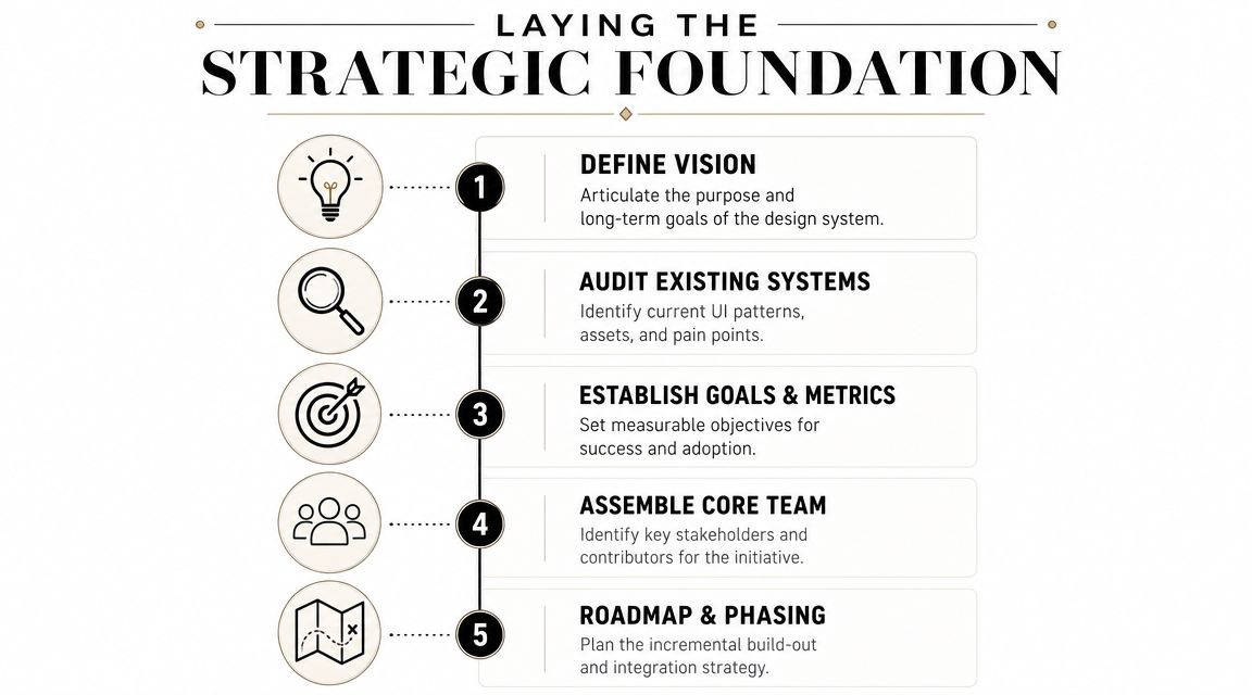
The fastest way to fail is to open Figma and start drawing components before you've defined the problem. Figma's own guidance is clear on this point. Teams should first answer why they want a design system, what specific problems it will solve, and how they will know it is successful (Figma design system guidance).
That advice sounds simple, but it's where most design system efforts go off track. Someone proposes "we need consistency," the team builds a component library, and six months later nobody can explain what business problem it fixed.
Start with an audit, not a library
Before you name a single token or publish a single component, audit the product. Not just the polished screens. Audit the complete product. Empty states, modals, validation messages, settings pages, dense data tables, permissions flows, and odd admin screens.
A useful audit usually includes:
Pattern inventory
Capture repeated UI elements such as buttons, inputs, badges, alerts, tabs, tables, cards, and navigation structures.Variant sprawl
Look for accidental duplication. Five button styles often exist because nobody defined when each one should be used.Code reality check
Compare what's in design files to what's shipping. The gap is often larger than people expect.Workflow pain points
Ask engineers, designers, QA, and product managers where they lose time. Those answers will shape your roadmap better than visual cleanup alone.
This audit gives you evidence. Leadership usually won't fund a design system because "the UI feels messy." They'll fund it when you show that teams are redoing work, shipping inconsistent experiences, and spending review time on problems that should already be solved.
Build a business case people outside design will support
A design system proposal gets traction when it's framed as an operating model, not a creative initiative. Leaders care about delivery speed, quality, predictability, and maintainability. Your business case should connect directly to those outcomes.
Use language like this:
- Reduced duplication across design and engineering
- Faster feature delivery through reuse
- Lower UI bug volume because common patterns are tested once and used many times
- Easier onboarding for new hires
- Stronger consistency across product and go-to-market surfaces
Nielsen Norman Group also points to the practical decision teams face early: adopt an existing system, adapt one, or build a proprietary system. The right choice depends on scale, replicability, and the resources and time you have, not the ambition in the kickoff deck. For many B2B SaaS teams, that's the first serious governance decision because it determines where effort should go and what not to build.
Define success before the work starts
If you don't define success up front, the system turns into an endless cleanup project. Good success criteria are operational. They tell you whether the system is changing behavior, not whether people said nice things about it.
Useful categories include:
- Adoption signals such as whether teams choose system components for new work
- Delivery signals such as whether shared UI work moves faster
- Quality signals such as fewer interface regressions and fewer style inconsistencies in review
- Governance signals such as whether contribution requests are getting handled predictably
Practical rule: If you can't explain how the design system changes product delivery, you haven't defined the problem well enough.
Treat the system like a product from day one
Even before the first release, the design system needs a rough product shape. It needs owners, a scope boundary, and a phased roadmap. It also needs explicit support from engineering leadership, because a design-only effort usually breaks when code and documentation drift apart.
That early framing matters more than the first components. Teams can recover from imperfect buttons. They rarely recover from unclear ownership.
Architecting Your System With Design Tokens
A SaaS team usually notices the cost of weak token architecture during a rebrand, an accessibility push, or the first enterprise customer who wants white-label support. What looked like a simple visual update turns into weeks of component edits because colors, spacing, and typography live inside the components themselves.
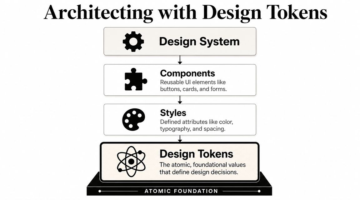
Design tokens prevent that failure mode. They store interface decisions as named values that design and code can both use, so the system can change without forcing teams to rewrite every screen.
Tokens are an operations tool, not just a design artifact
Teams often describe tokens as a consistency layer. That's true, but it undersells their value in a B2B product. Tokens create a contract between product design, engineering, QA, and any team responsible for branded experiences across plans, regions, or customer segments.
That contract matters when the company grows. A shared token layer lets one change flow through documentation, Figma libraries, frontend packages, and automated visual testing with far less manual cleanup. If you're funding the system through normal product delivery instead of a dedicated platform team, that reduction in repeated work is part of the business case. Teams like AppStarter web design services often frame this well in implementation work. The system pays for itself by reducing exceptions, review churn, and migration effort over time.
Start with the token sets that control the most screens
Early token architecture should stay small and stable. The goal is not to model every decision in the interface. The goal is to create a foundation that product teams can trust.
For most SaaS products, that means starting with:
- Color tokens for surfaces, text, borders, actions, and states
- Typography tokens for headings, body text, labels, captions, and dense data views
- Spacing tokens for layout rhythm, stack spacing, insets, and component padding
- Radius, shadow, and border tokens if those patterns repeat often enough to standardize
A token set earns its keep when it appears across many features and survives product changes.
Use semantic naming early
Raw values belong in a base layer. Product teams should consume semantic tokens.
blue-500 and gray-100 are fine as palette references. They break down once you add dark mode, tenant theming, or accessibility overrides. Semantic names hold up better because they describe intent instead of appearance.
Examples:
color.background.surfacecolor.text.secondarycolor.border.defaultcolor.action.primarycolor.feedback.error
The same rule applies to typography and spacing. font-size-14 says what the number is. type.body.sm says how it should be used. space-12 is harder to reason about than space.stack.md or space.inset.sm once the system grows and more contributors start touching it.
Build tokens in layers
A flat token file works for a small app. It gets messy fast.
A layered model is easier to maintain:
Base tokens
Raw primitives such as palette values, type scales, spacing steps, radius valuesSemantic tokens
Roles such as surface background, default border, primary action text, muted labelComponent tokens
Controlled overrides for a specific component, such as button padding or input border color
That structure gives you room to support theming and product variations without corrupting the foundation. It also makes governance easier because each layer answers a different question. Base tokens define the available materials. Semantic tokens define product meaning. Component tokens define implementation choices.
Keep the pipeline separate from the component library
This is a common architectural mistake. Teams put token values inside the same package as React components, then every token change becomes tied to component releases and framework decisions.
A cleaner setup looks like this:
- Design source in Figma variables or styles
- Token source of truth in JSON or a dedicated token repository
- Build step that transforms tokens into CSS variables, platform exports, or framework-specific formats
- Component packages that consume those outputs instead of owning them
That separation helps in three ways. It keeps tokens usable across marketing sites, admin tools, and product surfaces. It reduces coupling between styling decisions and component code. It also makes governance easier because design and engineering can review token changes independently from feature work.
Spacing exposes whether the system is real
Color gets the attention. Spacing reveals the discipline.
In many B2B interfaces, the consistency problem is not branding. It's density. Tables, forms, filters, side panels, and settings screens become inconsistent when each squad chooses its own padding and gap values. A constrained spacing scale solves a surprising amount of that mess.
Use a small set of values. Apply them to stack spacing, grid gaps, insets, and component padding. Then review exceptions aggressively. If every layout needs a special value, the system is absorbing product noise instead of reducing it.
A token should represent a repeatable decision. If a value only exists for one screen, it probably belongs in local code, not in the system.
Plan for governance before theming
The technical model is only half the work. The other half is deciding who can add, rename, deprecate, or remove tokens.
Without that control, teams create aliases that mean the same thing, old tokens linger in production, and migration work drags on for quarters. A simple governance model is enough to start:
- token changes require design and engineering review
- deprecated tokens stay documented until usage drops to zero
- new semantic tokens need a clear reuse case
- component teams can request additions, but the system owners decide naming and layer placement
This is one of the places where a part-time system team can still be effective. You do not need a large dedicated group to govern tokens. You need a small set of maintainers with authority, a review routine, and a rule that product delivery cannot bypass the foundation without a good reason.
Here's a useful primer before you go deeper into implementation:
Building Your First Component Set
A SaaS team usually feels the pain before they name it. One squad ships a new billing flow with custom form fields. Another adds a settings screen with a different spacing model and button behavior. Support starts logging avoidable usability issues. Engineering estimates creep up because every feature includes UI rework. That is the point where the first component set needs to do real operational work, not just tidy up the interface.
The first release should cover the parts product teams use every week and argue about every sprint. Start with the components that slow delivery, create accessibility risk, or produce inconsistent behavior across the app. In most B2B products, that means form controls, buttons, links, banners, tabs, dialogs, and table building blocks.

Prioritize by product pressure, not visual appeal
The best early components usually sit at the intersection of frequency, implementation cost, and cross-team inconsistency.
A practical shortlist looks like this:
Used everywhere and easy to standardize
Buttons, text inputs, labels, icons, helper text, badges, spacing and layout primitivesUsed often and expensive to rebuild repeatedly
Selects, dialogs, toasts, tabs, cards, alerts, empty statesValuable later, but costly too early
Date range pickers, data grids, advanced filters, permissions editors, chart wrappers
Teams often overinvest in high-visibility components because they look like system work. That creates a library that demos well and fails under production load. A solid button and field stack saves more time than an ambitious chart package that only one team can maintain.
For teams comparing what belongs in core UI work versus feature-specific design, this breakdown of AppStarter web design services is a useful reference. It reflects a real boundary many SaaS teams need to set. Shared interaction patterns belong in the system. Domain-specific workflows usually stay closer to the product.
Ship each component in three forms
A component is only usable when design, code, and guidance stay aligned. If one is missing, product squads fill the gap themselves, and drift starts again.
Design definition
The design source should represent real product states, not just the happy path. Include disabled, error, focus, loading, selected, destructive, and density or size variants you plan to support.
Keep the variant model tight. If a simple input has a dozen toggles, the problem is usually unresolved product rules, not missing component flexibility.
Production code
The coded component needs a stable API, predictable behavior, and enough abstraction to work across multiple flows without exposing internal implementation details. Accessibility should be built in, not left to the feature team to remember later.
For many SaaS teams, production-ready means:
- consistent prop naming across related components
- tests for interaction states and regressions
- support for common states without one-off overrides
- styling extension points that do not break internals
- clear ownership for bug fixes and API changes
If your frontend stack mixes frameworks or has legacy surfaces, plan that constraint early. In some environments, teams use ReactJS web components for shared UI across products to extend reuse without forcing every app into the same rendering setup. That approach adds packaging and testing overhead, so it only pays off when cross-product distribution is a real requirement.
Documentation
Documentation should answer the questions product squads ask under deadline pressure. When do I use this? Which variant fits this case? What accessibility behavior is already handled? What should I avoid overriding?
Good docs are usually short because the component itself is well designed.
What the first docs need to cover
A useful component page should include:
- purpose and recommended use cases
- variants and states with examples
- props, inputs, or configuration options
- accessibility behavior and team responsibilities
- do and don't examples
- related components and pattern-level guidance
If teams cannot tell when to use Button, Link, or Text Link Button in a table action cell, the system has added choice without reducing risk.
Build the surrounding patterns early
A component library without patterns still leaves product teams to solve the hard parts alone. In B2B software, the expensive design decisions often happen one level above the component.
Document the recurring flows that drive support volume, implementation inconsistency, or compliance risk:
- destructive action confirmation
- inline validation in long forms
- filter bars above dense tables
- settings pages with progressive disclosure
- permission assignment and review
- status communication for async jobs
- empty, loading, and error states for admin screens
This is also where governance meets delivery. A part-time system group can support pattern work by setting review rules for shared workflows, even if product squads still build many of the screens. That model works well in growing SaaS companies because it spreads implementation effort while keeping interaction decisions centralized enough to stay coherent.
Release through real product work
The first component set earns trust when it survives a live feature, a bug queue, and a few opinionated engineers. Put the initial components into a real roadmap project. Watch where teams override props, fork styles, or bypass the library. Those are not adoption failures by default. They usually expose missing states, weak APIs, or unclear governance.
Treat the first release like infrastructure. Fund it through the product work it speeds up, assign named maintainers from design and engineering, and measure success by reduced duplication, faster delivery, and fewer UI regressions. A small set that product squads use without hesitation is a better starting point than a large library nobody wants to touch.
Choosing Your Tooling and Documentation Stack
Tooling decisions get overcomplicated fast because teams compare software before they've defined workflow. The stack should support three functions: design authoring, component implementation, and documentation. If one of those is weak, the system drifts.
For most B2B SaaS teams, the practical question isn't "What's the best tool?" It's "Which toolchain helps design and engineering stay synchronized with the least friction?"
The core stack categories
A clean design system stack usually has one primary tool in each layer:
- Design tool for tokens, components, and patterns
- Development environment for building and testing reusable code components
- Documentation surface where standards, examples, and decisions live
Figma is the obvious center for design in many teams because it supports shared libraries and collaborative component work well. On the engineering side, Storybook is commonly the strongest fit because it lets teams isolate components, test states, and document usage in a way engineers will use. For docs, the right answer depends on who owns maintenance and how tightly you want code and content linked.
Design System Tooling Comparison (2026)
| Tool | Category | Best For | Key Consideration |
|---|---|---|---|
| Figma | Design | Shared component libraries, tokenized styles, collaborative design workflows | Needs disciplined library management to avoid drift |
| Storybook | Development | Isolated component development, visual review, implementation examples | Works best when teams commit to keeping stories current |
| Zeroheight | Documentation | Design-led teams that want polished documentation without building a custom docs site | Can create separation if code examples aren't maintained carefully |
| GitBook | Documentation | Process-heavy teams that need broader operational and governance documentation | Less tightly coupled to live component rendering |
| Custom docs site | Documentation | Teams with engineering capacity that want full control and tighter integration | Higher maintenance burden and stronger ownership requirements |
How the tools should connect
A good stack forms a loop, not a handoff chain.
Figma should define reusable patterns and tokenized styles. Storybook should express the coded components with realistic examples and usage states. Your docs layer should point to both the design intent and the implementation reality. If those become separate universes, adoption drops.
A practical workflow often looks like this:
- Design defines a component contract in Figma.
- Engineering implements the coded component in a shared library.
- Storybook becomes the working sandbox for states, examples, and edge cases.
- Documentation captures rules and rationale so teams understand decisions, not just APIs.
Pick tools your team will maintain. The most elegant stack fails if updating it feels like side work nobody owns.
What to optimize for in a SaaS environment
Growth-stage SaaS teams should optimize for maintainability over novelty. That usually means preferring tools that fit existing front-end practices and reduce translation between design and code.
Useful decision criteria include:
- Can engineers test and inspect components in isolation?
- Can designers publish updates without creating hidden divergence?
- Can docs stay close to live implementation?
- Can product squads discover approved patterns quickly?
- Can the stack support multiple products or surfaces if the company expands?
If your implementation side uses component-based front ends, it also helps to understand where reusable system components sit relative to broader front-end architecture. This overview of ReactJS web components is a useful reference for thinking through how component reuse works in practice, especially when your product spans multiple teams and code ownership boundaries.
Don't let documentation become a sidecar
The weakest stack pattern is treating docs as a publishing layer that gets updated at the end. Documentation should be part of the work definition for every component and pattern. If the coded component changes, docs should change with it. If design intent changes, examples should be revised immediately.
That usually pushes teams toward one of two realities. Either documentation is tightly coupled to component development, or someone explicitly owns doc maintenance as part of governance. Anything in between decays fast.
Driving Adoption, Migration, and Governance
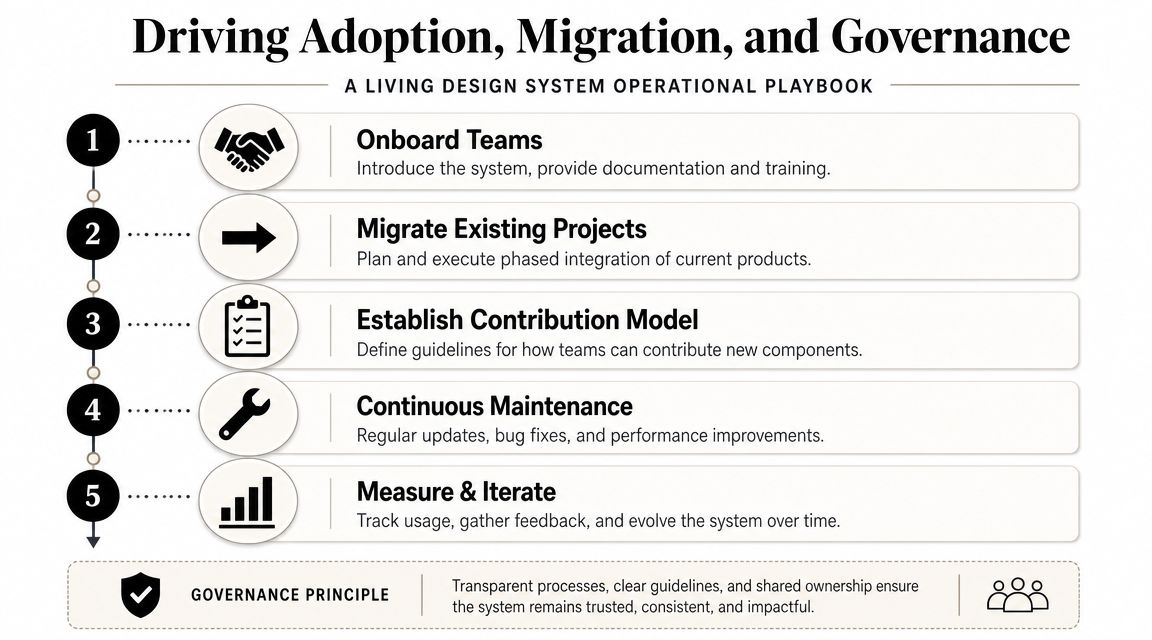
A design system can be well designed, well coded, and still fail. Failure usually happens after launch, when the organization treats the system like a completed deliverable instead of a living operating asset.
That's why governance matters as much as architecture. The hard part of how to build a design system isn't only creating tokens and components. It's creating a process that keeps people using, improving, and funding them.
Adoption starts with reducing uncertainty
Teams don't adopt systems because leadership announced them. They adopt them when using the system feels easier and safer than building from scratch.
That means rollout needs real support:
Launch with opinionated guidance
Show teams what to use for common scenarios instead of giving them a giant library and hoping for the best.Provide migration help
Engineers need examples, references, and decision rules. Designers need reviewed patterns and starter files.Run office hours or design reviews
A live feedback channel speeds adoption because teams can ask, "Should I extend this component or request a new one?"Make discovery easy
If teams can't find the right component or pattern quickly, they'll invent a new one.
Migrate forward first
The most expensive migration plan is a full retrofit mandate. It creates a lot of noise, consumes roadmap time, and often triggers resentment from product teams who see little immediate benefit.
A better strategy is usually:
- Use the system for new features first
- Refactor high-change areas second
- Leave stable legacy areas alone until there's a product reason to touch them
That approach works because migration becomes part of delivery, not a separate rewrite initiative. It also lets the system mature against real product demands before you force it across the whole application.
Governance gets easier when teams see the system helping current work, not blocking it.
Build a contribution model people can follow
A design system team doesn't have to be large, and some companies don't have a dedicated design system team at all. UX Planet's case study on building without one describes a model that required consensus building, Jira-based intake, design critique, usability testing, documentation, and repeated executive and product buy-in. It also describes using product initiatives to reserve time for design-system work so it doesn't get pushed behind roadmap delivery (UX Planet on building without a dedicated team).
That's one of the most practical lessons for B2B SaaS teams. Funding and staffing are not solved at launch. They are solved repeatedly through planning, intake, and prioritization.
A lightweight governance model that works
If you don't have a central team, use a federated model with clear authority. That usually means a small core group owns standards and release decisions, while product squads can propose contributions.
A workable governance model often includes:
| Governance area | Minimum standard |
|---|---|
| Intake | New component or change requests go through a shared backlog |
| Review | Design and engineering review requests together |
| Approval | A small core group decides whether to add, reject, or reshape proposals |
| Release | Changes ship on a predictable cadence with notes |
| Maintenance | Deprecated patterns are documented and phased out deliberately |
Define contribution criteria up front
Not every repeated piece of UI deserves a system component. Teams need a filter.
Use questions like:
- Is this pattern repeated across more than one product area?
- Does standardizing it reduce decisions or bugs?
- Can it be generalized without becoming vague or over-configurable?
- Will maintaining it centrally be cheaper than local duplication?
Design feedback loops are essential. If your organization needs a better process for structured critique and iteration, a practical guide on feedback on design can help tighten the review side of governance so component decisions don't become subjective debates.
Reserve capacity or the system will starve
This is the part leaders underestimate. If design-system work only happens when spare time appears, it won't survive roadmap pressure. Teams need planned capacity. Sometimes that comes through a dedicated squad. Often, especially in growth-stage companies, it comes from allocating time inside product initiatives.
A simple operating model can work:
- Product teams contribute fixes and requests as part of active feature work
- A rotating core group reviews and curates contributions
- Quarterly planning explicitly includes design system debt, upgrades, and documentation work
Indeed's design team also frames a design system as something maintained through endless releases, periodic maintenance, and cross-functional contribution, not a one-time build. That's the right mental model. Systems stay healthy when maintenance is normal work, not rescue work.
Your Design System Is a Product Not a Project
The companies that get value from design systems don't treat them like a one-off cleanup effort. They treat them like products with users, priorities, maintenance, and trade-offs.
That mindset changes everything. Strategy comes before components. Tokens come before visual sprawl. Documentation ships with implementation. Governance keeps the system useful after the initial enthusiasm fades.
For B2B and SaaS teams, this matters beyond interface consistency. A strong system supports scalable delivery. It lowers repeated effort, creates clearer handoffs, and gives the company a more stable foundation for product growth. That's especially important if your roadmap depends on expansion, multiple surfaces, or a stronger self-serve motion. If that's on your horizon, this guide to your 2026 PLG strategy is a useful companion because product-led growth gets harder when the experience feels fragmented.
Start smaller than you want. Make the first version usable. Build the operating model early. Then keep shipping.
If you're trying to scale a B2B or SaaS product without adding more manual process, MakeAutomation can help you design the operating layer around systems like this, from workflow documentation and cross-team process design to AI automation, CRM automation, SOPs, and scalable implementation support.