
Feedback on Design: A B2B & SaaS Automation Framework
Teams often don't have a design feedback problem. They have a workflow problem that shows up during design reviews.
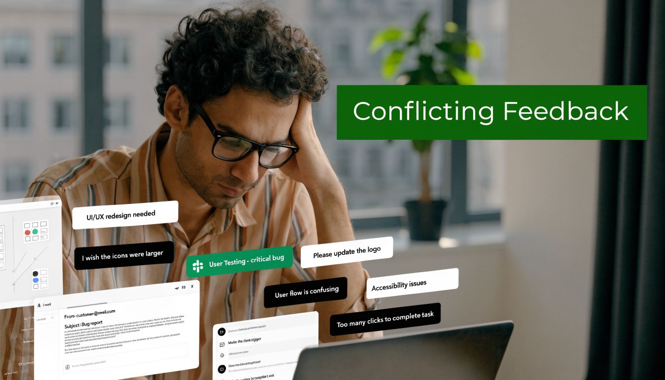
It usually looks the same. A founder drops comments in Slack. Sales adds screenshots from a prospect call. A customer success manager forwards an email from an unhappy account. Someone in product leaves a Figma comment with no context. The designer gets six versions of "this feels off," then a week later engineering asks which comments are real requirements and which were just opinions.
That mess slows launches, creates rework, and hides real UX issues until customers feel them. Worse, many customers won't tell you what went wrong. 91% of unhappy customers leave without providing feedback, and companies that align user feedback with business goals see a 15 to 25% increase in customer satisfaction, according to VWO's roundup of usability testing statistics. If your design feedback loop is loose, you're not just collecting comments badly. You're operating blind.
I've seen teams spend more energy managing feedback than improving the product. The fix isn't "ask for better comments." The fix is to treat feedback on design like any other operational system. It needs inputs, ownership, routing rules, prioritization, and a closed loop. The same discipline you'd apply to lead routing or project delivery belongs here too, especially if you've already felt the cost of poor user interface design examples in real products.
Why Your Design Feedback Process Is Broken
The process usually breaks long before anyone opens Figma.
A team starts with good intentions. They want collaboration. They want stakeholders involved. They want customers heard. Then they create a wide-open comment environment with no review goal, no decision-maker, and no rule for what counts as actionable feedback. The result is predictable. Designers get taste-based reactions mixed with usability problems, revenue concerns, and engineering constraints in one pile.
Feedback chaos is an operations failure
When feedback lives across Slack, email, calls, and comment threads, nobody knows which input matters. Teams then compensate with more meetings. That creates a second failure. Reviewers start reacting to each other instead of reacting to the design against a defined objective.
What breaks in practice:
- No review objective: People comment on everything because nobody defined what this round is for.
- No reviewer roles: Advisors act like approvers, and approvers act like end users.
- No intake standard: Useful observations and random preferences arrive in the same format.
- No routing logic: Bugs, UX issues, brand concerns, and strategic requests all go to the same place.
- No closure: Stakeholders don't hear what changed, so they repeat the same feedback next round.
Practical rule: If feedback can't be tied to a business goal, user task, system constraint, or brand requirement, it shouldn't enter the queue as a decision-driving input.
Unstructured feedback creates hidden risk
Poor design doesn't only hurt aesthetics. It damages conversion, trust, and retention. In B2B SaaS, a confusing onboarding screen can create support load. A weak form flow can hurt demo requests. A misaligned dashboard can raise churn risk among high-value accounts.
This is why feedback on design has to move out of the "creative review" bucket and into the operating model. Once you see it that way, the goal changes. You're no longer trying to get more comments. You're trying to build a system that gets the right comments, at the right moment, from the right people, then turns them into decisions without dragging the team into committee mode.
What doesn't work
I've watched teams try to fix this with softer language and nicer meetings. That helps the tone. It doesn't fix throughput.
What doesn't work:
| Approach | Why it fails |
|---|---|
| Open-ended review requests | Reviewers fill the vacuum with personal taste |
| Large approval groups | Nobody knows who has final authority |
| End-of-project feedback only | Problems surface after too many downstream decisions depend on them |
| Private side-channel comments | Designers lose context and accountability |
| One giant revision batch | Teams mix critical issues with cosmetic preferences |
The teams that get this under control treat design feedback as a managed pipeline. That's where the real improvement starts.
Build Your Feedback Foundation Before You Ask
Most feedback quality problems come from a setup problem, not a reviewer problem.
Teams ask for input before they define what they're validating. That leaves reviewers to invent their own criteria. In B2B and SaaS environments, that gets expensive fast because design choices often affect forms, onboarding flows, handoffs to CRM, and system behavior. Current design feedback guidance still doesn't give teams much structure for these automation-heavy environments, especially where design decisions affect workflows, funnels, and integrations, as noted in this review of the gap in automation-driven design feedback frameworks.
Start with a review brief, not a mockup
Before a single stakeholder comments, create a short review brief. One page is enough. The point is to give every reviewer the same frame.
A useful review brief includes:
- Business objective: What outcome should this design support? Demo bookings, activation, expansion, ticket deflection, faster handoff, or something else.
- User segment: New leads, trial users, admins, buyers, procurement, internal ops.
- Review scope: What should reviewers comment on in this round, and what is off-limits.
- Decision owner: One person has final call. Others advise.
- Constraints: Brand rules, technical limitations, legal requirements, accessibility needs, automation dependencies.
If the page says "homepage redesign," that's too broad. If it says "validate whether the hero and CTA hierarchy clearly support qualified demo bookings from mid-market buyers," reviewers know what to look for.
Match feedback type to design stage
A lot of useless feedback isn't wrong. It's early or late.
When someone gives polish feedback on a rough wireframe, they distract the team from structural issues. When someone raises a workflow dependency after visual approval, they force rework. Feedback on design should be staged.
Use this simple mapping:
| Design stage | Best feedback type | Avoid |
|---|---|---|
| Early concept | Problem framing, user flow, content hierarchy | Visual polish comments |
| Mid-fidelity | Usability, interaction clarity, edge cases | Brand micro-adjustments |
| Late-stage review | Accessibility checks, consistency, implementation readiness | Big conceptual changes |
| Post-release | Real usage friction, support patterns, adoption blockers | Re-litigating already approved preferences |
This one change cuts noise immediately. It also protects your team from the common "why are we debating button shades when the workflow still confuses users?" problem.
Define who gets to say what
Not every reviewer should have the same type of vote. That's where teams get trapped in design by committee.
I use three roles:
Decider
This person resolves trade-offs. Usually a product lead, founder, or functional owner. There should be one.Advisor
Advisors bring domain constraints. Sales can flag objection friction. Success can flag onboarding confusion. Engineering can flag implementation risk. They don't all need approval power.End-user signal source
This isn't one person. It's evidence from calls, support tickets, usability sessions, or customer-facing teams. Treat it as structured input, not a live free-for-all in the review meeting.
One decider creates speed. Many advisors create coverage. Mixing those roles creates delay.
Build categories before comments arrive
Teams often wait until after collection to organize feedback. That's backwards.
Create categories in advance so every comment lands in a usable bucket. A basic taxonomy works well:
- Usability issue
- Conversion risk
- Technical constraint
- Accessibility concern
- Brand alignment
- Content clarity
- New idea for later
The same sentence can mean different things. "This page feels heavy" might be a content clarity issue, a visual density issue, or a performance concern. Categories force the reviewer or the review owner to translate reactions into operationally useful labels.
For teams building a stronger process, it's worth keeping a shared resource library that aligns design decisions with operating constraints. That's where a practical bank of user experience design resources helps, especially when new reviewers need a common standard.
Set entry rules for every feedback round
I don't allow a new review round to open unless these questions are answered:
- What exact decision are we trying to make?
- Who is the decider?
- Which reviewer groups are in scope?
- What types of comments are allowed in this round?
- Where must all comments be submitted?
That last one matters more than teams think. A clean foundation isn't glamorous, but it's what makes the rest of the system run.
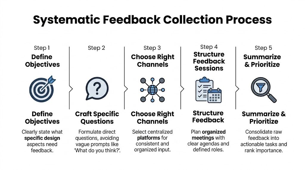
Systematically Request and Collect Feedback
Once the foundation is set, the next failure point is collection.
Many teams ask for feedback with one lazy prompt: "What do you think?" That question guarantees vague answers. It invites taste, not analysis. If you want useful feedback on design, your request has to shape the response before the reviewer types a word.
A stricter collection system isn't optional when a typical engineering team loses track of 42.8% of all design feedback generated during reviews, according to the source summarized from this design feedback discussion. If almost half the signal disappears, better collection isn't admin work. It's loss prevention.
Use prompts that force specificity
The fastest way to improve feedback quality is to ban generic prompts.
Replace "thoughts?" with prompts tied to goals, users, and constraints. Good prompts create narrow lanes. Reviewers then respond with observations you can route and act on.
Examples that work:
- For homepage review: "Does the page make it clear who this is for and what action we want qualified buyers to take?"
- For onboarding flow: "Where would a first-time admin hesitate, based on what you know from customer conversations?"
- For form design: "Is there any field, label, or step likely to reduce completion by creating confusion or unnecessary effort?"
- For internal dashboard UI: "What would make this faster to scan for a busy operator handling repeated tasks?"
Copy and paste templates for async requests
Here are the templates I use most.
Slack template
Reviewing: [asset/link]
Goal of this round: [single decision]
Audience: [user segment]
Please comment only on: [scope]
Please do not comment on: [out-of-scope items]
Leave feedback in this format:
- Observation
- Why it matters
- Suggested change or question
Deadline: [date/time]
Decider: [name]
Email template
Subject: Review request for [design name]
I'm requesting feedback on this design for one purpose: [goal].
Intended user: [audience]
Current stage: [concept, mid-fidelity, final QA]
Comment on: [specific areas]
Ignore for now: [specific areas]Please structure feedback as:
- What you noticed
- What user or business outcome it affects
- Whether it is critical now, useful later, or preference only
Submit feedback in [tool/location] by [deadline].
Final decision owner: [name]
These templates do two things. They reduce ambiguity, and they make later triage much easier because people are already pre-labeling intent.
Run live reviews with a script
Live reviews are useful when the design touches multiple teams or the issue is contentious. They're a disaster when they're treated as open brainstorming.
My rule is simple. Live reviews are for clarifying decision-quality input, not generating endless reaction loops.
Use this script:
Open with the decision
"Today's review is focused on whether this flow supports trial activation for admin users."Restate constraints
"Engineering has flagged implementation limits. Brand is not under review today."Walk the user path
Review the design in sequence instead of jumping around screen by screen.Capture comments in one place
A PM, designer, or ops lead logs every meaningful comment into the system of record during the call.Separate questions from decisions
If a point needs validation, mark it for follow-up. Don't force a decision in confusion.Close with owner and next action
Every unresolved item gets a name and a next step.
The meeting should end with fewer open loops than it started with. If it ends with more, the review wasn't managed.
Make asynchronous review easier than side-channel review
Distributed teams need async review. The problem is that async review often strips away context. Someone watches a Loom later, leaves a short comment, and assumes everyone interprets it the same way. They won't.
A better async setup includes:
- A recorded walkthrough with spoken context from the designer or product owner
- Frame-level comments inside Figma or the system used for review
- A fixed comment format so feedback isn't just "feels wrong"
- A deadline and review owner so comments don't drift for days
- A single source of truth where every approved item gets logged
If your team uses Figma, Loom, Slack, Jira, Asana, ClickUp, or Linear, the principle is the same. Comments can start in different tools, but they must end in one governed place. Otherwise your team will keep debating comments that nobody can trace.
Collect evidence, not just opinions
The strongest design feedback is grounded in observed behavior, support pain, or user friction reported by customer-facing teams. Opinion still matters, but it shouldn't dominate.
A review packet gets better when it includes:
- Support examples tied to the screen or workflow
- Sales objections that show where buyers get confused
- Customer success notes from onboarding friction
- Session clips or heatmap observations if your team uses behavioral tools
- Implementation notes from engineering before final visual sign-off
That turns collection from an opinion harvest into an evidence-gathering process.
Analyze Feedback and Prioritize What Matters
After collection, teams often create a new problem. They treat every comment as equally important.
That's how you end up redesigning around the loudest person instead of the most important issue. Feedback on design only becomes useful when raw comments are converted into categories, weighed against business goals, and translated into decisions.
Sort raw comments into four buckets
I use four primary buckets before I prioritize anything:
| Bucket | What belongs here | What to do next |
|---|---|---|
| Usability issue | Confusion, friction, unclear steps, task failure risk | Validate severity and user impact |
| Bug or implementation mismatch | Broken behavior, missing state, inaccurate design-to-build output | Route to engineering or QA quickly |
| New idea | Valuable suggestion that is not required for current objective | Move to backlog, don't derail current cycle |
| Subjective opinion | Taste-based reaction without clear business or user rationale | Challenge or deprioritize unless tied to a standard |
A lot of noise dies, which is healthy. Not every comment deserves a task. Some deserve a question back. Some deserve a "not in this round."
Look for the failure mode inside the feedback
Poor feedback often comes in forms that feel familiar. Vague comments. Personalized critique. Timing mismatch. Overloaded review batches. Conflicting stakeholder input. Those are all common methodology failures. The same source also notes that expert designers use 57% more backward iterations in early design phases to integrate feedback and avoid downstream issues, based on MockFlow's discussion of design feedback methodology.
That insight matters operationally. Early iteration is cheaper than late rework. So when an issue appears, ask first whether it belongs in this phase and whether it points to a deeper structural problem.
The B2B Feedback Prioritization Matrix
Here's the matrix I use with product, design, and ops. It keeps the team anchored to impact and delivery reality.
| Priority | Impact | Effort | Description & Example | Action |
|---|---|---|---|---|
| High | High | Low | Clear blocker to user success or conversion, easy to address. Example: primary CTA label causes confusion in a demo request flow. | Do now |
| High | High | High | Important issue with broad business or user impact, but needs coordinated work. Example: onboarding sequence structure conflicts with actual admin setup behavior. | Plan and assign cross-functional owner |
| Medium | Medium | Low | Improvement with visible value but not urgent. Example: dashboard labels need clearer grouping for routine tasks. | Slot into next design sprint |
| Medium | Low | Low | Cosmetic or clarity improvement with limited downside. Example: icon choice creates minor hesitation. | Batch with related clean-up work |
| Low | Low | High | Large effort, weak connection to current business goal. Example: entirely new layout concept suggested during a final-stage polish review. | Park or reject |
The table only works if your team agrees on what "impact" means. In B2B SaaS, impact usually comes down to one of these questions:
- Does this affect conversion or pipeline quality?
- Does this block activation or adoption?
- Does this create support burden or internal inefficiency?
- Does this introduce implementation or accessibility risk?
- Does this matter to a strategic customer segment?
Resolve conflicting feedback with a decision script
Conflicting input is normal. What's not normal is letting conflict linger because nobody wants to disappoint stakeholders.
Use direct language:
We reviewed the feedback against the goal of this design round. We're prioritizing the comments tied to user clarity and implementation risk. We're not acting on visual preference changes in this cycle because they don't support the decision currently on the table.
That script works because it doesn't insult the reviewer. It places the comment in context.
Ask these questions before anything gets approved
I use these filters in triage meetings:
- What user behavior or business outcome does this comment affect?
- Is this issue observed, inferred, or purely preferred?
- Does it belong in the current stage?
- What breaks if we ignore it for now?
- Who owns the final decision?
When teams skip this discipline, they drown in polite indecision. When they use it consistently, the backlog gets cleaner and stakeholder trust improves because people can see why one comment moved and another didn't.
Implement Changes and Close the Feedback Loop
A lot of teams are decent at collecting and discussing feedback. They fail at execution.
The breakdown usually happens at handoff. A design change gets approved in a meeting, but the resulting task is too vague for engineering, too broad for the designer, or too disconnected from the original rationale. Then the team ships something half-aligned and starts another review cycle to fix preventable confusion.
Turn approved feedback into clean work items
A task should preserve intent, not just the requested change.
A strong ticket in Jira, Asana, ClickUp, or Linear includes:
- Problem statement: What issue are we solving?
- Source of feedback: Which review round or stakeholder group surfaced it?
- Expected outcome: What should improve for the user or business?
- Acceptance notes: What must be true when the change is complete?
- Design reference: Figma frame, Loom walkthrough, or linked asset
- Dependencies: Engineering, copy, analytics, CRM, accessibility review
Bad ticket: "Update onboarding screen."
Better ticket: "Revise onboarding step labels and helper text to reduce admin confusion during initial setup. Reference approved comments on frames 12 to 16. Confirm copy fits existing implementation constraints."
Communicate decisions back to reviewers
This is the step teams skip, and it costs them later.
If reviewers don't hear what happened, they assume their input disappeared. Then they repeat old comments, escalate through side channels, or stop giving thoughtful feedback. Closing the loop fixes that.
Use a short update format:
| Status | What to communicate |
|---|---|
| Implemented | What changed and why |
| Deferred | Why it matters, and when it will be reconsidered |
| Rejected | Why it won't be acted on in this cycle |
| Needs validation | What additional evidence or testing is required |
A simple message is enough:
We implemented the changes related to task clarity and reduced friction in the form sequence. We deferred layout expansion ideas because the current release is focused on activation flow, not content depth. We rejected the visual restyling requests for this round because they weren't tied to the decision criteria.
That level of clarity trains better feedback over time.
Protect stakeholder trust with explicit expectation management
People handle "no" far better when they get a reason tied to goals, constraints, or timing. They get frustrated when they get silence.
This is the same principle behind strong delivery communication in client and internal teams. If your org struggles here, the habits used in managing client expectations in operational workflows apply directly to design reviews too.
Good feedback systems don't just capture input. They explain outcomes.
Measure whether the change helped
The exact KPI depends on the design change. I avoid one universal score because design work touches different outcomes across different flows.
Useful measures include:
- Conversion-related outcomes for high-intent pages and forms
- Support volume patterns where a design change should remove confusion
- User satisfaction signals gathered through your existing customer feedback process
- Completion quality for key workflows such as onboarding or internal operations
- Adoption patterns after UI changes in product areas tied to repeated usage
The point isn't to force design into one metric. The point is to connect approved feedback to an observable result. That's how feedback on design stops being "creative overhead" and becomes a visible part of product and revenue operations.
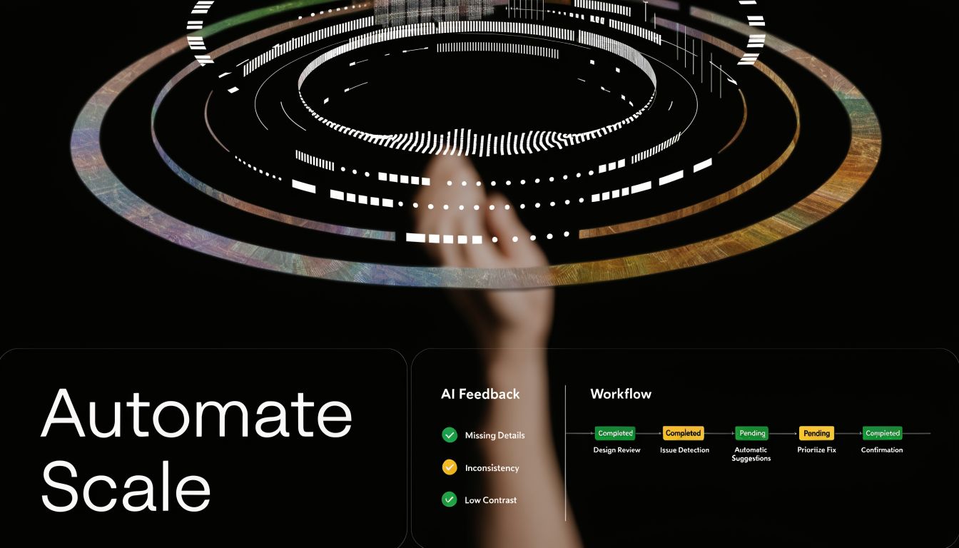
Automate Your Design Feedback Engine for Scale
Manual feedback systems can work for a small team. They fall apart when the company adds more products, more stakeholders, more customers, and more time zones.
Most SaaS teams hit a ceiling. The process, though documented, remains dependent on someone remembering to chase comments, summarize decisions, route issues, create tasks, and notify the right people. That isn't a system. That's a fragile habit stack.
Research around distributed teams highlights a real gap here. Asynchronous feedback for remote and global teams still lacks practical automation approaches, especially for AI-assisted synthesis and routing feedback to decision-makers by priority and impact, as discussed in this overview of common feedback bottlenecks.
What to automate first
Don't start with a giant transformation project. Start with the repetitive points of failure.
The first layer to automate:
Intake normalization
Pull comments from Figma, Slack, forms, or Webflow review tools into one central database.Categorization
Apply labels such as bug, usability issue, content clarity, accessibility concern, or future idea.Routing
Send tagged items to the correct owner or queue. Engineering gets implementation mismatches. Product gets workflow issues. Design gets visual and interaction work.Task creation
Approved feedback automatically creates a ticket with source links and key context.Status updates
When a ticket changes state, notify the original reviewer or stakeholder group.
Teams benefit from a practical layer of AI Automation resources, especially if they're trying to combine summarization, tagging, and cross-tool orchestration without adding more manual review admin.
A workable automation blueprint
Here is a pattern that holds up in B2B SaaS operations.
Intake pipeline
Use a form, comment trigger, or integration to capture every piece of feedback into Airtable, Notion, ClickUp, Jira, or another controlled system. Each record should carry:
- project name
- screen or asset link
- reviewer name and role
- feedback category
- urgency
- source tool
- decision owner
- current status
The main point is consistency. Once the structure exists, automation has something to work with.
AI-assisted summarization
Large comment threads waste team time. A practical workflow uses AI to summarize comments by theme, then drafts a structured brief for triage:
- repeated concerns
- comments tied to user friction
- comments that are pure preference
- unresolved conflicts
- recommendations for routing
This doesn't replace judgment. It reduces review overhead so judgment can happen faster.
Before adopting any workflow like this, watch a short example of how a multi-step process can be turned into a repeatable automation layer:
Rule-based task creation
Once a decider marks feedback as approved, create tickets automatically.
A simple rule set:
- If label = bug, create engineering ticket
- If label = usability issue, create product-design task
- If label = accessibility concern, notify designated reviewer and hold release if needed
- If label = future idea, move to backlog database, not active sprint
- If source includes strategic account context, tag account owner in CRM or customer-facing workflow
Integration platforms become useful. For example, MakeAutomation can be used as an implementation option to document and connect automation steps across feedback capture, routing, project management, CRM updates, and SOP execution. The value isn't magic. It's reducing the number of manual handoffs where context gets lost.
Build decision routing for distributed teams
Remote teams need stronger routing than colocated teams because nobody can rely on hallway clarification.
A scalable routing model includes:
| Feedback type | Routed to | Why |
|---|---|---|
| Conversion or funnel issue | Growth or product owner | They own trade-offs tied to acquisition |
| Workflow or onboarding friction | Product and customer success lead | They see activation and retention effects |
| Implementation mismatch | Engineering lead or QA | Fast technical validation matters |
| Brand consistency issue | Design lead or brand owner | Prevents random restyling requests |
| Accessibility concern | Assigned reviewer with release authority | Keeps compliance from being optional |
This is how you avoid a distributed version of design by committee. Comments don't go to everyone. They go to the person accountable for the category.
Automate the closed loop too
Intake automation often stops there. Communication back out should also be automated.
Useful triggers:
- ticket moved to done -> notify original reviewer
- decision marked deferred -> add to quarterly review queue
- repeated issue across multiple reviews -> flag pattern for design ops review
- strategic account feedback approved -> notify account owner
- comment unresolved past SLA -> escalate to decision owner
That last point matters. Feedback systems break when unresolved items just sit.
Automation should remove admin drag, not hide decision ownership. If nobody owns the final call, faster routing only speeds up confusion.
At scale, the strongest feedback engine isn't the one with the most comments. It's the one that consistently turns the right comments into action while preserving context, accountability, and speed.
If your team is drowning in scattered comments, unclear approvals, and slow design iteration cycles, MakeAutomation can help you document the workflow, connect the tools, and build an automation layer around feedback capture, routing, task creation, and stakeholder updates.