

ReactJS Web Components: A Scalable B2B Guide for 2026
You’re probably dealing with a familiar SaaS problem already. The product ships fast, but the UI layer gets messy fast too. One team has three versions of a status badge, another app still runs an older design system, and every acquisition, partner portal, or internal tool introduces one more frontend stack you now have to support.
React is still the center of gravity for numerous development groups, and for good reason. React.js, launched by Facebook in 2013, powers over 1.3 million websites globally and recorded more than 20 million weekly NPM downloads in September 2024 according to this React adoption overview. But for B2B platforms, React alone doesn’t solve the bigger distribution problem. You also need components that can survive org changes, app splits, embedded widgets, white-label portals, and mixed-framework environments.
That’s where reactjs web components become strategically useful. Not as a React replacement. As a way to separate the parts of your UI that should stay portable from the parts that should stay deeply React-native.
Why Your SaaS Needs a Component Strategy Beyond React
Most frontend problems in growth-stage SaaS companies aren’t caused by weak components. They’re caused by component drift. A billing app forks the original modal. A support dashboard patches a table for one special case. A partner-facing portal can’t consume your React library because it runs on a different stack. Over time, your “shared design system” turns into shared intent with separate implementations.
A better model is to split your UI into two layers:
- React-owned application surfaces for routing, state orchestration, data fetching, permissions, and product workflows
- Framework-agnostic UI blocks for reusable controls, embedded widgets, and cross-product modules
That second layer is where Web Components earn their keep. They give you browser-level encapsulation and a portable distribution format. React stays responsible for developer velocity. Web Components handle reuse beyond a single React runtime.
Where this matters in B2B products
In a SaaS environment, this usually shows up in a few repeatable places:
- Customer-facing embeds: A scheduling widget, pricing calculator, or onboarding module that needs to work outside your main app
- Internal operations tools: Teams often build them in whatever stack ships fastest, which makes shared React-only libraries harder to reuse
- Partner integrations: Agencies, resellers, or enterprise clients may want branded components without adopting your framework choices
- Micro-frontend programs: Business units want autonomy, but leadership still wants consistency
For teams thinking in that direction, this expert guide on micro frontends is worth reading because it frames the architectural trade-offs clearly. The practical takeaway is simple: if your business is splitting interfaces across products or teams, your component strategy has to survive beyond one framework boundary.
Practical rule: Keep the business workflow in React. Package the stable visual and interaction primitives so they can travel.
That approach is especially useful in automation-heavy products. If your platform supports CRM workflows, recruitment operations, outbound sales tooling, or AI-assisted dashboards, you’ll eventually need the same component in multiple delivery contexts. React gives you speed. Web Components give you reach.
Crafting Your First Framework-Agnostic Web Component
Before React enters the picture, the reusable block has to stand on its own. The browser already gives you the base primitives: custom elements, attributes, lifecycle hooks, events, and Shadow DOM. The primary decision is how much tooling your team wants around those primitives.
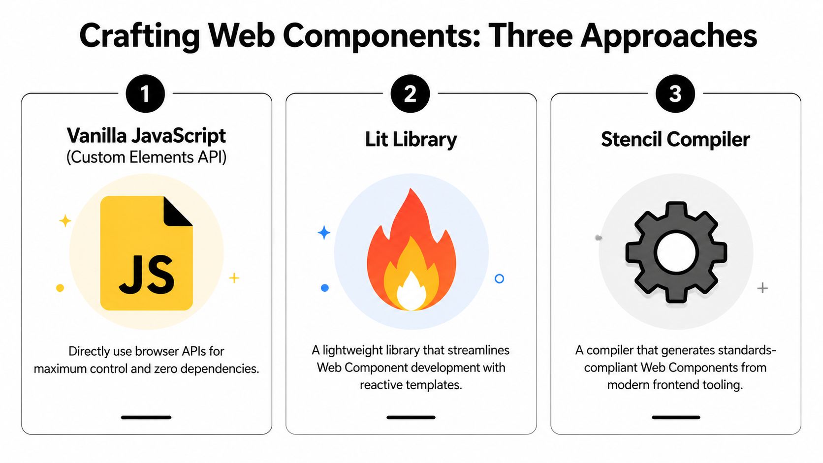
Vanilla JavaScript
Vanilla custom elements are the best way to understand what Web Components really are. You define a class, extend HTMLElement, register it with customElements.define(), and handle lifecycle methods directly.
class UserStatusCard extends HTMLElement {
  static get observedAttributes() {
    return ['name', 'status'];
  }

  constructor() {
    super();
    this.attachShadow({ mode: 'open' });
  }

  connectedCallback() {
    this.render();
  }

  attributeChangedCallback() {
    this.render();
  }

  render() {
    const name = this.getAttribute('name') || 'Unknown';
    const status = this.getAttribute('status') || 'Inactive';

    this.shadowRoot.innerHTML = `
      <style>
        .card { padding: 12px; border: 1px solid #ddd; border-radius: 8px; }
        .status { font-weight: 600; }
      </style>
      <div class="card">
        <div>${name}</div>
        <div class="status">${status}</div>
      </div>
    `;
  }
}

customElements.define('user-status-card', UserStatusCard);
Use this route when you need zero runtime dependencies, very tight control, and a minimal API surface. The downside is obvious after a few components. Templating gets repetitive, state handling is manual, and testing discipline matters more because the browser won’t rescue structure for you.
Lit
Lit is usually the best middle ground for SaaS teams. It keeps the Web Components model intact, but makes rendering and reactivity feel much less raw. You write less boilerplate, updates are cleaner, and styling within Shadow DOM is more ergonomic.
Lit fits teams that want standards-based output without hand-rolling every detail. It’s also easier to onboard frontend engineers who already think in reactive UI patterns.
Stencil
Stencil is a compiler-first option. It’s often the right call when you’re building a full component library that multiple products will consume and version over time. It gives you stronger packaging conventions, documentation workflows, and distribution ergonomics.
For tech leads, the choice usually looks like this:
| Approach | Best fit | Main trade-off |
|---|---|---|
| Vanilla | Small portable widgets | More manual maintenance |
| Lit | Product teams shipping reusable components fast | Another library to standardize |
| Stencil | Design systems and org-wide libraries | More setup and governance |
A useful filter is team maturity. If your engineers already work heavily in TypeScript, this primer on conditional types in TypeScript is relevant because typed component APIs become much easier to maintain when props and events are explicit instead of inferred from ad hoc usage.
Don’t choose the most “future-proof” tool on paper. Choose the one your team will still use correctly six months from now.
Seamlessly Integrating Web Components in React Apps
The integration layer is where teams either get real value or create lasting friction. Rendering <user-profile-card> inside JSX is easy. Making it behave like a first-class citizen in a React app takes more discipline.

According to this React and Web Components integration guide, successful integration can yield an 85-92% bundle size reduction per component and a 40% faster initial load time when the architecture is set up well. The same source points to the patterns that matter most: map HTML attributes to React props through attributeChangedCallback, and send data back up with custom events rather than mutating DOM directly.
The clean wrapper pattern
Treat the Web Component as an external UI primitive. Then create a React wrapper that translates React conventions into browser conventions.
import { useEffect, useRef } from 'react';

export function UserProfileCard({ user, onApprove }) {
  const ref = useRef(null);

  useEffect(() => {
    const node = ref.current;
    if (!node) return;

    const handleApprove = (event) => {
      onApprove?.(event.detail);
    };

    node.addEventListener('approve', handleApprove);
    return () => node.removeEventListener('approve', handleApprove);
  }, [onApprove]);

  return (
    <user-profile-card
      ref={ref}
      name={user.name}
      role={user.role}
      status={user.status}
    />
  );
}
This wrapper does three jobs well:
- It passes primitive values through attributes.
- It listens for custom events the way React expects.
- It hides browser-specific integration details from the rest of your app.
That wrapper layer is also where dynamic composition becomes easier. If your product renders components from metadata, feature flags, or workflow rules, patterns like those in this guide to ReactJS dynamic components become especially useful.
Passing complex data
Attributes are strings. Business apps are not.
For objects and arrays, use property assignment through refs instead of serializing everything into HTML attributes.
import { useEffect, useRef } from 'react';

export function TeamQuotaPanel({ account }) {
  const ref = useRef(null);

  useEffect(() => {
    if (ref.current) {
      ref.current.account = account;
    }
  }, [account]);

  return <team-quota-panel ref={ref} />;
}
Inside the custom element, read that assigned property and render from it. That keeps your API cleaner and avoids fragile JSON parsing.
Sending events back to React
The Web Component should dispatch browser-native custom events.
this.dispatchEvent(
  new CustomEvent('approve', {
    detail: { userId: this.userId },
    bubbles: true,
    composed: true
  })
);
bubbles helps events move up the tree. composed matters if Shadow DOM is involved.
Later in the process, this walkthrough is useful for seeing the concepts in action:
If React owns state, let the Web Component request changes through events. Don’t let it silently mutate application state.
That rule keeps ownership boundaries clear, which matters a lot in dashboards, CRMs, and workflow tools where many components compete to update the same data graph.
Mastering the Shadow DOM and Cross-Boundary Styling
The usual complaint is that Shadow DOM makes styling harder. That’s only half true. It makes casual styling harder. It makes reliable styling much better.
If your SaaS app has ever broken because a global stylesheet leaked into a supposedly shared component, you already know why encapsulation matters. Shadow DOM isolates internal markup and styles so a product team can’t accidentally wreck a reusable component with one broad selector.

Use design tokens, not CSS hope
The right way to theme a Web Component from React is to expose a small styling API. CSS custom properties work well for this.
:host {
  --card-bg: white;
  --card-border: #d0d7de;
  --card-radius: 10px;
}

.panel {
  background: var(--card-bg);
  border: 1px solid var(--card-border);
  border-radius: var(--card-radius);
}
Then the React app can set those values:
<user-profile-card style={{
  '--card-bg': '#0f172a',
  '--card-border': '#334155',
  '--card-radius': '12px'
}} />
This is much better than trying to punch through internal selectors from outside. The component owns structure. The consuming app owns theme values.
Reach inside only where you mean to
When a component needs controlled external styling of specific internals, expose parts.
<div part="header">Plan Details</div>
<div part="body"><slot></slot></div>
Then consumers can target them safely:
user-profile-card::part(header) {
  font-weight: 700;
}
For projected content, use ::slotted. That keeps slot content styleable without exposing the whole component internals.
- Use CSS variables when the consumer should adjust design tokens.
- Use
::partwhen the consumer should style specific internal regions. - Use
::slottedwhen the consumer passes child content into the component. - Avoid deep selector hacks because they create dependencies on internal markup that will eventually change.
Design rule: Every reusable component should expose a styling contract, not a styling accident.
Teams that follow that rule get the main Shadow DOM benefit without the “why won’t my CSS work” chaos that gives Web Components a bad name.
Advanced Strategies for Enterprise Distribution and SSR
A component architecture only becomes strategic when other teams can adopt it without Slack archaeology. That means distribution, versioning, release policy, and SSR behavior all matter as much as the component code itself.
The business case is stronger than many teams assume. A 2023 developer survey found that 68% cited integration complexity as a major barrier to Web Component adoption, as discussed in this analysis of why teams often avoid Web Components. That result lines up with what most engineering leaders see in practice: the browser standard is portable, but the developer experience is often rough unless the platform team smooths it out.
Distribution that teams will actually use
The easiest way to kill adoption is to publish components as source code fragments and let each product wire them differently. Package the library and ship it through a private registry with clear semver rules.
A good enterprise setup usually includes:
- A dedicated package boundary for Web Components, separate from app code
- Release notes with migration guidance so teams know whether a version is safe to adopt
- Storybook or equivalent docs with code samples for React consumers
- Thin React wrappers published alongside the raw custom elements when React is the main consuming environment
Org-wide reuse fails less from technical impossibility than from unclear ownership. Teams need to know who maintains the API, who reviews breaking changes, and who supports incidents.
SSR and hydration without surprises
SSR adds another layer of complexity. Custom elements can render fine on the client, but server rendering plus hydration can produce ugly edge cases if ownership is muddled. If React expects to hydrate markup one way and the custom element mutates that DOM too early, you get mismatch errors and brittle behavior.
The practical approach is conservative:
- Server render the shell where useful.
- Avoid mixing uncontrolled DOM mutation with React-owned nodes.
- Hydrate custom elements at predictable boundaries.
- Treat browser-only features carefully in server contexts.
Declarative Shadow DOM is promising for SSR-oriented workflows, especially in newer discussions around server-rendered component islands. But for most product teams, the right strategy is incremental adoption rather than speculative architecture.
The safer migration path
You don’t need a rewrite. Introduce Web Components where interoperability creates immediate advantage.
A good sequence is usually:
| Migration target | Why it works first |
|---|---|
| Embedded widgets | Clear boundary, minimal app coupling |
| Shared form controls | High reuse across products |
| White-label portal modules | Cross-team and cross-stack value |
| Legacy React edge areas | Lets you modernize without full replacement |
That’s how reactjs web components stay practical. They don’t replace your app architecture. They reduce the number of times your company rebuilds the same UI idea for different surfaces.
Performance Tuning and Robust Testing Frameworks
Hybrid architectures can perform well, but only if you remove the waste introduced by wrappers, repeated registration, and unnecessary rerenders. Most slowdowns in reactjs web components setups come from integration mistakes, not from the concept itself.
According to this React performance best practices article, optimized apps can see a 12% average improvement in Core Web Vitals. The same source warns against index-based keys in component lists because they can induce 300% unnecessary DOM diffs, while unique IDs cut those wasteful rerenders by 75%.

Where hybrid apps usually get slow
The common failure points are predictable:
- Wrapper churn: A React wrapper recreates handlers or object props every render, forcing unnecessary work
- Heavy first-load registration: Every custom element gets registered upfront even if only one route needs it
- Large list rendering: Dashboards map hundreds of items into rich components without virtualization
- Bad keys: Lists use indexes, so stateful rows remount or diff aggressively when order changes
For high-volume dashboards, memoization and list discipline matter more than almost anything else.
const MemoizedCard = React.memo(UserProfileCard);

const rows = useMemo(() => users.map((user) => (
  <MemoizedCard key={user.id} user={user} />
)), [users]);
Stable IDs are essential in operational products where records move, update, or reorder constantly.
What to optimize first
Start with the route entrypoint, not the prettiest component.
- Lazy-load custom element definitions for routes that need them.
- Memoize React wrappers when their props are stable.
- Virtualize long lists with
react-windowor a similar tool when dashboards render large datasets. - Profile event-heavy areas where Web Components emit frequent updates.
- Audit duplicate registrations if modules load in fragmented environments.
If your team is tightening QA at the same time, browser-level integration coverage matters. This guide to Cypress integration tests is a useful reference because hybrid systems often fail at boundaries that unit tests don’t fully expose.
A testing stack that catches real failures
Unit tests should validate the internal behavior of the Web Component. Integration tests should verify the React boundary.
A practical split looks like this:
| Test layer | What it should prove |
|---|---|
| Component unit tests | Rendering, attribute handling, event dispatch |
| React wrapper tests | Prop mapping, listener wiring, cleanup |
| Browser integration tests | Real interaction across Shadow DOM and app state |
| Visual regression checks | Styling contract stays stable across releases |
Test the contract, not just the implementation. A passing unit test doesn’t help if the custom event name changed and the React wrapper stopped listening.
For B2B products, that matters because the failures aren’t abstract. They hit sales dashboards, support flows, onboarding forms, and operations panels that real teams use all day.
Frequently Asked Questions About ReactJS Web Components
The highest-friction questions usually appear after the first successful demo. The component renders, but state shape, accessibility, and tooling start colliding with product reality. That’s normal.
As of 2025, there has been a 42% rise in GitHub queries related to “react web component state management,” and Redux integration can add 20-30% bundle overhead in SaaS CRMs, according to this discussion snapshot on state management questions around React and Web Components. That trend reflects what teams feel quickly: state wiring is where architecture choices become expensive.
For engineering leaders hiring into this kind of frontend complexity, browsing a role like this Vairix senior React, Next.js, React Native, Node.js position on YayRemote is useful because it reflects the kind of cross-boundary thinking modern frontend teams increasingly need.
Quick answers that save time
| Question | Answer |
|---|---|
| Should React or the Web Component own state? | Let React own app state unless the component is truly standalone. Use custom events to request changes upward. |
| Should I pass objects as attributes? | No. Use element properties via refs for objects and arrays. Attributes are best for strings, booleans, and simple primitives. |
| Is Redux a good bridge? | It can work, but heavier global state layers add overhead. Many teams do better with narrower event-driven boundaries or lighter stores. |
| How do I handle accessibility? | Build semantics into the custom element itself. Test keyboard flow, labels, focus handling, and ARIA exposure in a real browser. |
| Can third-party React libraries control internals inside Shadow DOM? | Often not directly. Prefer explicit APIs, slots, CSS variables, and ::part rather than assuming library selectors can reach inside. |
| Why does my event listener never fire in React? | Check the event name, attach the listener on the element ref, and make sure the custom event uses bubbles and composed when Shadow DOM is involved. |
| Should every shared React component become a Web Component? | No. Convert only the pieces that need portability, isolation, or cross-product distribution. Keep app-specific UI in React. |
The pattern that holds up
The strongest long-term pattern is simple:
- React owns orchestration
- Web Components own portable presentation
- Events move intent upward
- Props and properties move data downward
- Styling is contract-based, not hack-based
That pattern is boring in the best way. It reduces surprises, and boring architecture scales.
If your team is trying to standardize reusable UI while also streamlining CRM workflows, recruitment ops, project delivery, or AI-assisted customer interactions, MakeAutomation can help design the operational layer around that architecture. They work with B2B and SaaS companies to turn scattered manual processes into documented, scalable automation systems that support growth without adding frontend chaos.