

7 Top Business Intelligence Dashboard Examples for 2025
In today's fast-paced business landscape, relying on static spreadsheets is like navigating with an outdated map. The real competitive advantage lies in real-time, actionable data. Business intelligence (BI) dashboards are the modern compass, transforming complex data streams into clear, interactive visualizations that empower everyone from the C-suite to frontline managers.
But what does a truly effective dashboard look like? It’s more than just pretty charts; it's a strategic tool designed to answer critical questions, reveal hidden trends, and drive decisive action. Moving beyond theory, this guide dives into a curated collection of powerful business intelligence dashboard examples from the industry's leading platforms. We will showcase real-world designs for sales, marketing, finance, and operations, providing the inspiration you need to elevate your own analytics.
For each example, we will dissect exactly what makes it effective, breaking down the layout, key metrics, and strategic purpose. You'll get actionable takeaways and replicable strategies to implement immediately. This article is your visual playbook for building or refining an analytics powerhouse that turns raw data into your most valuable asset. We’ve included direct links and screenshots for each gallery, allowing you to explore these platforms and find the perfect template for your specific needs. From Tableau and Power BI to Looker Studio and Qlik, you'll see firsthand how to visualize success and make data-driven decisions with confidence.
1. Tableau Public – Dashboard Examples and Viz Gallery
Tableau Public isn't just a platform; it's a vast, living library of data visualization. As Tableau's official showcase, it offers an unparalleled collection of interactive dashboards created and shared by a global community of data professionals, students, and enthusiasts. This makes it an essential starting point for anyone looking for business intelligence dashboard examples that push the boundaries of creativity and analytical depth.
Its primary strength lies in its sheer volume and diversity. You can find dashboards covering virtually every industry and use case, from detailed financial performance trackers to complex marketing attribution models. The platform is organized into galleries and features a "Viz of the Day" to highlight exceptional work, providing a constant stream of inspiration.
Strategic Analysis & Key Features
The true value of Tableau Public for professionals is its function as a learning tool. Many creators allow their workbooks to be downloaded, enabling you to reverse-engineer their techniques, understand their data structures, and adapt their designs for your own projects. This hands-on access is an incredible resource for skill development.
- Learning by Deconstruction: Downloadable workbooks let you see the "how" behind an impressive visualization. You can explore calculated fields, parameter actions, and dashboard layouts from the inside.
- Broad Industry Application: Whether you're in healthcare, retail, or tech, you can find dashboards tailored to your specific industry's KPIs and challenges.
- Community-Driven Innovation: The platform showcases cutting-edge visualization techniques and design trends as they emerge, keeping you ahead of the curve.
How to Use Tableau Public Effectively
To get the most out of this resource, go beyond simple browsing. Use the search and filter functions to find dashboards relevant to your specific business function, like sales, operations, or HR. When you find an inspiring visualization, don't just admire it; download it (if available) and examine its construction in Tableau Desktop. This approach transforms passive inspiration into an active learning exercise. You can even find dashboards that incorporate advanced techniques; for a deeper dive into one such area, you can learn more about the fundamentals of predictive analytics.
Platform Breakdown
| Feature | Details |
|---|---|
| Pricing & Access | Free to browse and view all public dashboards. A Tableau license is required to open and edit files. |
| Unique Offering | The ability to download and reverse-engineer thousands of real-world dashboards. |
| User Experience | The interface is clean and searchable, with curated galleries making it easy to discover top-tier content. |
| Quality Variation | As a public platform, quality can vary. Focus on featured vizzes or those from established authors. |
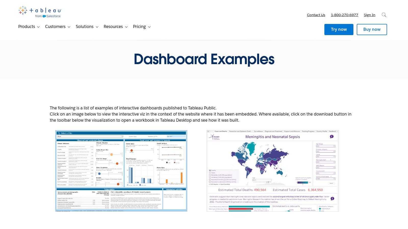
Website: https://www.tableau.com/dashboard-examples
2. Tableau Exchange – Accelerators (pre-built dashboard templates)
While Tableau Public offers inspiration, the Tableau Exchange provides a direct path to execution. It hosts "Accelerators," which are certified, pre-built dashboard templates designed by Tableau and its partners for specific industries and business functions. This resource is invaluable for teams needing to deploy robust, production-quality business intelligence dashboard examples quickly without starting from scratch.
Its core strength is its focus on rapid deployment and best practices. Instead of just showing what's possible, Accelerators give you a fully functional dashboard that you can connect to your own data sources. This significantly reduces development time and ensures your dashboards are built on a solid, vetted foundation. The Exchange allows you to filter by industry, department, and even data connection type, making it easy to find a relevant starting point.
Strategic Analysis & Key Features
The primary value of Tableau Exchange is its ability to standardize and accelerate analytics across an organization. By providing templates for common use cases like campaign analysis, pipeline management, or financial planning, it allows businesses to implement best-practice visualizations with minimal effort. This frees up analyst time to focus on generating insights rather than building dashboards.
- Rapid Time-to-Value: Accelerators come with clear setup instructions and data mapping guides, allowing for deployment in hours or days, not weeks or months.
- Certified Quality: Each template is vetted by Tableau or a certified partner, guaranteeing high-quality design, performance, and adherence to visualization best practices.
- Business-Focused Design: Templates are built around specific business needs and key metrics, ensuring they answer the most critical questions for roles in sales, marketing, finance, and operations.
How to Use Tableau Exchange Effectively
Begin by filtering the Accelerators by your specific department (e.g., Marketing) and the primary data source you use (e.g., Salesforce, Google Analytics). Review the included business metrics and required data fields for each template to find the best fit. Once downloaded, use the provided documentation to map your data. Treat the Accelerator as a powerful starting point; customize the branding, add or remove specific charts, and tailor the KPIs to perfectly match your organization's unique requirements.
Platform Breakdown
| Feature | Details |
|---|---|
| Pricing & Access | Many Accelerators are Free to download. Requires a Tableau Desktop or Cloud license to use and customize. |
| Unique Offering | Enterprise-ready, certified templates that drastically reduce dashboard development time. |
| User Experience | Clean, filterable marketplace interface that makes it easy to find relevant dashboards for specific use cases. |
| Quality Variation | Consistently high quality, as all dashboards are certified by Tableau or its trusted partners. |
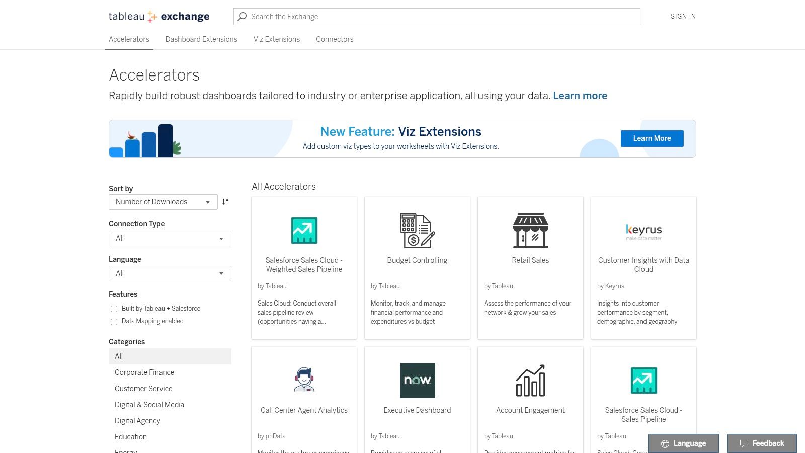
Website: https://exchange.tableau.com/en-us/accelerators
3. Microsoft Power BI – Data Stories Gallery (Fabric Community)
As Microsoft's primary showcase for user-created visualizations, the Power BI Data Stories Gallery within the Fabric Community is a treasure trove of practical and innovative reports. It's a go-to resource for seeing how real-world users tackle common business challenges using Power BI's suite of tools. This gallery provides countless business intelligence dashboard examples that are grounded in everyday operational needs.
The main advantage of this gallery is its direct connection to an active user community. The submissions often represent solutions to tangible problems faced by data analysts, managers, and executives. You'll find everything from detailed sales pipeline analyses and HR employee retention dashboards to complex financial models, all built within the Power BI ecosystem.
Strategic Analysis & Key Features
The Data Stories Gallery is more than just a place for inspiration; it's a practical learning environment for understanding effective data storytelling and BI implementation. Many entries include live, embedded reports, allowing you to interact with slicers, filters, and drill-throughs as if you were the end-user. This interactive element is crucial for understanding the user experience of a well-designed dashboard.
- Interactive Learning: The ability to click through live, embedded reports provides immediate insight into how different visuals and data models work together.
- Real-World Business Cases: Submissions often come with context, explaining the business problem the dashboard was designed to solve.
- Best Practice Showcase: The gallery highlights effective use of Power BI features like bookmarks, tooltips, and DAX measures, demonstrating best practices in report development.
How to Use the Data Stories Gallery Effectively
To maximize value, filter the gallery by business function or industry to find relevant examples. When you discover a compelling report, pay close attention to its narrative flow. How does it guide the user from a high-level overview to granular details? This is a key lesson in data storytelling. Also, examine the data model and integration behind the visualizations; strong dashboards are always built on a solid foundation, which is why it's crucial to understand the essentials of data integration best practices.
Platform Breakdown
| Feature | Details |
|---|---|
| Pricing & Access | Free to browse and interact with all submitted reports. A Microsoft account may be needed for community participation. |
| Unique Offering | A vast collection of live, interactive Power BI reports embedded directly in the community forum posts. |
| User Experience | Forum-style layout that is easy to browse, with posts often containing detailed author explanations. |
| Quality Variation | Quality is user-dependent. Focus on entries from Power BI MVPs, Super Users, or contest winners. |
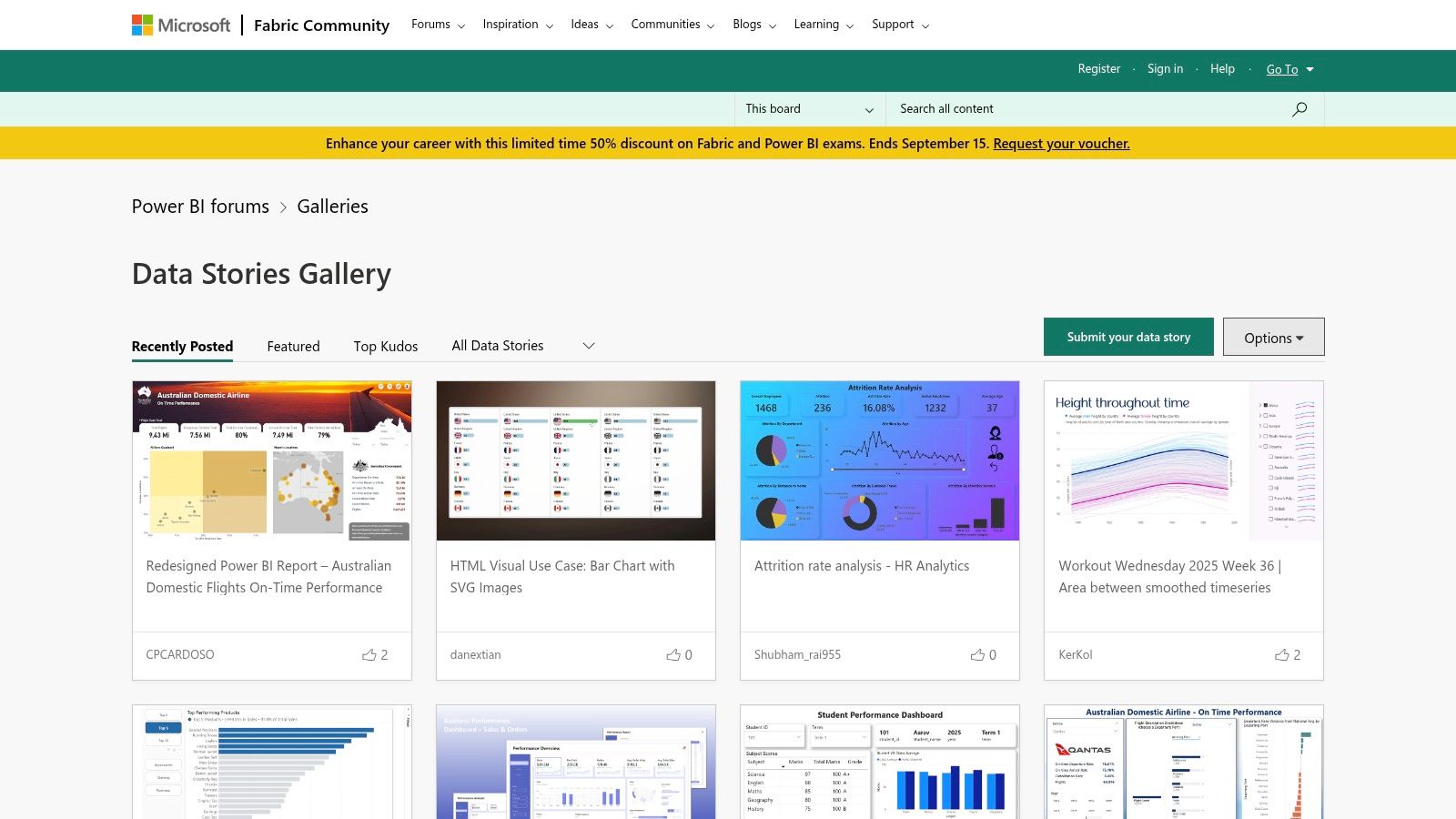
Website: https://community.fabric.microsoft.com/t5/Data-Stories-Gallery/bd-p/DataStoriesGallery
4. Looker Studio (Google) – Official Report Gallery
Google's Looker Studio (formerly Data Studio) Report Gallery is a curated hub of dashboards and reports, making it an indispensable resource, especially for those embedded in the Google ecosystem. It serves as an official showcase of what's possible with the platform, offering a strong collection of business intelligence dashboard examples that excel in marketing, web analytics, and general business reporting. The gallery is designed to be both a source of inspiration and a practical starting point for building your own dashboards.
Its core strength is its seamless integration with Google products like Analytics, Ads, and BigQuery, combined with its accessibility. The gallery features reports from both Google and the user community, demonstrating a wide range of design patterns, data blending techniques, and interactive features. This makes it an ideal place to learn how to visualize data from familiar sources effectively and at no cost.
Strategic Analysis & Key Features
Looker Studio's gallery shines as a launchpad for self-service BI. Unlike platforms focused purely on viewing, Looker Studio encourages a hands-on approach. Users can find a template that fits their needs, make a copy with a single click, and immediately connect their own data sources. This significantly lowers the barrier to entry for creating sophisticated, customized reports.
- Accelerated Development: Instead of starting from scratch, you can clone well-designed templates for Google Analytics, Google Ads, or YouTube Analytics, saving hours of setup and design work.
- Practical Learning: The gallery provides concrete examples of how to implement features like interactive filters, drill-downs, and calculated fields, allowing you to learn specific techniques directly.
- Ecosystem-Centric Dashboards: The best examples are deeply integrated with Google's data sources, providing a blueprint for anyone looking to build a comprehensive marketing or web performance command center.
How to Use Looker Studio Gallery Effectively
To maximize the value of the gallery, focus on templates that align with your primary data sources. Open a report you like and use the "Make a copy" option to connect your own Google Analytics or other accounts. This instantly populates the dashboard with your live data, turning an abstract example into a functional tool. Analyze how the original author structured their data blends and used parameters to make the report interactive, and apply those learnings to refine your own visualizations.
Platform Breakdown
| Feature | Details |
|---|---|
| Pricing & Access | Free to view, copy, and use all reports in the gallery. A Google account is required. |
| Unique Offering | The ability to instantly clone any template and connect it to your own live data sources. |
| User Experience | The gallery is straightforward and clean, organized by category, making it easy to find relevant reports. |
| Quality Variation | Quality can be inconsistent as many reports are user-submitted. Stick to featured or Google-created reports for best practices. |
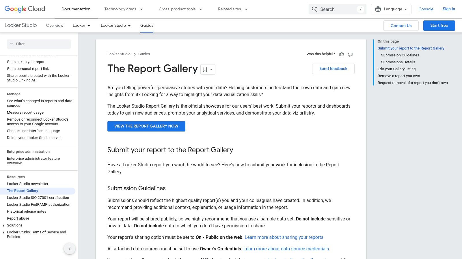
Website: https://cloud.google.com/looker/docs/studio/the-report-gallery
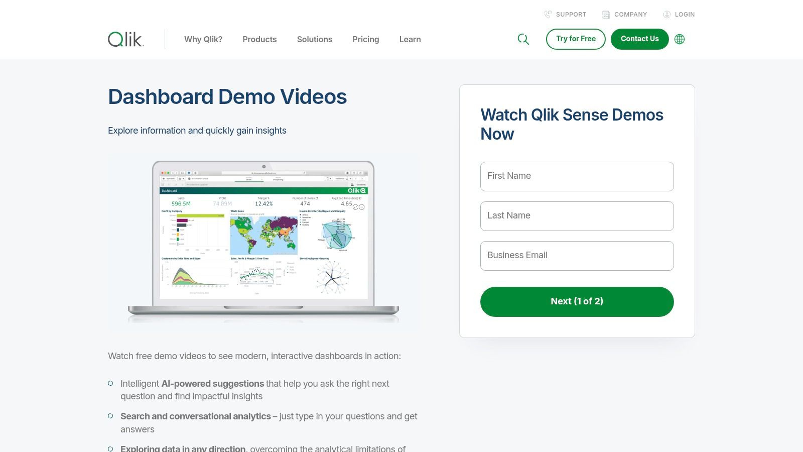
5. Qlik – Qlik Sense Dashboard Demos and Gallery
Qlik's demo hub provides a curated look into the enterprise capabilities of its Qlik Sense platform. Unlike public galleries that showcase individual creativity, Qlik's examples are designed to highlight its core technology, specifically the Associative Engine. This makes it a go-to resource for understanding how a BI platform can guide users to uncover hidden relationships and insights within their data, making it a powerful source for advanced business intelligence dashboard examples.
The gallery primarily features interactive video demos that walk users through complex dashboards, demonstrating features like AI-assisted insights, natural language search, and automated alerting. These examples are polished and professional, focusing on enterprise use cases such as supply chain management, financial services risk analysis, and healthcare operations. The emphasis is less on static design and more on the dynamic, exploratory user journey that Qlik facilitates.
Strategic Analysis & Key Features
The strategic value of Qlik's demo gallery lies in its clear demonstration of enterprise-grade analytics in action. It’s an ideal resource for decision-makers evaluating BI tools for large-scale deployment. The demos effectively show how Qlik handles complex data models and empowers non-technical users with powerful analytical tools, moving beyond simple visualization to genuine data exploration.
- Associative Exploration: The demos masterfully showcase Qlik's key differentiator. When a user makes a selection, they can see not only the related data but also the unrelated data (in gray), revealing unexpected patterns and outliers.
- AI and Conversational Analytics: Many examples feature the Insight Advisor, which uses AI to generate visualizations and insights based on natural language queries, showcasing the platform's user-friendliness.
- Enterprise Focus: Dashboards are built around sophisticated business problems, like optimizing inventory or managing customer churn, providing a realistic view of how the tool can be applied in a corporate setting.
How to Use Qlik's Demos Effectively
To leverage this resource, focus on the "how" and "why" behind the interactions shown in the demos. Don't just watch passively; actively question the data relationships being uncovered. Pay close attention to how the Associative Engine highlights relationships that might be missed in a traditional query-based BI tool. These demos are excellent for understanding how guided analytics can be integrated into workflows, a key concept explored in various business automation examples. Think about how these features could solve specific problems within your own organization.
Platform Breakdown
| Feature | Details |
|---|---|
| Pricing & Access | Free to view all demos. Access to the full Qlik Sense platform requires a subscription or free trial. |
| Unique Offering | Demonstrates the power of the Associative Engine and AI-driven insights for enterprise-level analytics. |
| User Experience | The demo hub is clean and well-organized, with videos and links guiding users to relevant features. |
| Quality Variation | All examples are professionally produced by Qlik, ensuring high quality and consistent messaging. |
Website: https://www.qlik.com/us/demo/qlik-sense-dashboards
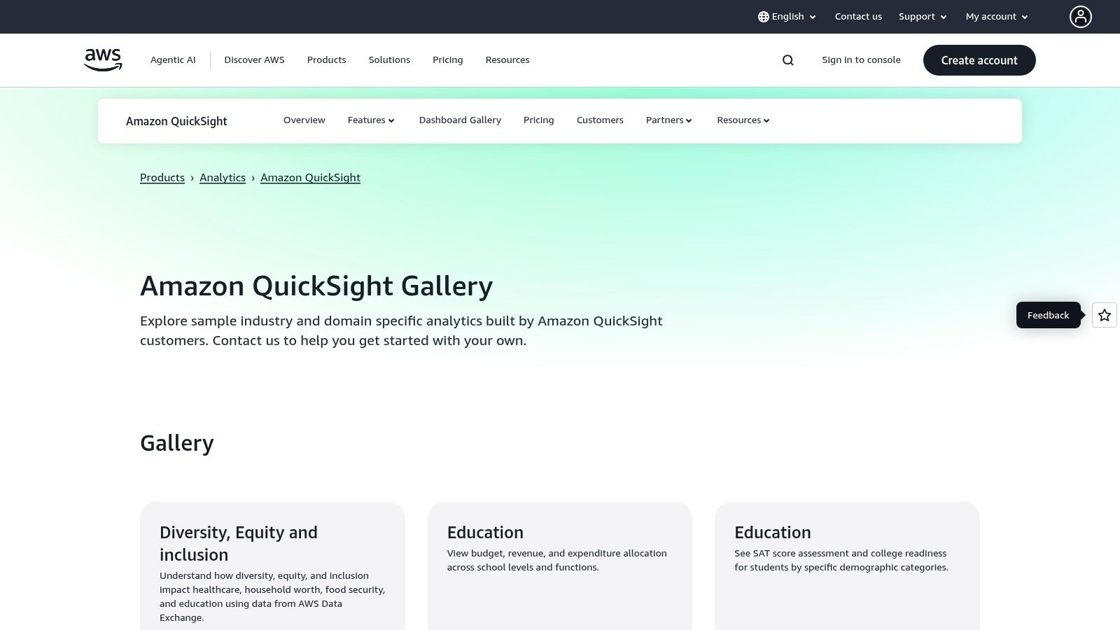
6. Amazon QuickSight – Dashboard Gallery
For businesses deeply integrated into the Amazon Web Services (AWS) ecosystem, the Amazon QuickSight Gallery is an essential resource. It functions as an official showcase of interactive dashboards, demonstrating the platform's capabilities across a wide range of industries, including finance, education, healthcare, and retail. This makes it an ideal place to find business intelligence dashboard examples that are not only well-designed but also optimized for the AWS environment.
The gallery's core strength is its focus on practical, industry-specific applications. Rather than just showcasing abstract visualizations, it provides tangible examples of how dashboards can solve real-world business problems. Each example is interactive, allowing users to click, filter, and drill down into the data to understand the platform's functionality and user experience firsthand.
Strategic Analysis & Key Features
The primary value of the QuickSight Gallery is its role as a blueprint for organizations building their BI solutions on AWS. It demonstrates best practices for dashboard layout, interactivity, and navigation, all within the context of the QuickSight tool. This is particularly useful for teams evaluating QuickSight or those looking to maximize their investment in the platform.
- Seamless AWS Integration: The examples implicitly showcase how QuickSight connects to AWS data sources like S3, Redshift, and Athena, providing a clear path for AWS users.
- Role-Based Design Inspiration: The gallery's structure helps you envision dashboards tailored to different user roles, from high-level executive summaries to granular operational views.
- Industry-Specific KPIs: Each dashboard is pre-loaded with relevant metrics and KPIs for its respective industry, saving you the initial research and setup time when designing your own.
How to Use the QuickSight Gallery Effectively
To leverage this gallery, focus on the structure and user flow of the examples. Interact with every filter, button, and chart to understand how the dashboard guides the user toward insights. Pay close attention to how different visualizations are combined to tell a cohesive story. While you cannot download the dashboards as templates, you can use them as a detailed visual and functional guide to replicate in your own QuickSight environment, accelerating your development process significantly.
Platform Breakdown
| Feature | Details |
|---|---|
| Pricing & Access | Free to browse and interact with all gallery dashboards. An AWS account is needed to build your own. |
| Unique Offering | Industry-specific, interactive dashboard examples designed specifically for the AWS data ecosystem. |
| User Experience | The gallery is clean and easy to navigate, with clear categories for different business sectors. |
| Quality Variation | As an official showcase, all examples are of high quality and represent platform best practices. |
Website: https://aws.amazon.com/quicksight/gallery/
7. Mode – Example Gallery (now part of ThoughtSpot)
Mode's Example Gallery is a powerful resource for data teams that operate at the intersection of business intelligence and data science. Now part of ThoughtSpot, this platform offers a curated collection of fully functional dashboards and reports that users can clone and adapt. This makes it an ideal source for business intelligence dashboard examples that incorporate advanced analytics, including SQL queries, Python/R notebooks, and custom visualizations.
Its core strength is the seamless integration of code-driven analysis with traditional BI. The examples go beyond simple KPI tracking to demonstrate complex analytical workflows like cohort analysis, sales forecasting, and customer segmentation. This is perfect for teams who need more than off-the-shelf charts and want to build highly customized, data-rich narratives.
Strategic Analysis & Key Features
The true value of Mode's gallery is its function as a project accelerator. Instead of starting from scratch, data analysts and scientists can clone a relevant example, connect their own data source, and immediately have a working model. This allows teams to quickly deploy sophisticated dashboards that would otherwise require significant development time.
- Code-Integrated Dashboards: Examples showcase how to blend SQL queries, Python/R scripts, and interactive visualizations in a single, cohesive report.
- Ready-to-Clone Templates: Users can copy entire projects, including the underlying code and visualization configurations, directly into their own Mode workspace.
- Advanced Analytical Patterns: The gallery features dashboards for sophisticated use cases like A/B test analysis, lead scoring models, and retention curves, providing a blueprint for data-driven decision-making.
How to Use Mode's Gallery Effectively
To maximize the gallery's potential, approach it with a specific business problem in mind. Search for examples that match your analytical needs, such as "funnel analysis" or "user engagement." Once you find a suitable template, clone it and begin by examining the underlying SQL and Python code. This deconstruction process is key to understanding how the logic works so you can successfully adapt it to your own datasets and business context.
Platform Breakdown
| Feature | Details |
|---|---|
| Pricing & Access | Free to browse all examples. A Mode workspace (trial or paid) is required to clone and modify dashboards. |
| Unique Offering | The ability to clone complete, code-driven analytical reports that combine SQL, Python/R, and visualizations. |
| User Experience | Clean, card-based layout that makes it easy to browse and understand the purpose of each example dashboard. |
| Target Audience | Best suited for data analysts, data scientists, and technical teams that require deep customization. |
Website: https://mode.com/example-gallery/
Comparison of 7 BI Dashboard Galleries
| Platform | Implementation Complexity | Resource Requirements | Expected Outcomes | Ideal Use Cases | Key Advantages |
|---|---|---|---|---|---|
| Tableau Public – Dashboard Examples | Low to Moderate (browse and learn) | Tableau Desktop or Cloud for editing | Inspiration, learning dashboard building | Broad industry dashboards, learning | Huge variety, free browsing, downloadable workbooks |
| Tableau Exchange – Accelerators | Moderate (setup and customization) | Tableau Desktop or Cloud license required | Rapid deployment of production dashboards | Industry-specific templates, rapid rollouts | Certified, high quality, clear setup instructions |
| Microsoft Power BI – Data Stories Gallery | Low (viewing and browsing) | No software needed to view | Inspiration, best practice examples | Business scenarios, storytelling, layout | Large active community, live embedded reports |
| Looker Studio (Google) – Official Report Gallery | Low (view and clone templates) | Google account for cloning and modifying | Learning design patterns and self-service reporting | Marketing, analytics, digital business | Free to copy, marketing focus, user submissions |
| Qlik – Qlik Sense Dashboard Demos and Gallery | Low (mostly demos and videos) | No installation for demos | Understanding Qlik’s features and workflow | Evaluations, enterprise analytics intro | AI insights, conversational analytics demos |
| Amazon QuickSight – Dashboard Gallery | Low (view samples) | AWS integration recommended | Industry-specific dashboard examples | AWS users, scalable enterprise dashboards | Strong AWS integration, cost-effective Reader pricing |
| Mode – Example Gallery (ThoughtSpot) | Moderate to High (advanced analytics) | Mode workspace for cloning and editing | Advanced code-driven dashboards | Data teams using SQL, Python/R, custom viz | Code integration, flexible advanced analytics workflows |
From Inspiration to Implementation: Your Next Steps in BI
We have navigated a landscape rich with powerful business intelligence dashboard examples, exploring galleries and templates from industry leaders like Tableau, Microsoft Power BI, Looker Studio, and Qlik. Each platform offers a unique window into the art of data storytelling, demonstrating how raw numbers can be transformed into strategic assets that drive decisions in sales, marketing, finance, and operations. The core lesson is clear: a well-designed dashboard does more than just display data; it answers critical business questions and illuminates the path forward.
From the intricate, community-driven visualizations in Tableau Public to the ready-to-deploy Accelerators in Tableau Exchange and the comprehensive Data Stories in the Power BI Fabric Community, we've seen that effective BI is both a science and an art. It’s about selecting the right metrics, choosing intuitive visualizations, and arranging them in a logical flow that guides the user from high-level summaries to granular details.
Synthesizing Inspiration into Action
The journey from viewing these examples to creating your own powerful dashboard requires a structured approach. The goal is not to replicate a dashboard pixel for pixel but to deconstruct its logic and apply the underlying principles to your unique business context. The most impactful dashboards are purpose-built, focusing on clarity over complexity.
To bridge this gap, focus on these key takeaways:
- Define Your "One Question": Before a single chart is created, identify the single most important business question your dashboard needs to answer. Is it "Which marketing channels have the best ROI?" or "Are we on track to meet our quarterly sales quota?" This question becomes your North Star.
- Prioritize KPIs Ruthlessly: Not all data is created equal. Select 3-5 primary Key Performance Indicators (KPIs) that directly answer your "one question." These should be front and center, with secondary, diagnostic metrics available for deeper exploration.
- Embrace the "Inverted Pyramid": Structure your dashboard like a news article. Start with the most critical, high-level insights at the top (the headline numbers), followed by trends and comparisons, and finally, provide access to the granular, detailed data at the bottom or through drill-down capabilities.
- Context is Everything: A number without context is meaningless. Always include comparisons against targets, previous periods (like month-over-month or year-over-year), or industry benchmarks to give your data significance and make it immediately actionable.
Your Roadmap to a High-Impact Dashboard
Feeling inspired is the first step; implementation is the next. Avoid the common pitfall of "analysis paralysis" by following a clear, iterative process. The perfect dashboard is not built in a day; it evolves with your strategy and user feedback.
Here are the actionable steps to get started:
- Identify a Business Pain Point: Pinpoint a specific, high-value problem or opportunity. For example, reducing customer churn, optimizing ad spend, or improving sales team performance.
- Select a Relevant Template: Revisit the business intelligence dashboard examples in this article. Find one that aligns with your chosen pain point. Use the Qlik Sense demos for operational efficiency or Looker Studio's gallery for marketing campaign analysis.
- Sketch a Low-Fidelity Wireframe: Grab a whiteboard or a piece of paper. Map out where your primary KPIs, key charts, and filters will go. This "storyboarding" phase ensures your layout is logical before you even touch a BI tool.
- Connect a Single Data Source: Start small. Connect just one or two essential data sources required to build your minimum viable dashboard. You can always integrate more data later.
- Build, Test, and Iterate: Create a version 1.0 of your dashboard and share it with a small group of stakeholders. Gather feedback on its clarity, usability, and impact. Use this feedback to refine and improve your design. This iterative loop is the secret to creating a tool that people will actually use.
The power of these BI platforms lies in their ability to democratize data, enabling teams to move from reactive problem-solving to proactive, data-informed strategy. By taking these deliberate steps, you can transform the inspiration from these world-class examples into a customized, high-impact business intelligence tool that fuels growth and clarifies your strategic vision.
While BI dashboards are essential for visualizing data, their power is limited by the quality and flow of data feeding into them. MakeAutomation supercharges your BI initiatives by seamlessly integrating your apps and automating the complex data workflows required to populate your dashboards with real-time, accurate information. Connect your CRM, ad platforms, and financial tools to your BI system effortlessly with MakeAutomation and ensure your decisions are always based on the freshest insights.