

Unlock B2B/SaaS Growth: Operational Efficiency Metrics
You can feel the ceiling before you can explain it.
Leads are coming in. The team is working hard. Slack never goes quiet. Your calendar is full, your pipeline looks active, and yet growth feels heavier than it should. Every new customer seems to require a custom workaround, every handoff introduces delay, and every weekly meeting ends with the same conclusion: everyone is busy, but not enough is getting done.
That's the point where founders usually make one of two mistakes. They either push harder and ask the team to do more, or they start buying tools without a clear operating model. Neither fixes the problem. The issue is rarely effort. It's visibility.
Operational efficiency metrics give you that visibility. They tell you where time leaks, where quality breaks, where capacity sits idle, and where automation can remove friction instead of adding another layer of complexity. Used well, they stop operations from being a vague feeling and turn them into a managed system.
From Busy to Productive Shifting Your Growth Mindset
A founder I've seen many times in SaaS looks successful from the outside. Revenue is moving. Headcount is growing. Customers are signing. Inside the business, though, the operating rhythm is unstable. Sales says deals stall in handoff. Success says onboarding starts too late. Support says ticket queues spike after each release. Finance says margins are tighter than expected.
Nobody is wrong. They're each reporting a symptom.
A key shift happens when leadership stops asking, “Why does it feel messy?” and starts asking, “Which part of the system is breaking, and how do we measure it?” That's the moment operational maturity starts. You stop managing by noise and start managing by constraints.
The hidden cost of hustle
Early-stage companies often reward responsiveness over repeatability. That works for a while. The founder jumps in. A manager patches the process. A top performer carries the load. But once volume increases, improvisation stops being a strength and becomes a tax.
Common signs show up fast:
- Sales activity rises but deals don't move faster. The team is busy, but the process is clogged.
- Customer issues get answered, but not resolved cleanly. Work is happening, yet rework keeps returning.
- Teams add tools to save time. Instead, they create more manual updates across HubSpot, Jira, Stripe, QuickBooks, and Slack.
You don't scale by demanding more effort from the same broken workflow. You scale by measuring the workflow and fixing what the data exposes.
What changes when you use metrics properly
Founders often think metrics are for board decks. In practice, they're for daily decisions. The right metrics show whether automation should be applied to lead routing, onboarding, support triage, invoicing, reporting, or QA. They also show when automation is solving the wrong problem.
The goal isn't to build a giant dashboard full of vanity numbers. The goal is to create an instrument panel that tells you three things clearly:
- Where work slows down
- Where quality falls apart
- Where automation can improve output without creating downstream damage
That's how a business moves from busy to productive.
What Are Operational Efficiency Metrics Really
Operational efficiency metrics are measurements that tell you how well your business turns inputs into outputs with minimal waste. Inputs can be staff time, software spend, ad spend, engineering hours, support effort, or system capacity. Outputs can be closed deals, onboarded customers, resolved tickets, shipped features, or retained revenue.
A simple way to think about it is a professional kitchen.
A home cook can tolerate wasted motion. If dinner takes longer, nobody files a complaint. In a commercial kitchen, wasted motion hurts service immediately. If prep stations aren't organized, if ingredients arrive late, if one cook is overloaded while another waits, the whole line slows down. Tickets back up. Food quality drops. Rework starts. Customers feel it.

A SaaS company works the same way. The “kitchen” is your lead flow, implementation process, product delivery, customer support, finance ops, and internal handoffs. If your CRM is messy, if support data lives in one tool and billing data in another, if onboarding depends on one person remembering a checklist, then you don't have an isolated productivity issue. You have an operational design problem.
Metrics are the business equivalent of a line check
Good operators don't rely on instinct alone. They use a short list of measures to confirm whether the system is healthy. That's why strong teams connect company goals to measurable outcomes, often through frameworks like OKR measurement for leaders. The point isn't the framework itself. The point is turning ambition into something observable.
Here's the practical test. If a metric doesn't help you make a better decision, it's clutter.
Useful operational efficiency metrics answer questions like these:
- Where are we losing time between stages
- Which team is overloaded and which team is underused
- Are we getting faster by improving the process, or just pushing errors downstream
- Which automations remove repetitive work, and which merely hide poor workflow design
Why this idea matters beyond software
This isn't a new management fad. One of the clearest historical examples is Overall Equipment Effectiveness, or OEE, which became a major benchmark in manufacturing through Total Productive Maintenance in Japan. OEE combines availability, performance, and quality into one measure of how much scheduled production time is productive, and an 85% OEE score is often treated as world-class according to Cloudvara's explanation of OEE and operational efficiency.
That matters because it shows how serious operators think. They don't just ask whether a machine is running. They ask whether it's available, performing at the right rate, and producing acceptable output.
Practical rule: Never treat speed alone as efficiency. Productive output only counts when quality holds.
That same logic applies in SaaS. A faster onboarding flow that creates more support tickets isn't more efficient. A higher sales activity level that creates lower-quality customers isn't more efficient. Good metrics make that visible.
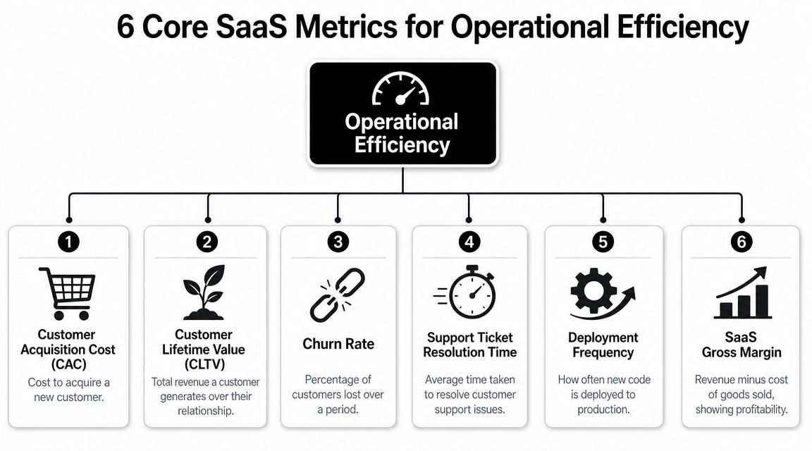
The 6 Core Metrics Every SaaS Business Must Track
A founder sees revenue growing, the team is hiring, and everyone feels busy. Then deals start taking longer to close, onboarding slips, support queues swell, and margins tighten. That is usually the point where gut feel stops working. You need a small set of metrics that shows where work is slowing down, where capacity is getting wasted, and where automation can remove friction instead of adding another tool to manage.
These six metrics cover the operating system of a SaaS business: how you acquire customers, how quickly work moves, how well you resolve issues, how productively you use people, and how efficiently spend turns into revenue.
A short walkthrough can help if you want a quick visual before setting formulas and owners:
| Metric | Formula | What It Measures |
|---|---|---|
| Revenue per Employee | Total revenue / total employees | How effectively the company converts headcount into revenue output |
| Lead-to-Customer Conversion Time | Total elapsed time from lead creation to closed-won customer | How long the revenue engine takes to turn demand into customers |
| Cycle Time | Total process time / number of units | How quickly a repeatable process is completed |
| Mean Time to Resolution | Total time to resolve issues / total resolved issues | How efficiently support or ops teams close problems |
| Customer Acquisition Cost | Total sales and marketing cost / number of new customers acquired | How efficiently the company acquires customers |
| Utilization Rate | Capacity used / total capacity available × 100, or billable hours / total hours available × 100 | How much available team or system capacity is actually used |
Revenue per employee
Revenue per employee is a blunt measure, which is why it is useful.
It tests whether the way you have built the team matches the economics of the business. If headcount rises faster than revenue, that can be a deliberate choice if you are hiring ahead of growth. It can also mean people are spending too much time on manual coordination, duplicate data entry, and handoffs between systems that should talk to each other automatically.
Data sources: accounting software, payroll systems, HRIS, and your revenue reporting layer.
Automation improves this metric by reducing the need to hire around broken workflows. If finance is exporting and reconciling data by hand, if customer teams update the same account in three tools, or if operations staff spend hours every week fixing sync errors, revenue per employee will weaken long before the org chart looks bloated.
Lead-to-customer conversion time
This metric shows where sales motion turns into waiting.
A long lead-to-customer cycle usually means one of a few things. Leads sit unassigned. Reps miss follow-up windows. Demo scheduling depends on email back-and-forth. Approvals stall in inboxes. Sales-to-solutions handoffs require manual rework. None of those problems gets solved by asking the team to "sell harder."
Data sources: HubSpot, Salesforce, meeting schedulers, proposal tools, and contract systems.
Automation addresses the delay directly. Route inbound leads by territory or segment. Trigger follow-up tasks the moment a prospect takes a high-intent action. Generate reminders when an opportunity sits too long in one stage. Push contract status back into the CRM so the team is not guessing where the deal stands.
Cycle time
Cycle time measures how long repeatable work takes once it starts. In SaaS, that could mean onboarding a new customer, shipping a feature, approving an invoice, publishing content, or completing an implementation.
The key operational question is simple: where is the work waiting?
Founders often look at a slow process and assume the team needs to move faster. In practice, cycle time is often inflated by idle time between steps. Work waits for approval. A form is missing one field. Ownership is unclear. Someone has to copy information from one system to another before the next person can begin.
Automation helps by removing those pauses. Required-field checks prevent incomplete intake. Auto-assignment rules send work to the right owner immediately. Status changes trigger the next task without someone chasing updates in Slack. If you want a clearer view of how those process signals should appear in reporting, build them into your business intelligence reporting setup instead of relying on manual spreadsheet snapshots.
Mean time to resolution
Support volume can look healthy on paper while customers still wait too long for answers. Mean Time to Resolution shows whether the team is closing issues, not just replying to them.
MTTR usually rises when context is scattered. An agent has the ticket in one system, billing history in another, product issues in a third, and the latest internal discussion buried in chat. The team may be working hard, but the process forces every case to start with internal detective work.
If your team needs to ask three internal questions before they can answer one customer question, your process is under-instrumented.
Data sources: support platforms, engineering issue trackers, incident tools, and customer data systems.
Automation improves MTTR by assembling context before the agent gets involved. Account data can be pulled into the ticket automatically. Priority can be assigned from issue type or contract tier. Aging tickets can trigger escalations. Repeat issues can follow predefined workflows instead of being reinvented case by case.
Customer acquisition cost
CAC sits in finance reports, but the root causes are often operational.
When CAC rises, the market may not be the first problem. You may have duplicate leads, broken attribution, missed follow-ups, long qualification delays, or disagreement between sales and marketing on what counts as a qualified opportunity. Spend goes up, but the system around that spend does not convert demand efficiently.
Automation improves CAC by tightening execution. Ad responses should hit the CRM immediately. Lifecycle stages should be standardized. High-intent actions should trigger alerts or sequences without manual intervention. List imports and one-off spreadsheet uploads should be reduced because they create lag, errors, and duplicate records that distort performance.
Utilization rate
Utilization measures how much of your available capacity gets used. For services teams, that often means billable hours versus total available hours. For broader operations, it can mean how much team or system capacity is producing useful output. Netsuite covers both capacity utilization and resource utilization in its operational KPI guide.
This metric matters in implementation, support, agencies, and engineering teams where capacity is finite and demand is uneven.
It also needs careful interpretation. High utilization can mean strong planning. It can also mean burnout, slower response times, and no room for urgent work. Low utilization can signal waste, or it can reflect a deliberate choice to protect service quality during hiring, training, or a product transition. The number only helps when you read it alongside the operating context.
What founders often miss
These six metrics are not a reporting checklist. They are a problem map.
Use them to locate the constraint.
- If sales feel slow, inspect lead-to-customer conversion time and CAC.
- If delivery feels messy, inspect cycle time and utilization.
- If post-sale experience is slipping, inspect MTTR and the workflows around onboarding and support.
- If headcount keeps rising without enough output, inspect revenue per employee and trace where manual work is consuming capacity.
Good operators use metrics to make changes. They identify where the process is breaking, then apply automation to remove the specific delay, handoff, or error behind the number. That is how KPI tracking turns into a practical roadmap for scaling.
Building Your Custom Metrics Dashboard
A founder opens a dashboard Monday morning and sees green arrows everywhere. Pipeline is up. Tickets closed are up. Team utilization is up. By Thursday, two customers are threatening to leave, implementation is slipping, and support is overwhelmed. The dashboard did not fail because it lacked data. It failed because it was built to report activity instead of support decisions.
Build the dashboard around the choices leadership needs to make.
The practical sequence is Goal -> Process -> Metric.
If the goal is stronger retention, start with the workflows that shape retention, usually onboarding, product adoption, and support. Then choose the measures that show whether those workflows are healthy, such as onboarding cycle time, time to first value, and MTTR. That structure matters because it ties every number to an operational problem someone can fix, often with a workflow change or automation.
Start from the decision
Founders often ask what they should track. The better question is which decision keeps coming up without a clear answer.
Use a simple filter:
- Goal: What business result matters right now
- Process: Which workflow drives that result
- Metric: Which measure shows whether that workflow is performing well enough
A few examples:
Goal: Improve retention
Process: Onboarding and support
Metric: MTTR, onboarding cycle timeGoal: Increase sales velocity
Process: Lead qualification and follow-up
Metric: Lead-to-customer conversion time, CACGoal: Protect margins
Process: Delivery staffing and fulfillment
Metric: Utilization, revenue per employee
This approach keeps the dashboard operational. If a metric has no decision attached to it, it does not belong on the leadership view.
You also need one place where these numbers are defined and updated consistently. A practical guide to business intelligence reporting for centralized operational visibility can help you set up that reporting layer before your team ends up arguing over whose spreadsheet is correct.
Show relationships, not isolated KPIs
Single metrics create false confidence. Linked metrics help diagnose the actual issue.
As noted earlier, efficiency metrics are more useful when they are read in pairs or groups. Speed without quality can hide rework. High utilization without service-level context can hide queue buildup. Lower CAC can look good until you see conversion time stretching because reps are chasing poor-fit leads.
For a SaaS operator, this means the dashboard should reflect trade-offs. A faster onboarding cycle is not a win if first-week support tickets rise right after launch. A fully booked implementation team is not healthy if customer wait times expand and urgent work has nowhere to go. Good dashboards show output, strain, and quality together so leaders can decide whether to add automation, rebalance capacity, or redesign the workflow.
A useful dashboard helps a team diagnose a constraint and act on it.
Keep the first version small and usable
The first dashboard should stay tight enough that leadership can review it in a few minutes and know where to ask questions.
Pick 3 to 5 KPIs that meet three tests:
- They connect to the current company goals
- A team can change the result through process improvements
- The data can be captured the same way every time
That last point matters more than founders expect. A slightly imperfect metric with consistent definitions is more useful than a precise metric pulled manually once a month. Consistency lets you spot change early. Automation makes that consistency possible because the metric is generated by the work itself, not by someone cleaning exports at the end of the week.
Avoid building one giant dashboard for everyone. Leadership needs a short list tied to growth, delivery health, and operating capacity. Department heads can keep deeper views for queue management, staffing, and daily execution. When every team gets every metric, attention scatters and meetings get longer.
A good dashboard creates focus and gives automation a clear job. Each KPI should point to a workflow worth improving, then to the handoff, delay, or manual step that can be removed. That is how a dashboard stops being a report and starts acting like a scaling plan.
Implementing Your Tracking System With Automation
Manual metric tracking breaks as soon as the business gets busy. Someone forgets to update a sheet. Definitions drift between teams. A manager spends Friday afternoon merging CSV exports from Stripe, HubSpot, Jira, and QuickBooks. By the time the dashboard is ready, the numbers are already old.
The fix is not more reporting discipline. The fix is building an automated data pipeline around the tools your team already uses.
![]()
Build the pipeline once, then let work generate data
A practical automation setup usually follows this pattern:
Define the metric clearly
Decide what counts, what doesn't, and which timestamp or event triggers the measurement.Locate the system of record
Lead creation may live in HubSpot. Revenue may live in Stripe or QuickBooks. Resolution timestamps may live in Intercom, Zendesk, or Jira.Connect events across tools
Use native integrations, webhooks, Make.com, or Zapier to push changes as they happen.Store normalized data
Send the cleaned records into a reporting layer, data warehouse, or dashboard tool.Create alerts, not just charts
If a lead sits untouched, a ticket ages past target, or utilization trends in the wrong direction, the system should notify someone automatically.
For teams mapping this out, a practical guide to how to automate business processes is useful because it frames automation as a system design problem, not just a collection of apps.
What good implementation looks like
The best setups share a few traits:
- Events are captured automatically. A deal stage change, ticket close, invoice payment, or deployment update should log itself.
- Definitions stay consistent. If sales and finance define “customer” differently, your CAC will be unreliable.
- Dashboards update without manual assembly. People should spend time interpreting metrics, not rebuilding them.
- Ownership is explicit. Every core metric needs someone responsible for monitoring and improving it.
Automation also changes behavior. When teams trust the data, they stop arguing about whether a problem exists and start working on the cause. That's a major operational upgrade.
Start narrow
Don't automate every metric at once. Choose one high-friction workflow first.
For many SaaS companies, that's one of these:
- Lead handling: capture, enrich, route, and timestamp inbound demand
- Support operations: classify tickets, attach account context, and log resolution time
- Delivery workflow: trigger onboarding tasks, status updates, approvals, and completion dates
Once the pipeline proves reliable, you can extend it. That sequence matters. Good automation makes operations measurable. Bad automation creates faster confusion.
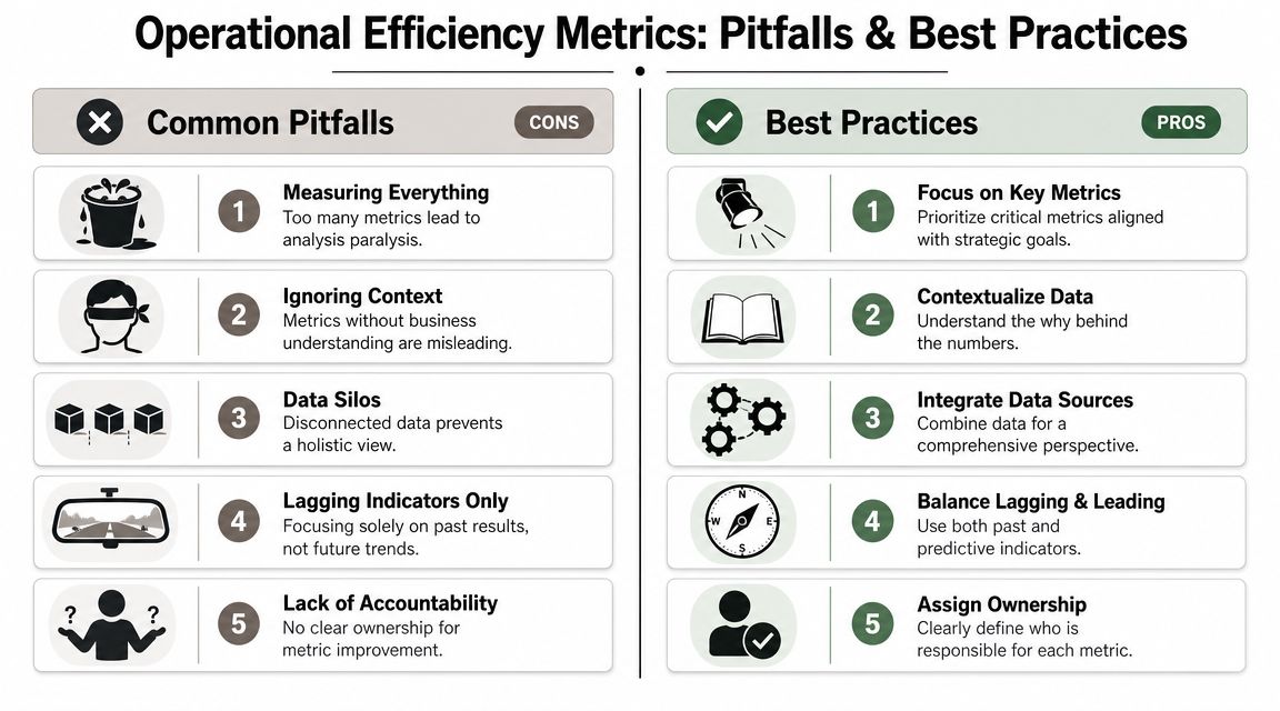
Common Pitfalls When Tracking Efficiency Metrics
Metrics can improve a business. They can also make teams optimize the wrong thing with more confidence. That's why a lot of “data-driven” companies still feel chaotic. They aren't short on numbers. They're short on judgment.
The most common mistake is assuming that any movement in a metric is useful progress. It isn't. Some improvements are fake. They shift work, delay problems, or lower quality where leadership can't see it yet.
Faster is not always better
This is one of the most important trade-offs in operations. A process can get faster while becoming less reliable. Atlas Systems highlights this gap clearly in its discussion of misleading efficiency gains and the need to pair speed with quality measures. That's why metrics such as first-pass yield and defect rate matter alongside classic efficiency measures.
In SaaS terms, the pattern is familiar:
- Onboarding speeds up, but customers submit more support requests later.
- Support closes tickets faster, but more issues reopen because agents are pushed to close rather than solve.
- Engineering ships faster, but customer-facing bugs increase and operations absorbs the cleanup.
Those are not wins. They are deferred costs.
The cleanest sign of false efficiency is when one team's improvement creates another team's backlog.
Five traps that hurt operators
Some pitfalls are obvious. Others hide inside reasonable-sounding goals.
- Measuring everything: More metrics create more noise. Teams stop seeing what matters and start reporting for the sake of reporting.
- Optimizing one KPI in isolation: Cutting support effort may improve short-term cost views while increasing resolution time and customer frustration.
- Ignoring context: A utilization target can damage service quality if staffing is already tight.
- Treating lagging indicators as enough: Revenue tells you what already happened. It doesn't warn you that onboarding is slipping today.
- Leaving metrics ownerless: If everyone sees the number but nobody owns the process, nothing changes.
How to protect against false wins
Use paired metrics and operational context.
A practical approach looks like this:
| If you track this | Pair it with this | Why |
|---|---|---|
| Cycle time | Quality or rework indicator | Faster work can hide errors |
| Utilization | Response time or backlog | High usage can hide overload |
| CAC | Conversion flow metrics | Rising cost may be a process issue, not just a channel issue |
| MTTR | Reopen rate or customer feedback trend | Fast closure isn't the same as real resolution |
The discipline here is simple. Don't ask whether a number improved. Ask whether the business improved because of it.
That's what separates operational efficiency metrics from vanity reporting.
Real-World ROI From Efficiency Automation
The return from automation usually doesn't show up as one dramatic breakthrough. It shows up as friction removed from places that used to consume attention every day. A handoff no longer stalls. A ticket arrives with context attached. A lead gets routed instantly instead of waiting in a shared inbox. A finance report updates without someone staying late to compile it.
Those changes matter because they reclaim management capacity as well as team capacity.
Where the payoff usually appears
In practice, the clearest ROI tends to show up in a few places:
- Sales operations: automated lead routing, enrichment, and follow-up reduce delay between inquiry and action
- Customer operations: ticket classification and workflow triggers shorten time to resolution and reduce back-and-forth
- Delivery operations: onboarding checklists, approval flows, and status updates keep implementations from stalling in hidden queues
- Finance and reporting: synced billing, revenue, and operational data remove manual reconciliation work
These gains compound because they improve both execution and visibility. Teams don't just move faster. They can finally see what's happening.
What good ROI looks like
The strongest ROI cases usually share the same pattern. Automation removes repetitive coordination work, standardizes a process, and makes the result measurable. That creates a feedback loop. Leaders can see whether the workflow improved, whether quality held, and where the next bottleneck sits.
If you want a clean way to evaluate those gains, this guide on how to calculate return on investment is a useful framework. It helps tie automation work back to labor savings, throughput improvement, service quality, and management time recovered.
Good automation doesn't just save time. It makes the business easier to run.
The best part is that you don't need to automate everything to feel the benefit. One well-chosen workflow can change how the company operates. Once a founder sees reliable metrics flowing from real operational activity, gut-feel management starts to lose its appeal quickly.
If you're ready to turn scattered workflows into measurable systems, MakeAutomation can help design and implement the automations that improve visibility, reduce manual work, and make your core operational efficiency metrics easier to track and improve.