

Form and Function in Design: A SaaS Founder’s Guide
You're probably in one of two situations right now.
You've launched a product that looks polished, modern, and expensive, but new users still ask where to click first. Or you've built something powerful that loyal customers love after training, yet every demo feels harder than it should because the interface doesn't help people understand the value quickly.
That is the fundamental tension behind form and function in design. Founders often treat it like an art-school debate. It isn't. It's a product strategy decision with direct consequences for adoption, onboarding, support load, and long-term scalability.
In B2B software, this tradeoff gets sharper because your product usually has to do hard things. It has workflows, permissions, data models, integrations, exception paths, and now AI features layered on top. If the product is beautiful but confusing, buyers hesitate. If it's useful but clumsy, expansion gets harder. Your job isn't to pick one side forever. Your job is to decide what the product must do clearly before you decide how it should look.
The Beautifully Broken Product Dilemma
A founder spends months refining a dashboard. The UI has soft shadows, custom icons, elegant animations, and a homepage that looks ready for an award gallery. The launch goes live. Prospects say it looks impressive.
Then the support emails start.
Users can't tell which button starts the core workflow. Sales demos drift into explanation mode because the interface doesn't explain itself. The onboarding team keeps writing workaround notes. Product usage feels lower than expected, even though nothing appears “wrong” from a visual standpoint.
This is the beautifully broken product. It isn't ugly. It isn't low effort. It's just built in the wrong order.
When polish hides friction
In early-stage SaaS, founders often confuse visual confidence with product clarity. Those are not the same thing. A dashboard can look clean while still making users think too hard.
That confusion usually shows up in a few places:
- Navigation that looks minimal: Fewer visible options can feel elegant, but hidden controls often make complex workflows harder to discover.
- AI features added as surface decoration: A copilot panel or smart prompt box may look advanced, yet still interrupt the task the user came to complete.
- Brand-first decisions: Teams protect color systems, animation styles, and page symmetry while users struggle with setup, configuration, or handoff.
A founder's first design mistake usually isn't bad taste. It's letting appearance answer questions that only workflow design can solve.
If this sounds familiar, it helps to get practical feedback on design decisions before your team invests further in the wrong layer. Founders rarely need more opinions about aesthetics. They need clearer judgment about what the interface is asking the user to do.
The business cost of a broken experience
A product can survive being plain. It usually can't survive being unclear.
B2B buyers don't adopt software because it has stylish cards and refined typography. They adopt software because it helps their team complete recurring work with less friction. If the form gets in the way of the function, the customer experiences your product as effort.
That's when “nice design” becomes expensive.
The Architectural Principle That Shaped Modern Design
A founder often learns this lesson the hard way. The team ships a polished interface, buyers praise the visual quality in the demo, and then onboarding stalls because the product's structure does not match how people work.
The idea behind that failure is older than software.
The phrase form follows function came from architecture. Louis Sullivan introduced it in 1896 in The Tall Office Building Artistically Considered, arguing that a building's shape should grow from its purpose rather than from borrowed decoration. That argument emerged during a period when taller commercial buildings were becoming more practical and more necessary, as summarized in this account of Sullivan and Wright's design philosophy.

Why skyscrapers changed the conversation
Skyscrapers forced architects to solve new operational problems. Height changed circulation. Steel changed structure. Elevators changed how people used a building floor by floor. Older visual conventions could not answer those constraints on their own.
That is why Sullivan still matters to software founders.
A workflow automation platform faces the same kind of pressure. As the product grows, the interface has to support more permissions, more exceptions, more integrations, and more handoffs across teams. If the visual layer ignores those realities, the product starts to feel like a beautiful office building with no workable floor plan.
Sullivan's point was straightforward. Beauty should emerge from use, not distract from it.
In SaaS, that means the layout should clarify the job to be done. The navigation should reflect task frequency and consequence. The AI layer should reduce decisions or effort, not introduce a new panel that customers now have to interpret. Before your team commits to a redesign, a usability test plan for complex product workflows helps verify that the interface supports the actual sequence of work.
Wright pushed the principle further
Frank Lloyd Wright extended the argument by saying form and function are one. That is a stronger standard. It means the appearance and the purpose should feel integrated, the way a good operating system makes controls, feedback, and behavior feel like one coherent product instead of separate decisions glued together late.
That distinction is useful for founders building their first serious B2B platform.
Sullivan helps you set priorities. Get the core workflow right. Make the product understandable. Remove ornamental choices that add cognitive load.
Wright helps you mature the product after that. In a well-designed SaaS platform, the visual hierarchy, interaction patterns, data model, and automation logic reinforce each other. Users should not have to translate the interface before they can trust it.
This matters even more in AI-powered tools. If an assistant suggests actions, summarizes data, or generates next steps, the surrounding interface has to explain scope, confidence, and control. Otherwise the product feels smart in a demo and risky in production.
A useful modern reference point is modern brand brutalist aesthetics. The style is intentionally bold and sometimes confrontational, but the lesson for SaaS is practical. Strong visual identity works only if users can still read the system, predict outcomes, and complete high-value tasks without friction.
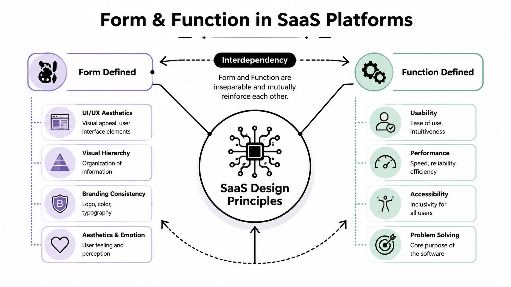
Translating Form and Function for SaaS Platforms
A founder ships a polished new dashboard for an automation product. The sales team loves the demo. Then the first enterprise customer logs in, tries to set up a routing rule, and asks three questions in the first five minutes: Where do I start? What will this change? Can I undo it?
That gap is the SaaS version of form versus function.
In software, form is the visible expression of the product. It includes layout, typography, spacing, color, iconography, hierarchy, and the emotional tone the interface creates.
Function is the product's working logic in the hands of a real customer. It includes task completion, workflow behavior, permissions, speed, discoverability, accessibility, and how well the system holds up as accounts add more users, data, rules, and exceptions.
For B2B founders, the practical question is not whether form matters or whether function matters more. The question is whether the interface helps a customer understand a complex system quickly enough to adopt it, trust it, and expand usage across a team.
What form looks like in a B2B product
In SaaS, form works like the signage in a busy airport. The building can be beautiful, but if people cannot tell where security starts, where gates changed, or which line applies to them, the design has failed at its job.
The same is true in a CRM, workflow builder, admin console, or analytics product. Good form helps users answer a few questions fast:
- where to begin
- what deserves attention now
- what changed
- what is informational versus actionable
- which action carries risk
This is why a product can look modern and still feel hard to use. A minimalist interface that hides system status or flattens priority forces users to interpret the product before they can operate it. In workflow automation tools, that cost shows up quickly. Setup takes longer, mistakes increase, and admins hesitate to roll the product out more broadly.
What function really means in SaaS
Function is not limited to whether a feature technically runs. It includes whether a revenue ops manager can build a workflow without second-guessing the logic, whether a support lead can audit an AI suggestion before approving it, and whether a new admin can configure permissions without opening three help articles.
That standard gets harder in AI-powered products. A useful assistant can save time. A poorly framed one adds another control surface to an already dense interface. Suggestions, confidence cues, approval states, exceptions, and fallback behavior all need to be clear at a glance.
A Nielsen Norman Group report discussing AI design patterns and looking ahead to 2025 makes the broader point clearly: adding AI does not automatically make an interface easier to use. In many B2B products, it introduces more interpretation work unless the surrounding UX explains what the system is doing, why it is doing it, and what happens next.
If an AI feature needs a walkthrough before the user can complete a basic task, the issue is product design, not feature count.
Founders building workflow software should treat user experience design resources for workflow-heavy SaaS products with the same discipline they bring to pricing, onboarding, and sales. In B2B, UX affects adoption, expansion, and support load.
A simple translation
Here is the practical version:
- Form answers: What does the system signal before the user clicks?
- Function answers: What happens after the user clicks?
- Strong SaaS design answers both: Did the user understand the choice and get the expected result?
That is the standard for products built to scale. The interface should help customers act with confidence, especially when the product includes multi-step workflows, shared team permissions, and AI-generated recommendations.
A Practical Framework for Balancing Aesthetics and Usability
Founders don't need a philosophy seminar when a release is slipping. They need a way to make decisions.
The simplest rule I use is this: if a design choice improves perception but slows a core workflow, it's probably too expensive. You can revisit aesthetics later. You can't casually recover trust after users decide your product is confusing.
Start with the primary job
Before debating visuals, write down the product's core task in one sentence.
Not “manage revenue operations.” Not “streamline collaboration.” Write the user action. For example: create a workflow, approve a lead, route an inbound call, review an AI suggestion, export a report.
Then test every design choice against that action.
Ask these questions:
- Does this help users find the next step?
- Does this reduce setup or interpretation effort?
- Does this visual treatment clarify state, risk, or priority?
- Will this still work when the account has more data, more roles, and more exceptions?
If the answer is no, it may be attractive but not useful.
Use a decision filter for every new feature
A lot of design debt enters products through additions, not redesigns. One more panel. One more shortcut. One more AI assistant. Each seems harmless on its own.
Use a lightweight review like this:
- Core-path impact: Does the feature improve the main workflow or distract from it?
- Cognitive load: Will the user need explanation to interpret the screen?
- Scalability test: Does the layout still work with more records, integrations, or permissions?
- Support forecast: Will this create more “where do I click” questions?
- Aesthetic contribution: Does the interface feel more trustworthy and coherent after the change?
Practical rule: Treat visual polish as a multiplier, not a substitute. It makes a strong workflow easier to trust. It doesn't rescue a weak one.
For hands-on evaluation, a structured usability test plan helps teams catch friction before it spreads across onboarding, support, and sales.
SaaS design approach comparison
| Metric | Function-First Approach | Form-First Approach |
|---|---|---|
| Initial user understanding | Users grasp the task path faster because key actions are obvious | Users may admire the interface but still hesitate on where to begin |
| Onboarding | Training focuses on workflow depth, not basic navigation | Training often compensates for unclear structure |
| Feature expansion | New capabilities can fit into a system with clearer logic | Additions tend to create clutter because visual harmony came first |
| Support burden | Questions are more likely to be edge-case or account-specific | Questions often repeat around navigation and setup |
| Sales demos | Value is easier to show through action | Value depends more on explanation from the presenter |
| Long-term scalability | Better suited for complex permissions, automations, and integrations | Often requires rework once complexity increases |
Don't overcorrect into ugliness
Function-first doesn't mean plain for the sake of plain. Users still judge trust, quality, and seriousness from visual form. A sloppy interface creates doubt, even if the workflow is technically strong.
The target isn't austerity. It's clarity first, refinement second, harmony always.
How Form and Function Drive Success in Modern SaaS
A founder approves a polished redesign for an AI workflow product. The sales team loves the screenshots. Prospects praise the interface on demos. Then the trial accounts arrive, and users still ask the same question on day one: where do I start?
That gap explains why form and function matter so much in SaaS. Visual polish can get a product into the conversation. Operational clarity keeps it in the account.
Two kinds of product strength
A product like Monday.com shows how visual structure can reduce hesitation. Color, spacing, and grouping help new users scan the screen and form a quick mental model. For a founder, that matters because early confidence affects demo performance, trial activation, and internal stakeholder buy-in.
Older enterprise software often succeeded from the opposite direction. It handled complex processes well, stayed predictable under heavy use, and supported advanced roles and permissions. But many of those products asked users to tolerate friction on the way to value.
For B2B and SaaS founders, the lesson is practical. Form helps the product feel trustworthy and easier to approach. Function helps teams run recurring work without errors, workarounds, or constant support. Workflow automation and AI tools need both because buyers judge them twice. First in the demo, then in the daily routine.
AI makes the tradeoff sharper
AI speeds up interface production. Teams can generate mockups, add assistants, and ship new surfaces faster than before. That speed is useful, but it also makes weak product judgment more expensive.
A Gartner forecast for 2026 has been cited in this analysis of AI-era form versus function to argue that AI design tools may shorten project cycles while also increasing the risk of "form creep," where novelty outpaces operational clarity. The exact percentages matter less than the pattern many product teams already recognize. Faster production makes it easier to add one more panel, one more assistant, and one more visual idea that competes with the main job the user came to do.
Form creep is what happens when the interface gains personality faster than it gains usefulness.
In workflow software, that usually shows up in familiar ways. An AI copilot gets its own permanent drawer. Suggested prompts push status data below the fold. A floating assistant interrupts the task instead of helping complete it. The product still looks current, but it asks the user to manage the interface itself.
AI should reduce the effort required to complete work. If users must learn a second interface just to access the benefit, the design is serving the feature instead of the customer.
Here's a useful example to study before adding more AI surface area:
What good looks like in workflow software
The strongest modern SaaS products treat design like airport signage. People should know where to go next, even in a busy environment, without stopping to interpret the system. That principle becomes even more important in tools for recruiting pipelines, sales automation, customer operations, and multi-step approvals, where one unclear screen can slow an entire team.
Three patterns show up again and again in products that scale well:
- The main path stays visible: Users can spot the next meaningful action without scanning every panel.
- Advanced capability stays available, but contained: Power users can configure rules, exceptions, and integrations without overwhelming new users.
- AI works inside the workflow: It drafts, recommends, summarizes, or automates within the task instead of acting like a separate product bolted onto the screen.
That last point is where many first major products go off course. Founders often treat AI as the headline feature because it sounds new and demos well. Customers usually treat it as labor reduction. They want fewer manual steps, faster decisions, and cleaner handoffs between people and systems.
Success in modern SaaS comes from aligning visual form with operational intent. A strong interface does not just look current. It helps a customer train faster, adopt more thoroughly, and run the same process at higher volume without the product collapsing into clutter.
Measuring the ROI of Good Design Choices
A founder approves a redesign, the team celebrates, and the product still needs the same onboarding calls, the same workaround docs, and the same support explanations. That is usually the moment design stops feeling like a brand exercise and starts looking like an operating cost.
For B2B and SaaS products, especially workflow automation and AI tools, design ROI shows up in how much friction the product removes from real work. A strong interface helps a new customer configure a process correctly, helps a manager trust what the system is doing, and helps your team support more accounts without adding the same amount of headcount.
The benefit of a function-first approach is that you can measure it. The classic Anglepoise lamp offers a useful analogy. Its design came from practical constraints such as balance, movement, and light control, and the result was a product that felt intuitive because its form followed its job, as described in this discussion of quantifiable functional design. Good SaaS design works the same way. If the product is shaped around the work users need to complete, the business effects become easier to see.

Metrics that tell you if the design is working
You do not need a formal lab to judge design quality. You need a small set of signals tied to behavior inside the product.
Track metrics such as:
- Task completion rate: Can users finish the workflow you intended them to complete?
- Time on task: How long does the same job take for a first-time user versus a trained user?
- Error rate: Where do people misclick, backtrack, choose the wrong setting, or create invalid automations?
- Support themes: Which questions keep appearing in tickets, implementation calls, and sales demos?
- Adoption depth: Which capabilities become part of the customer's weekly workflow, and which ones only look impressive in the interface?
These measures turn design from a matter of taste into a product decision with evidence behind it.
Tie product clarity to business outcomes
In SaaS, interface clarity affects more than usability. It changes cost structure.
If a customer can set up a routing rule, approve an AI suggestion, or troubleshoot a failed automation without calling your team, onboarding gets shorter and support load drops. Sales conversations also improve because prospects can see how the product works without needing a rep to translate every screen. Product teams benefit too, because they can add capability on top of a clearer foundation instead of layering new features onto confusion.
That is the scorecard founders should care about. Better design should reduce explanation.
The ROI of design is easier onboarding, lower support drag, faster adoption, and a product that can handle more complexity without becoming harder to use.
A founder's scorecard
Use one question to evaluate every release:
Does this design help the customer complete important work with less assistance from our team?
If the answer is yes, you are improving the product in a way that supports adoption, retention, and scale. If the answer is no, the interface may look sharper while the business gets harder to run.
Conclusion Building Scalable Products That Endure
Founders often frame this as a choice between beauty and utility. That's the wrong frame.
The fundamental choice is whether you'll build your product on a stable foundation or on presentation alone. In B2B software, that foundation has to be functional clarity. Users need to understand the workflow, trust the system, and complete valuable work without depending on your team to translate the interface.
That doesn't mean form is secondary forever. It means form has a job. It should reinforce trust, guide attention, reduce effort, and help the product feel coherent as complexity grows. When that happens, aesthetics stop being decoration and start becoming part of the operating system of the product.
Good founders learn this earlier than they expected. A polished but confusing interface creates drag across onboarding, support, sales, and retention. A clear, useful product can always become more refined. The reverse is harder.
That's why the strongest view of form and function in design isn't “form versus function.” It's function establishing the structure, and form making that structure easier to understand, adopt, and scale.
Build the product your customer can run, not just the one your team is proud to show.
If you're building a workflow-heavy SaaS product and need help turning messy processes into a clearer, more scalable system, MakeAutomation helps B2B teams design and implement AI and automation workflows that reduce manual work, improve usability, and support growth without adding operational clutter.