
Usability Test Plan: A B2B SaaS How-To Guide
You’re probably in one of two situations right now. Either your product team knows something in the workflow feels off, but nobody can agree where users get stuck. Or you’re moving fast, shipping features, and realizing too late that “works in the demo” isn’t the same as “works for a sales ops lead on a deadline.”
That’s where a strong usability test plan earns its keep. It turns vague concern into a clear study, keeps stakeholders aligned, and stops your team from wasting a week testing the wrong thing with the wrong people. For B2B SaaS teams, that matters even more because your users aren’t casually browsing. They’re approving spend, reconciling records, routing leads, fixing workflow issues, and trying to get through complicated tasks without asking support for help.
A good plan also protects efficiency. The Nielsen Norman Group formalized 9 essential steps for planning studies in 2012 and described the test plan as a “communication tool and record” in its usability-test checklist. That framing is right. The plan isn’t paperwork. It’s operational control.
Laying the Strategic Foundation of Your Test Plan
Teams usually fail before the first session starts. Not because they can’t recruit participants or run Zoom calls, but because the study is built on weak goals. “Improve engagement” is not a research objective. “Reduce drop-off when sales managers build their first automation workflow” is.
A useful usability test plan starts by forcing precision. What business decision needs support? What workflow matters most? Which audience matters now, not eventually? In B2B SaaS, focus is where ROI begins.
Turn business goals into research goals
Founders often arrive with broad product questions. That’s normal. The problem is that broad questions produce muddy sessions and even muddier findings.
Use a simple conversion process:
Start with the business goal
Example: improve trial-to-demo conversion.Identify the user behavior behind it
Example: users aren’t connecting their CRM or finishing setup.Translate that into a research goal
Example: evaluate whether first-time admins can complete account setup and connect data sources without intervention.Write observable questions
Can users find setup? Do they understand required fields? Where do they hesitate? What causes abandonment?
That approach changes the quality of the whole study. You stop asking whether users “like” the product and start observing whether they can do the job your revenue model depends on.
Practical rule: If a research question can’t be answered through behavior you can observe in-session, it probably belongs in a survey or stakeholder meeting, not a usability test.
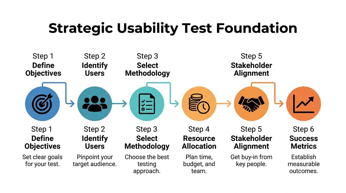
Define scope before stakeholders expand it
The second failure point is scope creep. A team says it wants to test the onboarding flow. By the time the sessions start, the study also includes billing, permissions, dashboards, mobile responsiveness, and the new AI assistant.
That doesn’t work.
Your plan needs a hard boundary around what’s in and what’s out. A scope statement can be short, but it has to be explicit.
A practical format:
In scope
First-time admin setup, CRM connection, lead routing rule creation, first dashboard interpretationOut of scope
Billing settings, historical reporting, mobile experience, advanced integrations, support portalDecision the study supports
Whether the current setup experience is ready for broader rollout
This is also where stakeholder alignment happens. If product, design, customer success, and leadership all expect different outcomes, the study will disappoint all of them. Keep the plan visible, approved, and lightweight.
If your team wants a broader operational reference, this complete guide to conducting usability testing is a useful companion because it helps connect planning decisions to the actual research workflow.
Build participant definitions around behavior, not demographics
In B2B SaaS, a weak participant profile is expensive. “Users at mid-sized companies” is not enough. You need to know what they own, what tools they touch, and what pressure they work under.
Strong B2B participant definitions usually include:
Role responsibility
Are they a sales ops manager, revenue operations lead, agency account manager, or founder wearing three hats?Workflow ownership
Do they configure automation, approve workflows, or consume reports created by someone else?Product maturity
Are they evaluating new software, migrating from spreadsheets, or replacing an incumbent platform?Environment complexity
Do they work with one CRM, multiple integrations, approval chains, or team permissions?
That distinction matters because task performance varies wildly by responsibility. A founder might tolerate exploration. A sales ops director won’t. They need clarity, speed, and confidence.
For teams creating repeatable research operations, curated user experience design resources can help standardize persona inputs, workflow mapping, and study templates across releases.
Write the success criteria before you recruit
A surprising number of teams recruit participants before they’ve decided what success looks like. That’s backwards. If you don’t know what counts as evidence, you’ll collect anecdotes, not insight.
Define success in plain language:
- Users can complete the target workflow without moderator rescue
- Users interpret labels and system feedback correctly
- Users recover from common errors without leaving the flow
- The team can identify the highest-friction moments for design revision
A plan with this level of clarity gives everyone the same frame. Researchers know what to test. Designers know what’s being evaluated. Product leaders know what decision the findings will support.
That’s the strategic foundation. Without it, the rest of the usability test plan becomes busywork.
Crafting High-Impact Tasks and User Scenarios
Most bad usability studies don’t fail because of the tool. They fail because the tasks are written like instructions instead of real work.
In B2B SaaS, that mistake is fatal. Your users operate inside deadlines, approval chains, compliance needs, messy data, and internal expectations. If your task doesn’t feel like something they’d need to do, the behavior you observe won’t mean much.
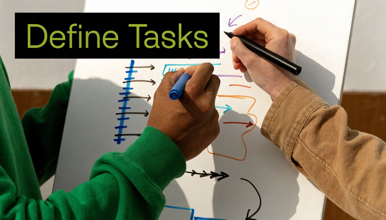
Write scenarios that mirror job pressure
A strong task gives the participant a goal, a reason, and enough context to behave naturally. It does not tell them where to click.
Compare these:
Weak task
Click the automation tab and create a new workflow.Strong task
A new batch of inbound leads needs to be routed to the right account owners. Show how you’d create a workflow that assigns leads based on region.
The second version produces better evidence because it reflects intent. You can observe whether navigation, terminology, field labels, and workflow logic all support the user’s goal.
A few reliable rules help:
Use workplace context
Tie tasks to approvals, routing, reporting, onboarding, or support escalation.Keep language neutral
Don’t include interface labels unless users would already know them.Test one core behavior at a time
Multi-part tasks can be useful, but only if each step mirrors a real sequence.Avoid teaching inside the prompt
If the task includes clues to the correct path, you’re measuring reading comprehension, not usability.
The best task prompts sound like something a manager would ask an employee to do by noon.
Match participants to the workflow, not the company size
Recruitment gets oversimplified in SaaS. Teams say they need “decision-makers” or “admins,” but that often hides critical differences in actual behavior.
Someone who buys software isn’t always the same person who configures it. Someone who configures it isn’t always the person who uses it every day. Your usability test plan should recruit according to the exact workflow under study.
A useful screening structure includes:
| Screening focus | What to confirm |
|---|---|
| Role fit | The participant actually performs or supervises the target workflow |
| Tool familiarity | They’ve used comparable systems or categories before |
| Task frequency | They perform the behavior often enough to have expectations |
| Decision context | They work within the constraints your product is built for |
Many B2B studies improve instantly when a team stops testing with friendly generalists and starts testing with users who feel the friction.
Use sample size as a planning tool, not a vanity metric
Some founders still assume they need a huge sample before a study is worth running. For qualitative usability work focused on finding problems, that’s usually the wrong instinct.
Jakob Nielsen’s foundational principle holds that testing with 5 users uncovers approximately 85% of usability problems, as summarized in Lyssna’s guide to the usability test plan. That’s why lean teams can move quickly without waiting for a giant research budget.
The trade-off is simple. If you’re trying to discover usability issues in a specific workflow, a small focused group is efficient. If you’re trying to compare segments or validate a benchmark statistically, you need a different study design.
Use that distinction when setting expectations with leadership:
- Small qualitative studies are best for discovering friction, unclear labels, weak navigation, and broken mental models.
- Larger quantitative studies are better when you need confidence around measurable performance differences across groups.
The wrong move is blending those goals into one study and satisfying neither.
Build task sets that reveal failure patterns
A good test doesn’t rely on one “hero task.” It uses a small sequence that surfaces where the experience breaks across discovery, setup, execution, and review.
For a B2B SaaS workflow, a high-value task set might include:
Find the starting point
Where would you go to create a new automation?Configure a rule
Set conditions and assign an action based on a realistic trigger.Review output
Confirm whether the rule works as intended and where results can be monitored.Recover from confusion
Handle an edit, missing field, or ambiguous status message.
That sequence tells you much more than a single completion metric. It shows whether the interface supports orientation, confidence, and recovery. Those are the places where support costs and churn often begin.
Choosing Logistics and Defining Success Metrics
A usability test plan becomes real when you decide how the sessions will run and how success will be measured. These decisions determine whether teams create a smooth operation or introduce noise that weakens the findings.
The right logistics depend on product complexity, audience access, and internal bandwidth. The right metrics depend on the decision you need to make after the study.
Compare your session formats honestly
There’s no prestige in picking the most intensive method. The best choice is the one that reveals useful behavior with the least operational waste.
Here’s the practical comparison:
| Format choice | Best used when | Main advantage | Main limitation |
|---|---|---|---|
| Remote moderated | The workflow is complex and you need follow-up questions | You can probe confusion in real time | Scheduling and moderation take more team time |
| Remote unmoderated | Tasks are straightforward and you need faster scale | Easy to run across more participants | You lose the ability to clarify intent |
| In-person moderated | Physical context or high-touch observation matters | Strong rapport and detailed observation | Higher coordination cost and smaller reach |
For most B2B SaaS teams, remote moderated is the default sweet spot for important flows. It lets you observe complex setup behavior, listen to reasoning, and catch hesitation that analytics alone won’t show.
Unmoderated studies still have a place. They’re useful when you want to sanity-check simpler tasks, compare wording, or get broader directional input. They’re less useful when your product includes permissions, integrations, branching logic, or decision-heavy steps.
Choose the lightest method that still gives you trustworthy evidence. Anything heavier is overhead. Anything lighter is guesswork.
Plan the operational details before the calendar fills up
The logistics section of a usability test plan should answer a few simple questions clearly:
- Who’s moderating?
- Who’s observing?
- Which platform will record the session?
- What environment will participants use?
- How will consent, scheduling, and note-taking work?
- Where will findings be stored?
This sounds basic, but it’s where studies often become messy. A missing staging account, unclear observer roles, or untested recording workflow can ruin a session.
Keep observer participation controlled. Too many voices in the room or on the call can change participant behavior and distract the moderator. A quiet backchannel for notes and follow-up questions is usually enough.
Measure what matters to product decisions
Metrics should connect directly to usability, not just interest. In B2B SaaS, the most useful measures usually capture completion, efficiency, mistakes, and confidence.
Below is a practical reference table.
| Metric | What It Measures | B2B SaaS Benchmark | How to Collect |
|---|---|---|---|
| Task success rate | Whether users complete the task correctly | Over 78% is considered a pass according to UX Tigers on user testing | Observe completion status for each participant and task |
| Error rate | How often users make mistakes that block or slow progress | Below 5% is ideal according to UX Tigers on user testing | Log misclicks, failed attempts, incorrect inputs, and recovery issues |
| Time on task | How long users need to finish key workflows | Compare against your own baseline | Use session timing from start prompt to task completion or abandonment |
| SUS score | Overall perceived usability after the session | No benchmark cited in this section | Use a post-test survey after core tasks |
| Qualitative friction themes | Where users hesitate, misunderstand, or lose confidence | Qualitative | Tag recurring issues in notes and recordings |
A few cautions matter here.
First, don’t over-index on time-on-task when users are learning a new interface. Longer time can indicate friction, but it can also reflect deliberate exploration. Context matters.
Second, success rate is only useful if “success” is defined before the sessions start. If one observer counts a task as complete and another doesn’t, your metric won’t survive scrutiny.
Tie metrics back to ROI
B2B founders: pay attention. Usability work matters because friction has a business cost.
If users can’t complete setup, onboarding slows. If they misinterpret workflow rules, support volume rises. If they can’t trust the output, adoption stalls inside the account.
That’s why benchmarks matter. A task success rate above 78% and an error rate below 5% give teams a concrete reference point for judging whether a workflow is healthy enough to scale, based on the UX Tigers benchmark guidance. The metric isn’t the goal by itself. The goal is making better product decisions faster.
Executing the Test and Analyzing Key Findings
A polished usability test plan still won’t save a poorly run session. Execution is where discipline shows. The moderator needs consistency. The observers need structure. The team needs a way to turn raw behavior into decisions designers and developers can act on.

Use a script so every participant gets the same study
A moderator script isn’t about sounding robotic. It’s about reducing variation. If one participant gets extra explanation and another doesn’t, your findings become harder to trust.
A useful script usually includes:
Opening language
Explain the purpose, confirm consent, and tell participants you’re testing the product, not them.Think-aloud prompt
Ask them to narrate what they expect, what they notice, and what feels unclear.Task wording
Read each task exactly as written.Neutral follow-ups
“What are you thinking now?” works. “Did you notice the setup button?” doesn’t.Debrief questions
Ask where they felt confident, where they hesitated, and what they expected to happen.
That consistency pays off during analysis because you can compare behavior across participants without wondering whether moderation changed the outcome.
Pilot the study before real sessions start
Every serious usability test plan should include a pilot session. One internal dry run or one pilot with a near-match participant can reveal broken links, confusing prompts, unrealistic tasks, and logging problems.
Pilot sessions usually surface issues like these:
- The task wording accidentally gives away the answer
- A test account lacks the right permissions
- The prototype doesn’t support a key branch of the flow
- The moderator asks leading follow-up questions without realizing it
Fix those before the main sessions begin. It’s much cheaper to adjust the plan than to explain away compromised findings afterward.
For teams that want a structured way to improve critique and response loops after testing, a clear framework for feedback on design helps turn observation into sharper product decisions.
If your pilot feels awkward, that’s useful. If your live sessions feel awkward for the same reasons, that’s avoidable.
Moderate without rescuing
The hardest skill in usability testing is restraint. When a participant hesitates, the team often wants to help. Don’t.
The moment you guide them past confusion, you erase the evidence you came to collect. In B2B tools, especially, the hesitation is often the finding. A buried permission control, vague workflow label, or unclear status message may be exactly why onboarding stalls in production.
Good moderation means staying curious and neutral:
- Ask what they expected to happen
- Ask what they’re looking for
- Ask what a label means to them
- Let silence do some work
You’re not there to prove the design is good. You’re there to understand how it behaves under real use.
A short walkthrough on facilitation and observation can help teams calibrate before they run live sessions:
Analyze patterns, not anecdotes
After the sessions, teams often jump straight to a highlight reel of memorable quotes or painful moments. That’s useful for storytelling, but it isn’t enough for prioritization.
Structured analysis works better. Start by grouping issues into themes:
| Theme | Example signals |
|---|---|
| Findability | Users can’t locate setup, reports, or status controls |
| Comprehension | Labels, instructions, or system states are misunderstood |
| Workflow logic | Users don’t understand sequence, dependencies, or outcomes |
| Error recovery | Users can’t correct mistakes or recover confidence |
Then layer in the quantitative results. For B2B SaaS tools, industry benchmarks often target a task success rate between 70-85% and a System Usability Scale score above 80, which Maze describes as a gold standard for user satisfaction in its guide to planning usability testing.
That mix matters. The metrics tell you how serious the problem is. The session evidence tells you why it happened.
Prioritize fixes by business impact
Not every usability issue deserves the same response. A typo in helper text is not the same as a failed setup step that blocks first value.
A practical prioritization filter asks:
- Does this issue block completion?
- Does it affect a core revenue or onboarding workflow?
- Is the confusion repeated across participants?
- Can the team fix it quickly, or does it require deeper redesign?
That gives product teams a usable action list instead of a generic research report. The strongest deliverable is usually short: key findings, evidence, severity, and recommendation.
That’s what turns a usability test from an interesting exercise into a decision-making asset.
Advanced Strategies for Scaling and Inclusivity
Once a team proves the value of usability work, the next challenge is consistency. Studies happen once, then pause. Findings live in decks. Recruitment starts from zero every time. Analysis takes too long. The program never becomes operational.
That’s where automation and inclusivity change the maturity of the whole practice.
Use automation to increase cadence, not just speed
AI and automation help most when they remove repetitive work around the study, not when they replace research judgment.
Useful places to automate include:
Recruitment operations
Screen incoming candidates against role criteria and route likely fits for review.Scheduling and reminders
Reduce no-shows and manual coordination.Transcription and tagging
Turn recordings into searchable text and cluster recurring issues faster.Repository management
Store findings by workflow, persona, and feature so future teams can reuse them.
This is also where tool selection matters. Platforms such as Maze can support more scalable testing workflows, and one case highlighted in earlier source material reported 500+ annual tests, 75% faster insights, and 10x larger samples across 300+ team members after operational changes. The lesson isn’t that every team needs that volume. It’s that mature research systems reduce friction in the research process itself.
Automation also pairs well with adjacent quality practices. If your team is tightening UI consistency between releases, this roundup of Visual Regression Testing Tools is useful because it complements usability work by catching visual changes that can create new friction after a design update.
Scale doesn’t come from running more sessions randomly. It comes from making recruitment, capture, analysis, and reuse repeatable.

Build inclusivity into the plan, not as an afterthought
A lot of B2B SaaS usability testing still assumes a narrow user profile. Standard plans often miss users with different cognitive processing styles, energy regulation needs, or sensory sensitivities. That’s a problem because the omissions distort the data.
One often-overlooked angle is testing with neurodiverse users, who make up 15-20% of the tech workforce, and the same source notes that inclusive design can show a 22% ROI boost from broader insights in B2B contexts, as referenced in guidance on usability testing with people with disabilities.
In practice, that means your usability test plan should account for things like:
Pacing adjustments
Allow more processing time without treating pauses as failure.Instruction clarity
Remove ambiguity from moderator prompts and task setup.Sensory considerations
Keep sessions predictable, with fewer interruptions and clearer transitions.Alternative communication styles
Some participants may give richer feedback after task completion rather than while thinking aloud.
Inclusive testing is not separate from ROI. In B2B software, users often operate under cognitive load already. If the test setup adds unnecessary pressure, your results reflect the test environment as much as the product.
Combine inclusivity with operational discipline
The strongest research operations don’t treat inclusive testing as a special project. They build it into the standard process. Screener criteria, session options, moderation guidelines, consent flow, and reporting templates all make room for different user needs.
That’s especially important when products touch complex workflows like CRM administration, hiring pipelines, approval systems, or AI-assisted operations. The more mentally demanding the task, the more your plan should account for varied ways users process information.
For teams formalizing that work, practical support around web accessibility consulting can help align product testing with broader accessibility and usability standards across digital experiences.
Frequently Asked Questions About Usability Testing
What’s the difference between usability testing and QA testing
They solve different problems.
QA testing checks whether the product is broken. It looks for defects, regressions, and unexpected system behavior. Usability testing checks whether people can use the product effectively. A workflow can pass QA and still fail users because labels are unclear, steps are confusing, or decisions feel risky.
You need both. QA protects release quality. Usability testing protects user success.
Can you run a useful usability test plan with a small budget
Yes, if you stay focused.
Keep the scope narrow. Test one important workflow. Recruit from existing customers, trial users, or qualified contacts already close to the product. Use remote sessions, record them, and take structured notes. A small study with the right participants is more valuable than a broad study with easy-to-reach but irrelevant participants.
What you can’t do on a small budget is answer every product question at once.
What should you do if the findings are inconclusive
Treat inconclusive results as a planning signal, not a dead end.
Usually one of three things happened:
- the task prompts were too vague
- the participant mix didn’t match the workflow
- the success criteria weren’t defined tightly enough
Revise the study and rerun the critical tasks. Short follow-up rounds are often enough to clarify whether the issue is with the interface or with the test design.
How often should B2B SaaS teams run usability tests
Run them whenever a change affects a critical workflow. That usually includes onboarding, setup, permissions, reporting, handoffs, or anything tied closely to activation and retention.
The strongest teams don’t wait for a redesign. They test before high-impact releases and again after meaningful changes.
If your team wants to turn usability testing into a repeatable growth system instead of an occasional research task, MakeAutomation helps B2B and SaaS companies build efficient operational workflows around UX, AI, automation, and scalable process design. That includes the systems behind better testing, faster feedback loops, and product experiences that support adoption rather than slow it down.