

Workflow Visualization: Unlock Efficiency for 2026
Your team probably already has workflows. They just don't exist in a form anyone can trust.
Lead handoff happens in Slack. Client onboarding lives partly in a CRM, partly in someone's head, and partly in a spreadsheet with no owner. Approvals stall because nobody knows who has the ball. A task gets redone because the intake brief was incomplete. Another gets delayed because one system updated and the next person never saw it. Founders usually call this “growing pains.” In practice, it's operational debt.
That debt gets expensive long before it looks dramatic. Teams compensate with meetings, status checks, manual follow-ups, and heroic people who remember how things really work. The business keeps moving, but it doesn't move cleanly. That's where workflow visualization matters. Not as a design exercise. As a management system for seeing how work moves.
From Hidden Chaos to Visible Control
Fast-growing B2B companies usually don't fail because they lack effort. They struggle because work is happening through too many unofficial paths at once.
Sales creates one version of the customer record. Delivery creates another. Finance waits for data that wasn't captured upstream. Support gets pulled in late because a promised feature was never documented. Everyone feels busy. Few people can point to the exact sequence of steps, decisions, and handoffs that produced the result.
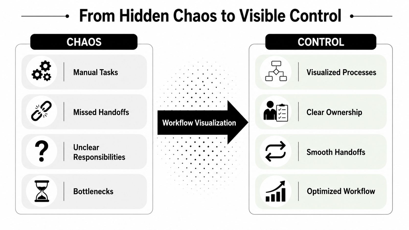
What workflow visualization actually fixes
A useful workflow map does three things at once:
- Makes ownership visible so nobody has to guess who acts next
- Exposes handoffs and decision points where work often stalls
- Creates a shared operating picture that sales, ops, finance, and delivery can all read the same way
That shared language matters more than most founders think. A major milestone in this field came when Business Process Model and Notation, BPMN, was first released in 2004, giving organizations a common graphical language for tasks, decisions, and handoffs, which helped move workflow visualization beyond ad hoc flowcharts into a shared enterprise method, as outlined in this BPMN and workflow visualization overview.
When a company doesn't have that shared method, every process conversation turns into interpretation. One person means “qualified lead” as soon as a form is filled out. Another means after budget is confirmed. A third assumes it means after a discovery call. The workflow breaks before automation even starts.
Practical rule: If two departments describe the same process differently, you don't have a process yet. You have competing stories.
Pretty diagrams don't solve operational debt
Many teams go wrong by documenting the ideal path, printing a polished flowchart, and calling the work done.
The map looks clean because it excludes the actual friction. It leaves out the missing information, the approval loops, the exceptions for enterprise customers, the “wait until legal replies” branch, and the manual fix someone always performs on Fridays. A founder sees the chart and thinks the company is organized. The operators know better.
Strong workflow visualization creates visible control, not visual comfort. It gives you a system people can use to diagnose breakdowns, standardize execution, and decide what should be automated next. That's the difference between a company that scales through clarity and one that scales by adding coordinators to chase work around.
How to Map Your Real-World Workflows
Don't start with your entire business. Start with one painful process that already causes delay, confusion, or rework.
For most SaaS and service businesses, that might be lead qualification, proposal approval, onboarding, implementation kickoff, content production, or invoice collection. Pick the process where missed steps produce obvious downstream cost.

Start with scope, not software
A rigorous workflow visualization method starts by scoping one process, interviewing the people who execute it, and enumerating each task in sequence. Often, the next part is overlooked: documenting interruptions, rework, or exception paths, even though a 2024 paper highlights the need to uncover these gaps because oversimplified maps can hide the bottlenecks that need fixing, as discussed in this research on interruptions and information granularity gaps.
That means your first job is not drawing. It's extracting reality.
Ask the team questions that force specificity:
- What starts this process
Not the policy answer. The trigger. An inbound form, a signed contract, a Slack message, a verbal approval, or a spreadsheet row.
What information is required
List the inputs for each step. Missing inputs are often why work stops or gets bounced back.
Who does the work
Name the role or team for every action and every approval.
What changes state
Define what completion looks like at each stage. “Done” is useless. “Opportunity moved to proposal sent” is actionable.
Where does it break
Ask where people wait, redo work, escalate, or go off-system.
Map the happy path first, then force the mess onto the page
There is value in getting the basic sequence down. You need a readable baseline. But if you stop there, you'll create a diagram that helps in workshops and fails in operations.
Use a second pass for the messy layer:
- Interruptions such as missing approvals, unavailable stakeholders, or external dependencies
- Rework loops where a task returns to a prior stage
- Exception branches for VIP customers, urgent requests, compliance checks, or incomplete records
- Information gaps where one team needs data another team never captures
At this stage, workflow visualization stops being decorative and becomes diagnostic.
The best automation opportunities rarely sit on the main path. They sit in the repeated exception that your clean diagram tried to hide.
A practical way to do this is to maintain two views of the same process. One is an executive map with the major steps and owners. The other is an operator map that includes exception routes, wait states, and rework. That prevents the diagram from becoming unreadable while preserving the truth.
Validate with the people doing the work
A process map created by managers alone usually reflects policy, not execution.
Walk the draft with the people who move the process. Ask them where the map is wrong, where they improvise, and what they do when the system doesn't match reality. If three people perform the same step differently, capture that. Standardization starts with seeing variation, not pretending it doesn't exist.
If you're mapping a revenue process, a targeted resource like this sales process flowchart guide can help teams define stages and handoffs more clearly before they automate.
For teams building a more formal mapping discipline, these business process mapping techniques are useful for choosing when to use a flowchart, swimlane, or a more detailed operational map.
Here's a simple field checklist I use with clients before a map is considered usable:
- Clear start and end points so the team knows what is inside the process and what is not
- Named decision criteria instead of vague labels like “review” or “check”
- Visible handoffs between teams, systems, or vendors
- Known exception paths for the problems that happen repeatedly
- Validation by operators who do the work every week
A short explainer can also help your team align on the basics before you workshop the process in detail:
Choosing Your Workflow Visualization Toolkit
The right tool depends less on features and more on what stage you're in. Teams typically engage in one of three jobs: exploring, documenting, or automating. Choose a tool that matches that job.
Three tool categories that matter
Whiteboards and sticky notes are still useful when you're pulling process knowledge out of people. They lower resistance. Teams talk more freely when the map still feels editable.
Dedicated diagramming tools work better once the process needs to be shared, reviewed, and maintained. They give you clean swimlanes, versioning discipline, and a format leadership can readily read.
Integrated platforms matter when the diagram isn't just for communication. In that case, the visual model starts becoming the automation logic or at least the blueprint for it.
| Tool Category | Best For | Example | Key Benefit |
|---|---|---|---|
| Low-fidelity mapping | Early discovery workshops | Whiteboard, sticky notes | Fast collaboration without tool friction |
| Dedicated diagramming | Process documentation and review | Miro, Lucidchart | Clear, shareable maps with cleaner structure |
| Integrated platforms | Live workflow execution and automation design | Make, Zapier, HubSpot process builder | Visual logic can connect directly to operational systems |
Match the tool to the maturity of the process
If you're still arguing about what happens, don't buy a complex platform yet. Use something flexible and rough. The value comes from surfacing disagreements.
If the process is stable enough that multiple teams rely on it, document it in a tool built for clarity. At this stage, consistency matters more than sophistication.
If the process is repeatable and rule-based, move into a platform that lets the workflow connect to systems and triggers. Such platforms enable visual models to stop being reference material and start affecting real execution. Teams comparing those options often benefit from a practical overview of a workflow diagram tool before committing to one approach.
Use the cheapest tool that lets you answer the next operational question. Don't overbuild the stack before you understand the process.
What works and what doesn't
What works:
- Using low-fidelity tools for discovery because people correct rough drafts faster
- Standardizing symbols and naming once the map becomes shared documentation
- Choosing integrated tools only after roles, triggers, and exceptions are known
What doesn't:
- Starting in a complex automation platform too early, which locks confusion into software
- Letting every team invent its own notation, which makes cross-functional maps hard to read
- Treating the diagram as finished, which guarantees it will drift away from reality
One note on vendors. If you want visual workflow design tied to automation delivery, options include Make, Zapier, CRM-native builders, and MakeAutomation, which works on AI and automation optimization for B2B and SaaS operations. The right choice depends on whether you need documentation, orchestration, or hands-on implementation support.
Powering Automation and AI with Visuals
A static diagram is useful. A visual workflow tied to live execution is much more valuable.
Once a team can see the sequence, owners, and decision points, the next question is straightforward: which steps should a system handle, which steps should a human approve, and where should AI help with classification, drafting, routing, or exception detection?

The map becomes a build specification
The biggest mistake founders make here is trying to automate before the workflow is explicit. That usually creates brittle automations that mirror someone's assumptions instead of the company's actual process.
A stronger sequence looks like this:
- Define the workflow visually with triggers, steps, owners, and exceptions
- Separate deterministic logic from judgment calls so you know what software can handle
- Automate the repeatable core and leave visible approval points where human review still matters
- Feed performance data back into the map so the process can be improved, not just executed
This is especially important in AI-enhanced operations. AI can classify inbound requests, draft responses, summarize records, or route work. But it still needs the surrounding workflow to define when it acts, what data it uses, where it sends output, and what happens if confidence is low or information is missing.
Move from ownership maps to time analysis
Advanced workflow visualization becomes particularly insightful. Research from clinical workflow analysis shows that timestamp data can be turned into interactive visualizations for task analysis, sequential-pattern analysis, and location analysis. That shifts the operational question from “who owns this step?” to “where does time go, and which sequences correlate with delays?” as described in this interactive workflow visualization research.
That idea translates well beyond healthcare.
In a B2B company, timestamped workflow data can show:
- Where queues build up between stages
- Which exception paths consume disproportionate effort
- How long approvals sit untouched
- Which sequence patterns tend to produce errors or escalations
This is the point where workflow visualization becomes an operational control panel.
If you're building AI-driven process flows, a platform designed around an AI agent workflow builder can help connect the visual process design to live orchestration, decision logic, and handoff behavior.
When a workflow diagram can answer both “what should happen” and “what actually happened,” it stops being documentation and starts becoming infrastructure.
Automation gets better when exceptions are visible
The clean path isn't usually where automation fails. Failure happens when records are incomplete, customers don't fit the default route, or approvals stall in edge cases.
That's why I push founders to automate the common path only after the exception map exists. The exception map tells you where to put fallbacks, alerts, human review points, and recovery logic. Without it, every automation looks successful in a demo and fragile in production.
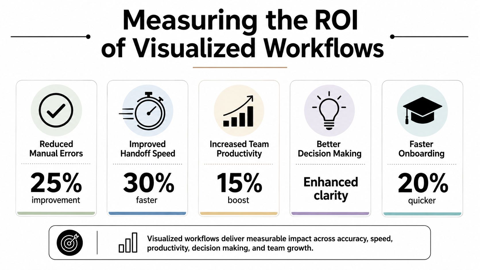
Measuring the ROI of Your Visualized Workflow
If workflow visualization doesn't change decisions or results, it turns into documentation overhead. The way to avoid that is simple. Tie the map to operating metrics.
The most useful guidance here is practical: workflow visualization is strongest when it captures bottlenecks and timing data, not just steps. Annotating the map with status, performance, or delays helps teams detect inefficiencies, and measuring cycle time and queue points turns the diagram into a control surface for continuous improvement, as noted in this workflow analytics and reporting discussion.
What to measure on the map
Don't measure everything. Measure what reflects process health.
A practical set usually includes:
- Cycle time from the first trigger to the final outcome
- Queue length where work waits between stages
- Error or rework frequency when tasks bounce backward
- Throughput for how much work completes over a period
- Exception volume for how often the workflow leaves the standard path
These metrics become more useful when attached to specific points on the visual map. If a proposal approval step sits idle for too long, mark that on the diagram. If client onboarding loops back because data is missing, mark the intake step. The visual context helps people understand cause, not just observe symptoms.
How founders should read the results
A founder doesn't need a perfect process lab. They need enough visibility to answer three questions:
| Question | What to inspect on the workflow | Likely action |
|---|---|---|
| Where does work slow down | Queues, delays, approval waits | Reassign ownership, automate routing, tighten approval rules |
| Where do mistakes start | Rework loops, missing inputs, exception branches | Improve intake, validation, or handoff requirements |
| What should be automated next | Repetitive manual tasks on stable paths | Build automations around high-volume, rule-based work |
A useful review rhythm is to look at the map with operators and ask where time accumulates, where people chase information, and where the same exception keeps appearing. If the answer stays the same month after month, the business is showing you where the return is.
A process map earns its keep when it helps you stop one recurring delay, one recurring error, or one recurring manual chase.
What ROI looks like in practice
Not every gain shows up as a dramatic metric spike. Often the early return is operational clarity.
New team members ramp faster because ownership is visible. Managers spend less time mediating handoffs. Automation projects go live with fewer surprises because the underlying process was validated first. Sales and delivery stop arguing about what was supposed to happen because the workflow says it plainly.
That is real ROI. It compounds because every future improvement starts from a clearer baseline.
Your Blueprint for Scalable Growth
Most companies don't need more hustle. They need a clearer operating system.
Workflow visualization gives you that system by making work visible, shared, and improvable. Significant payoff comes when you map not just the clean route, but the messy one. Interruptions, rework, approvals, missing information, and exception handling are where time leaks out and where automation either succeeds or breaks.
Start small and prove it
Pick one process that's already painful. Map it with the people doing the work. Include actual exception paths. Validate it. Then decide what should be standardized, what should be automated, and what still needs human judgment.
That sequence is how founders stop guessing.
Treat it as a discipline, not a project
The companies that scale cleanly don't create one workflow diagram and move on. They build a habit of revisiting high-friction processes, refining decision logic, and connecting live operational data back to the map.
That discipline matters because growth changes workflows. New products add branches. Larger deals introduce approvals. More team members create more handoffs. If your visual system doesn't evolve, the business drifts back into tribal knowledge and workaround culture.
For B2B and SaaS operators, this is one of the most practical moves you can make. It gives your team a shared source of truth, turns automation from guesswork into implementation, and creates a stronger foundation for AI-enabled operations.
Start with the process everyone complains about. That's usually the one most ready to pay you back.
If you're ready to turn messy processes into clear, automated systems, MakeAutomation can help you map the actual workflow, identify what should be automated, and implement practical AI and automation improvements without forcing a one-size-fits-all process on your team.