The Meaning of Legible: Why It Matters for Business & UX
You're probably dealing with some version of this today.
A sales rep sends a proposal that looks polished at first glance, but key numbers are buried in dense paragraphs. A customer success manager opens a dashboard and can't tell which label belongs to which metric. A founder reviews an internal SOP and realizes the team has been following three different interpretations of the same instruction. Nothing is technically missing. The problem is that the information isn't easy to decode.
That's where the meaning of legible becomes more important than is commonly understood. In business, legible doesn't just mean “looks nice.” It means the information can be identified, distinguished, and acted on without friction. That applies to proposals, onboarding flows, invoices, CRM notes, analytics dashboards, forms, and increasingly, AI systems that need to interpret what a human means.
More Than Just Clear Text
A founder opens a pipeline report before a board meeting. The chart labels are cramped. The type is small. Colors are too similar. Two metrics use abbreviations that only the ops lead understands. The founder doesn't have a strategy problem in that moment. They have a legibility problem.
That distinction matters because teams often misdiagnose communication failures. They say a dashboard is “messy,” a proposal is “hard to follow,” or a workflow document is “confusing.” Often, the first issue is simpler. People can't quickly tell what they're looking at. If the eye has to work too hard before the brain can even begin, decisions slow down.
The word itself has deep roots. The term “legible” was first recorded between 1400–50, deriving from the Latin “legibilis,” meaning “that can be read” according to Dictionary.com's entry on legible. That history matters more than it seems. For over six centuries, people have had the same core problem: how to present information so another person can decode it.
In product and brand work, form stops being decoration and starts being function. If you've ever worked through form and function in design, you've seen the same principle play out. A design choice succeeds when it helps the user do the job faster, with less effort and less doubt.
For B2B teams, legibility affects more than aesthetics. It shapes whether a buyer trusts the document, whether a rep enters the right data, and whether an operator follows the right step the first time.
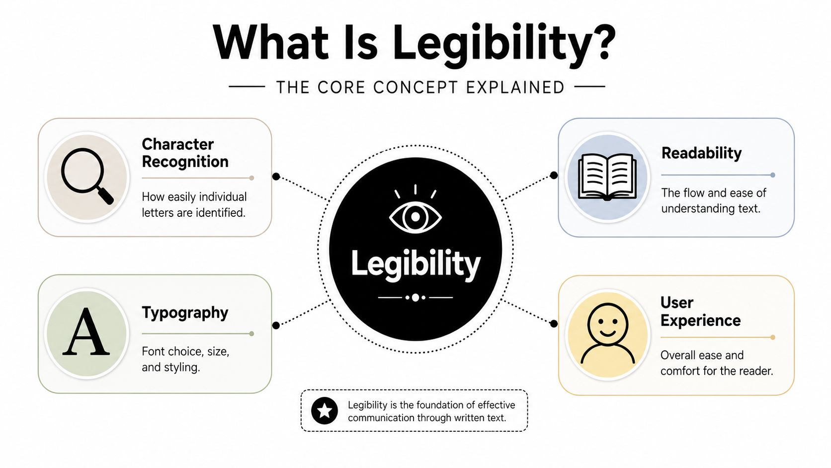
What Is Legibility The Core Concept Explained
Legibility is the quality that makes text identifiable at the smallest useful level. It's about whether a reader can distinguish letters, words, and lines of text without strain.
According to Legible Typography's explanation of legibility, legibility is the functional characteristic that makes a message accessible by ensuring the clarity needed to identify individual characters, words, and text in paragraphs. Its opposite, illegible, means the writing is functionally indecipherable.
Think in layers
A useful analogy is a brick wall.
If a paragraph is the wall, legibility is your ability to see each brick clearly. You can't judge the structure if the individual pieces blur together. In text, those bricks are letters and words. If the letters are cramped, ambiguous, too light, too stylized, or too low-contrast, the reader has to spend effort on recognition before they can move on to meaning.
That's why legibility sits underneath broader user experience. Many UX design principles come back to the same idea: reduce friction, respect attention, and make the interface easy to interpret.
Where people usually get confused
The term “legible” is often used as a general synonym for “easy to read.” That's close, but not precise enough.
Legibility is narrower and more technical. It asks questions like:
- Can I tell these letters apart
- Can I scan this row without misreading it
- Can I identify the button label instantly
- Can I decode this handwriting or font without hesitation
This applies across formats:
- Handwriting: A doctor's note might contain the right information, but if the letterforms blur together, it fails on legibility.
- SaaS UI: A billing dashboard may have accurate numbers, but if labels are tiny and contrast is weak, users will hesitate.
- Documents: A contract can be carefully written, but if the typography is cramped, the reader slows down before they even assess the terms.
Practical rule: If users must squint, zoom, or reread to identify the text itself, you don't have a content problem yet. You have a legibility problem.
For founders, that's a valuable diagnosis. It helps you fix the right layer first.
Legible vs Readable A Critical Distinction for Creators
A lot of teams use legible, readable, and clear as if they mean the same thing. They don't.
This is one of the most useful distinctions you can make if you write landing pages, design dashboards, build internal tools, or review sales materials. When you know which problem you're dealing with, fixes become much faster.
The simplest way to separate them
Legibility is about perception.
Readability is about flow.
Clarity is about understanding.
A sentence can be perfectly legible and still be painful to read. A paragraph can be readable in a visual sense and still be unclear because it uses vague language or buried logic.
Here's the side by side view.
| Concept | Focus | Question It Answers | Example |
|---|---|---|---|
| Legibility | Visual recognition of text | Can I distinguish the letters and words? | A UI label in a clean font with enough size and contrast |
| Readability | Ease of reading continuous text | Can I move through this sentence or paragraph smoothly? | Short sentences, sensible line length, familiar wording |
| Clarity | Ease of understanding meaning | Do I understand what this actually means? | “Cancel subscription” is clearer than “Manage service continuity preferences” |
A common business example
Say your product team writes this instruction inside a workflow tool:
Please ensure all customer-originated billing exceptions are routed through the appropriate escalation pathway for resolution alignment.
That sentence might be legible if the font, spacing, and contrast are good. But it's not very readable, because the wording is heavy. It's also not very clear, because people may not know what “resolution alignment” means.
Now compare it to:
Send unusual billing issues to the finance lead before replying to the customer.
Same task. Lower friction.
How to diagnose the real problem
When someone says “this page is hard to read,” ask three questions:
- Can people visually identify the text quickly? If not, fix legibility.
- Can they move through the copy without slowing down? If not, fix readability.
- Do they understand the message and next step? If not, fix clarity.
Different teams often owning different layers is significant.
- A designer might fix the font, contrast, spacing, or hierarchy.
- A content strategist might shorten the copy or improve scannability.
- A founder or product lead might rewrite the value proposition so the meaning lands faster.
A clean font won't rescue muddy thinking. Sharp copy won't help if the interface makes every label hard to parse.
In B2B, this distinction protects time. It stops marketing from blaming copy for what is really a visual design issue, and it stops design from polishing screens that still use vague language.
Why Legibility Is a Critical Metric for Business Success
When legibility fails, work slows down before anyone notices why.
A user hesitates in a settings panel because labels are too similar. A prospect stops reading a proposal because the pricing section feels dense. An operations team makes inconsistent decisions because the SOP looks like a legal brief instead of a usable instruction set.

In product, legibility reduces hesitation
For SaaS tools, legibility is part of operational efficiency. Users don't experience your interface as a collection of design decisions. They experience it as speed or friction.
If table headers are hard to scan, support tickets increase. If form labels are ambiguous or visually weak, people enter bad data. If a dashboard requires effort just to decode, managers export the data into spreadsheets they trust more.
That's why legibility belongs inside accessibility work, not outside it. Teams that invest in accessibility consulting services usually discover that accessible design also improves day to day efficiency for everyone else using the system.
In sales and marketing, legibility affects trust
Buyers don't separate content from presentation as neatly as internal teams do.
A proposal with clean hierarchy, readable tables, and obvious next steps feels easier to trust. A landing page with sharp contrast, disciplined spacing, and strong headings helps visitors orient themselves. A pricing page that makes users hunt for plan differences creates doubt.
These aren't cosmetic concerns. They influence whether a person keeps moving or abandons the task.
In operations, illegible systems create hidden rework
Internal docs are where many companies lose time.
An SOP can be technically correct and still fail in practice if people can't scan it quickly. Dense paragraphs, weak headings, inconsistent formatting, and overloaded screenshots make routine work harder than it should be. Teams then improvise. Improvisation creates variation. Variation breaks automation.
Here's a short explainer that reinforces why visual presentation changes how people process information:
High stakes make the rule obvious
Legal contexts make the value of legibility impossible to ignore. In that setting, a document is only acceptable if it is “capable of being read or deciphered with ease”, and documents below a legibility threshold can be deemed inadmissible, as described in this discussion of legibility as a legal standard.
Business software rarely carries courtroom consequences, but the principle is the same. If people can't reliably decode what's in front of them, the communication has failed.
The Future of Legibility in AI and Automation
The meaning of legible is expanding beyond text.
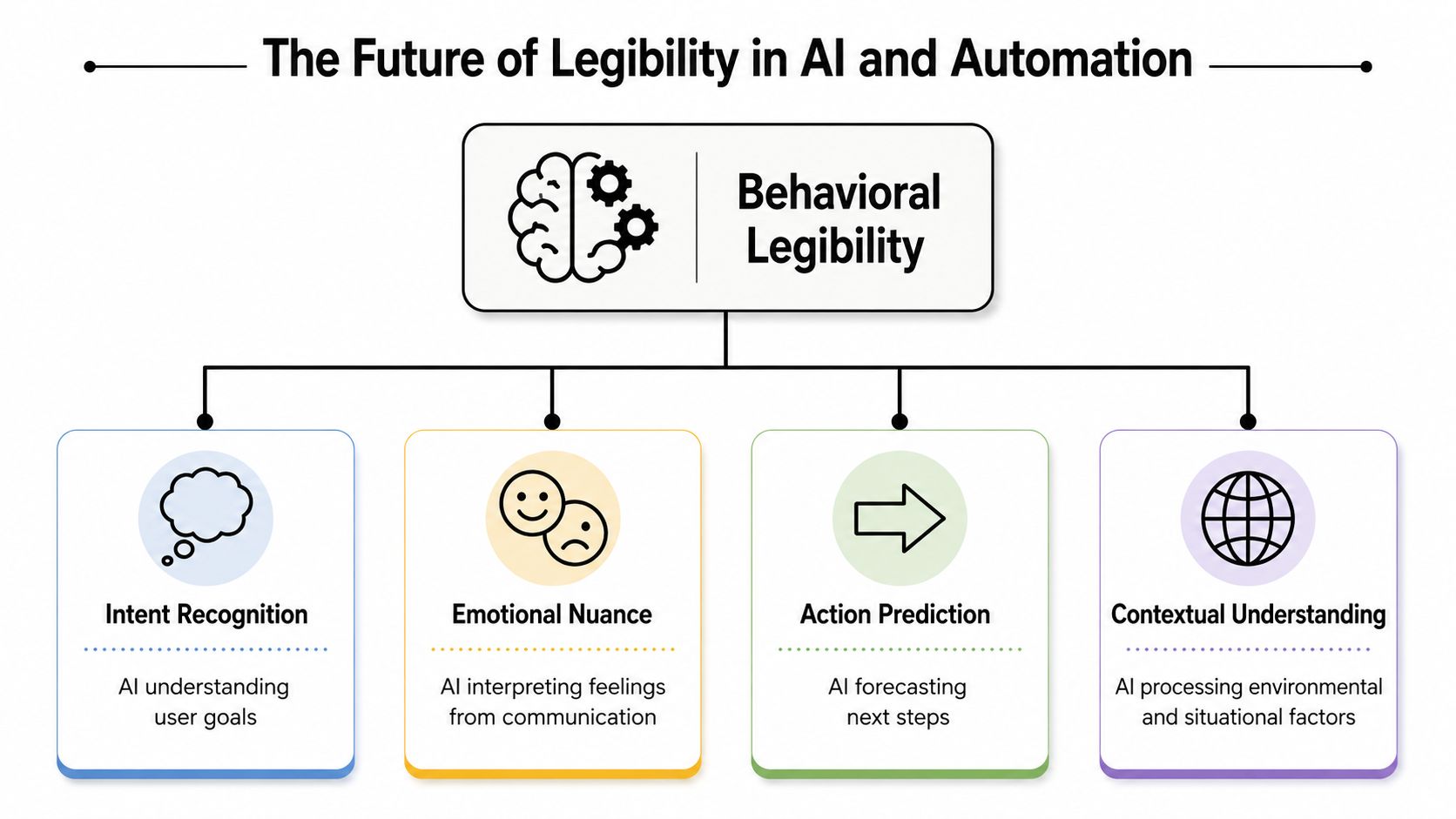
In AI ethics and machine interaction, legibility increasingly refers to whether something can be discerned or distinguished, including behavior, emotion, and intent. That shift matters for any business using voice AI, chat agents, or automated decision systems.
From text legibility to behavioral legibility
According to Vocabulary.com's definition of legible, the term can also mean capable of being discerned or distinguished. In AI contexts, that opens a new layer of interpretation.
A voice agent doesn't just need words converted into text. It needs signals that are legible enough to act on. Is the customer frustrated? Is the prospect hesitant? Is the speaker asking a question, making a complaint, or giving approval?
If those cues aren't detectable, the system misses the point even when the transcript is accurate.
Why founders should care
A lot of automation projects fail because they treat human communication as if it were only verbal content. But real interaction includes pacing, tone, confidence, interruption, and emotional cues. A strong transcript is useful. A legible interpretation of intent is better.
That's also why tools that produce polished text from voice input are becoming more valuable. They don't just capture words. They help convert rough speech into something structured enough for human review and downstream systems.
If your AI can hear the sentence but can't recognize the intent behind it, the interaction is still partly illegible.
For B2B teams deploying AI in support, sales, or intake workflows, this is the next frontier. Traditional legibility helps humans read systems. Behavioral legibility helps systems read humans.
5 Practical Ways to Improve Legibility Today
You don't need a rebrand or a product redesign to improve legibility. Small changes often remove the most friction.
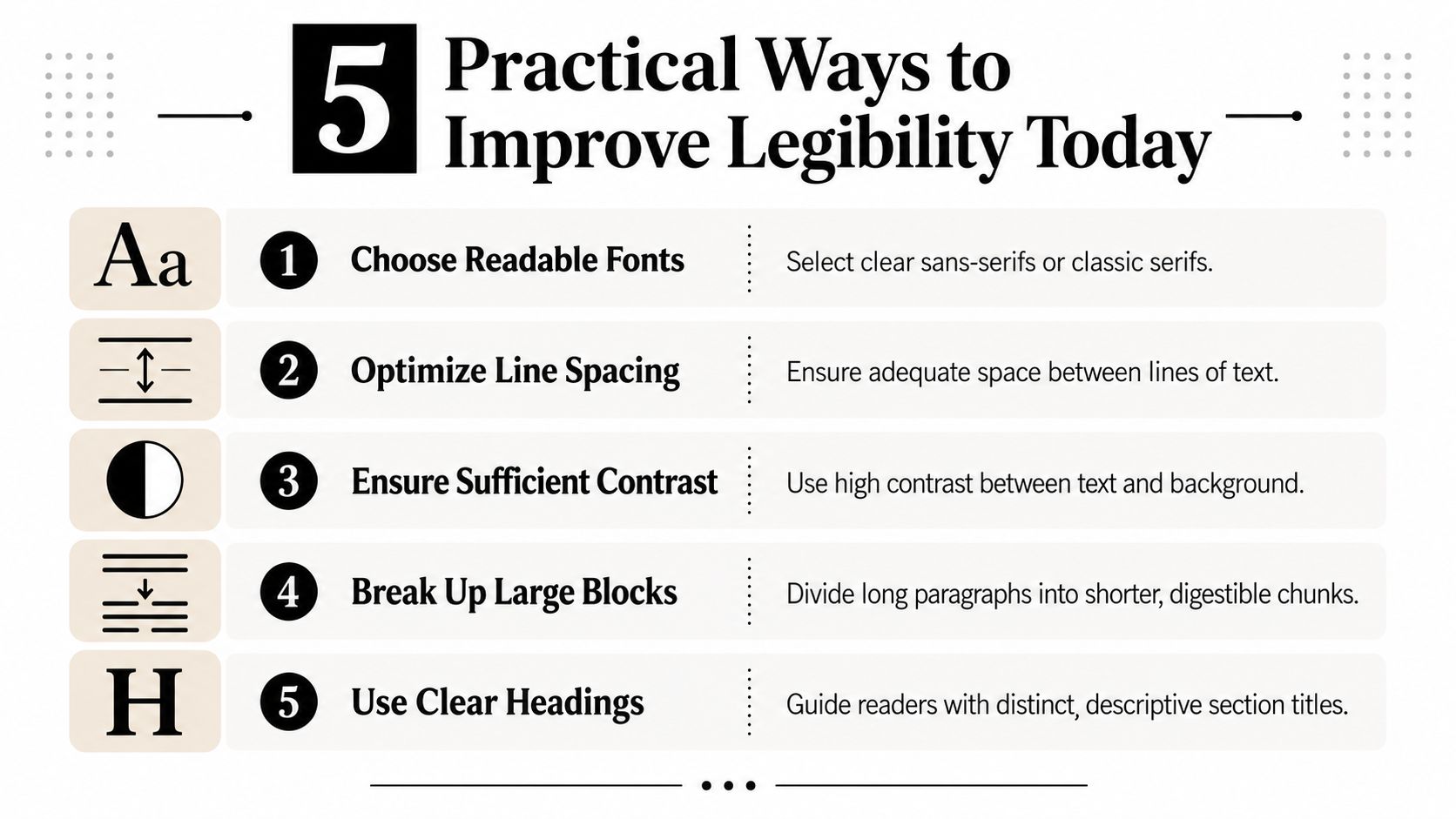
Start with the text itself
Choose simpler fonts for functional interfaces
Save decorative type for brand accents. In dashboards, forms, proposals, and internal tools, use typefaces built for screen use and fast scanning. If a character set makes similar letters easy to confuse, switch it out.Give lines and blocks of text more room
Crowded interfaces feel harder than they are. Increase spacing between lines, labels, rows, and sections so the eye can separate elements without effort.
Fix the surrounding conditions
Use stronger contrast
Light gray text on a nearly white background often looks modern in mockups and annoying in production. If users have to lean in to read, contrast is too weak.Break large blocks into usable chunks
Long paragraphs hide meaning. Split dense instructions into steps, bullets, headings, and short supporting notes. Teams trying to build LinkedIn authority for founders already use this principle in social content because formatting changes whether people engage or scroll past.
Shorter chunks don't dumb content down. They reduce the work required to enter it.
Improve structure, not just style
- Build consistent hierarchy across your system
Headings, labels, helper text, buttons, and tables should follow repeatable patterns. That's one reason mature teams invest in design system documentation. Consistency makes interfaces easier to parse because users learn the pattern once and reuse it everywhere.
If you want a simple test, open your busiest page and ask someone unfamiliar with it to complete one task. Don't ask whether they “like” the design. Ask where they hesitate, zoom, reread, or misinterpret. That's where legibility is breaking down.
If your team is building SaaS workflows, AI agents, internal SOPs, or client-facing systems, MakeAutomation can help you turn confusing processes into legible, scalable operations. Their work focuses on clearer systems, stronger automation, and practical AI implementation that people can use.